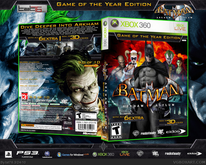
Ok. First of all the first full 3D game so I had to make a cover for it. A year ago I made a boxart for Batman: Arkham Asylum www.vgboxart.com/viewfullbox.php?boxid=29499&boxloc=%2Fboxes%2F360%2F29499_batman_arkham_asylum_collectors_edition-orig.jpg. That was one of my first box. Since that I had over 330000 downloads on console-covers.and 1140+ favs on VGBA. I put a lot of effort in this cover. Wanted to do something special for the first anniversary of my hobby.Hope you all like it. Downloadable available. For PAL version please visit www.console-covers.com
A definate piece of art,the back is really the star of your masterpiece(it sure does look pretty artistic). The front pretty good but it has some negative aspects:
1. The red explosion behind the villains,the color doesn't blend with the picture.
2. Try to blend the villains in a better way, the smock doesn't help too much.
But the things I suggested are not quite necessary,a gradient will sure help,some thing like light blue.
But still it rocks,keep it up. You sure do have the ability to overcome the odds,+fav
 Batman: Arkham Asylum Game of the Year Edition Box Cover Comments
Nice one Tat. FAV!
[ Reply ]
Ok. First of all the first full 3D game so I had to make a cover for it. A year ago I made a boxart for Batman: Arkham Asylum www.vgboxart.com/viewfullbox.php?boxid=29499&boxloc=%2Fboxes%2F360%2F29499_batman_arkham_asylum_collectors_edition-orig.jpg. That was one of my first box. Since that I had over 330000 downloads on console-covers.and 1140+ favs on VGBA. I put a lot of effort in this cover. Wanted to do something special for the first anniversary of my hobby.Hope you all like it. Downloadable available. For PAL version please visit www.console-covers.com
Edited at 1 decade ago
[ Reply ]
Very awesome, looks really official.
[ Reply ]
WOW! +fav, and you better keep making boxes like this cuz its an author fav!
[ Reply ]
Definitely one of the better Arkham Asylum covers on the site
[ Reply ]
Why so few comments?
Where have you been tat76? You finally came back from consolecovers, :)
My only gripe is that the gamespot logo could have been put somewhere out of the way of Joker's face.
Edited at 1 decade ago
[ Reply ]
#6, Thank You. I was here all the time. For some reason I never have too many comments....
Edited at 1 decade ago
[ Reply ]
Question, did you happen to get those borders from the main website? I ripped the borders from the website and used them, they look similar.
[ Reply ]
Got it from the Collector's Edition Promo Picture... Had to fix it a bit.
Edited at 1 decade ago
[ Reply ]
#6, Agreed, though extremely nice box!
It's worth waiting for your next one if its as wonderful as this!
[ Reply ]
Great composition man. Looks fantastic!
[ Reply ]
HOF! Thank you for the Favs' EVERYONE...
[ Reply ]
Don't think that the red explosion on the front fits at all.
[ Reply ]
#13, That is not an explosion. Actually taht is the Moon from the Background. I just recolored it. :)
[ Reply ]
#14, Ah. Well I just don't think the color works. I'd have stuck with cooler tones.
[ Reply ]
awesome fav
[ Reply ]
The characters don't blend in with the fiery background but it look ok with the presentation.
[ Reply ]
A definate piece of art,the back is really the star of your masterpiece(it sure does look pretty artistic). The front pretty good but it has some negative aspects:
1. The red explosion behind the villains,the color doesn't blend with the picture.
2. Try to blend the villains in a better way, the smock doesn't help too much.
But the things I suggested are not quite necessary,a gradient will sure help,some thing like light blue.
But still it rocks,keep it up. You sure do have the ability to overcome the odds,+fav
[ Reply ]
Somebody stole your boxart.
link
[ Reply ]