sonic_custom [ Buy Sonic The He... at Amazon ] By niososonic 19 on April 14th, 2010 No Printable Available Sonic The Hedgehog Box Cover Comments Comment on niososonic's Sonic The Hedgehog Box Art / Cover. Cancel Reply niososonic 19 [ 1 decade ago ] My entry for Draxxx's Custom artwork comp. I'm very happy how it turned out, and I put alot of effort into this one. Credit to hexxer on thecoverproject.net for the template. Enjoy! Favs & Comments welcome, Author favs very welcome! Everything is GIMP made #2, give reasons. And that hurts because of all the effort. Edited at 1 decade ago [ Reply ] Kira666Yagami 2 [ 1 decade ago ] Damn, I didn't see the comp... I don't like it at all. Edited at 1 decade ago [ Reply ] soniciscool 11 [ 1 decade ago ] #2,disagree. I think this is really good. [ Reply ] Drakxxx 46 [ 1 decade ago ] #2 It would help the artist to know why you "don't like it all". If your going to comment, do so respectfully please. The effort is apparent with this one, and I think you did a wonderful job capturing the style and colors of the game. Very nice work. :) [ Reply ] Unknown Flames 33 [ 1 decade ago ] There are many things I like, and hate about this box. What I like: -Great art -Nice work of capturing the game's style -Pretty nice positioning What I don't like: -The logo is pretty badly done -The back text is overused, I don't care if IT IS sonic I'll fav, nice work! [ Reply ] stevencho 44 [ 1 decade ago ] #5, I'd have to disagree. I think the logo was done very nicely. I think it needs a little something to make it stand out though like a shadow or something. Overall, I really like this. Good job. [ Reply ] niososonic 19 [ 1 decade ago ] Thanks everybody! I'll try to add a drop shadow, if I'm not to lazy [ Reply ] Ronthis the Werewolf 39 [ 1 decade ago ] Very good! 5/5 +fav! Though the ring in sonics hand (on back)is messed up! Still worth 5/5 and fav though! [ Reply ] niososonic 19 [ 1 decade ago ] #8, Yes, that ring looks like a rubberband... thanks though. [ Reply ]
 Sonic The Hedgehog Box Cover Comments
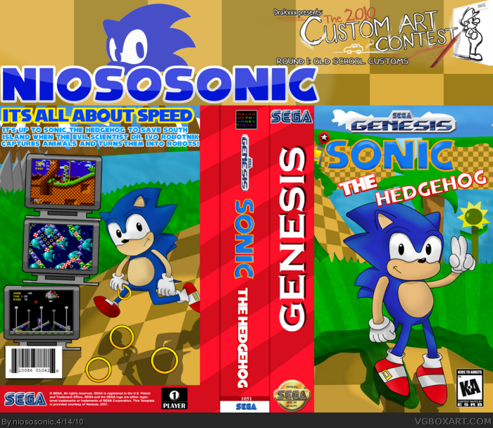
My entry for Draxxx's Custom artwork comp.
I'm very happy how it turned out, and I put alot of effort into this one.
Credit to hexxer on thecoverproject.net for the template.
Enjoy!
Favs & Comments welcome, Author favs very welcome!
Everything is GIMP made
#2, give reasons. And that hurts because of all the effort.
Edited at 1 decade ago
[ Reply ]
Damn, I didn't see the comp...
I don't like it at all.
Edited at 1 decade ago
[ Reply ]
#2,disagree. I think this is really good.
[ Reply ]
#2 It would help the artist to know why you "don't like it all".
If your going to comment, do so respectfully please.
The effort is apparent with this one, and I think you did a wonderful job capturing the style and colors of the game. Very nice work. :)
[ Reply ]
There are many things I like, and hate about this box.
What I like:
-Great art
-Nice work of capturing the game's style
-Pretty nice positioning
What I don't like:
-The logo is pretty badly done
-The back text is overused, I don't care if IT IS sonic
I'll fav, nice work!
[ Reply ]
#5, I'd have to disagree. I think the logo was done very nicely. I think it needs a little something to make it stand out though like a shadow or something. Overall, I really like this. Good job.
[ Reply ]
Thanks everybody! I'll try to add a drop shadow, if I'm not to lazy
[ Reply ]
Very good! 5/5 +fav! Though the ring in sonics hand (on back)is messed up! Still worth 5/5 and fav though!
[ Reply ]
#8, Yes, that ring looks like a rubberband... thanks though.
[ Reply ]