this one could be much better, as for the front the texte should be better centered, background a bit darker, as for the spine it has no life, a little pic or something (fade color instead of plain..) should make it less boring and for the back, the texts (synopsis and features) are way tooooooo big and needed better traitement
your first iron man was far better (even it misses a bit life to make it interresting)
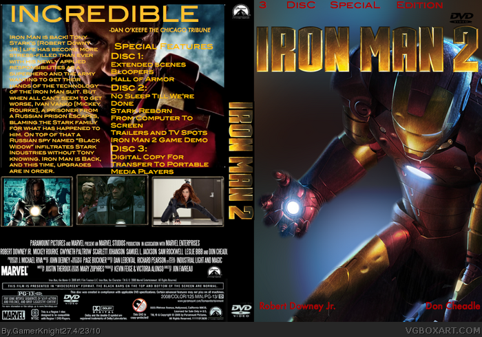
 Iron Man 2 Box Cover Comments
Nice box. The logo could be rendered and the red writing on the front could be better. Overall 4/5
[ Reply ]
this one could be much better, as for the front the texte should be better centered, background a bit darker, as for the spine it has no life, a little pic or something (fade color instead of plain..) should make it less boring and for the back, the texts (synopsis and features) are way tooooooo big and needed better traitement
your first iron man was far better (even it misses a bit life to make it interresting)
[ Reply ]