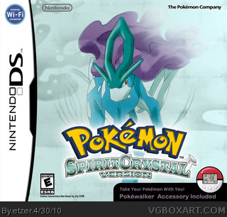
I was bored and put this together putting my tablet to use after a while without using it. The idea came while playing SoulSilver and I thought about how I would hate if they'd come out with a remake of Crystal after I bought the remake of Silver. Although, when you think about it, Nintendo wouldn't come out with a remake of a remake, would they? Maybe. ^_^
#5, Well, the Pokemon logo I got from Google Images, the "SpiritCrystal Version" text, I made with a first text layer with a green gradient and gray gradient stroke and a copy of that same layer placed layer under it, with a black stroke slightly bigger that the gray one, so it looks like it has 2 strokes. Then I merged the layers and used the Warp tool to sort of bend it.
 Pokemon SpiritCrystal Version Box Cover Comments
I was bored and put this together putting my tablet to use after a while without using it. The idea came while playing SoulSilver and I thought about how I would hate if they'd come out with a remake of Crystal after I bought the remake of Silver. Although, when you think about it, Nintendo wouldn't come out with a remake of a remake, would they? Maybe. ^_^
[ Reply ]
Wow, I love it :)
[ Reply ]
#2, Thx!
[ Reply ]
Really good, one of the better third in the HeartGold SoulSilver series. Might want to try a back now.
[ Reply ]
#3, You are most certainly welcome. If you don't mind me asking, how did you make that logo?
[ Reply ]
#5, Well, the Pokemon logo I got from Google Images, the "SpiritCrystal Version" text, I made with a first text layer with a green gradient and gray gradient stroke and a copy of that same layer placed layer under it, with a black stroke slightly bigger that the gray one, so it looks like it has 2 strokes. Then I merged the layers and used the Warp tool to sort of bend it.
#4, I'm already working on it! ^_^
[ Reply ]
*whistles* Impressive... very impressive! So, what font did you use for the "SpiritCrystal Version" text if I may ask?
[ Reply ]