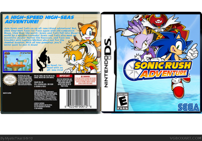
I would recommend using a new (Cleaner looking) font for the text on the back, lowering the title to fill the negative space below (And moving the characters accordingly to balance things) and definitely clean up that seagull (Google "Vector Magic" and use their services for a quick, though not perfect, clean-up of the bird.)
 Sonic Rush Adventure Box Cover Comments
Credit:
Renders:Sonic Art Archive, Planet Renders
Logo:Sonic Art Archive
Other Logos-KoopaDasher/VGBA Simple Needs
I'm happy about how this turned out, and I hope you like it!
[ Reply ]
Very nice! +Fav!
[ Reply ]
Nice! Front seems empty but + favorite
[ Reply ]
nice ! but sega logo looks stretched and captain whiskers is squished
[ Reply ]
Hmmm, very good! fav
[ Reply ]
I would recommend using a new (Cleaner looking) font for the text on the back, lowering the title to fill the negative space below (And moving the characters accordingly to balance things) and definitely clean up that seagull (Google "Vector Magic" and use their services for a quick, though not perfect, clean-up of the bird.)
[ Reply ]