You're improving dude. But there are a couple inconsistencies. Your Mm logo looks like you distorted it after you did the entire box and your spine isn't set coreectly. But it's still a step up from your previous boxes. Just fix some of the details and you got a good box.
Thanks. the mm logo looks a bit weird because I forgot to put it on but I remembered at the last minute and the spine is like that because im not very good with spines.
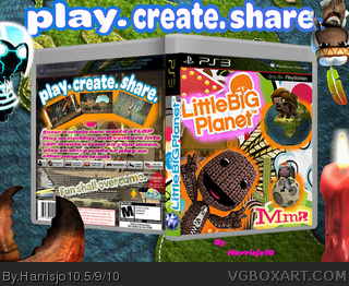
 Little Big Planet Box Cover Comments
Much better than before. The spine's a bit off.
Edited at 1 decade ago
[ Reply ]
You're improving dude. But there are a couple inconsistencies. Your Mm logo looks like you distorted it after you did the entire box and your spine isn't set coreectly. But it's still a step up from your previous boxes. Just fix some of the details and you got a good box.
[ Reply ]
Thanks. the mm logo looks a bit weird because I forgot to put it on but I remembered at the last minute and the spine is like that because im not very good with spines.
[ Reply ]