I like this a lot, especially the character placement on the front. I agree about the Nintendo being white too, it puts more emphasis on the Pokemon Stadium logo IMO.
The box is pretty damn good, but the artwork completely steals the show.
Especially my man Blastoise. What a badass lookin' bazooka-turtle. Where did you get it, exactly? (I know you credited Godzilla and Gamera, but I'm not really sure who they are.)
#3, too crowded for you? XD I've seen more crowded ones on your page ;)
@ package: I cannot find much to complain about. The black box on the front may be too much, but I guess it is not working without it. Put the Nintendo 64 on top into a black box as well? Maybe, but it could be too much. The only thing I would change is the "N"-Logo on the spine, since it is not in the spines center (compare the black spave around it and you will see the left space is a bit bigger). Maybe you should add a white line to show the edge of the spine, as on the top, too?
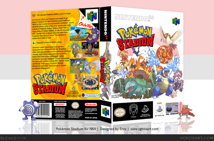
 Pokemon Stadium Box Cover Comments
Needed a printable, made one. Hope you like it. Thanks to Godzilla and Gamera for the artwork. I need a printable for Pokémon Colosseum too so that might be my next project.
[ Reply ]
Awesome, this is just amazing!
I want to buy it now, and print your case out
[ Reply ]
Not bad. I really like the back. But the front is too crowded for me. Plus I would recommend changing the Nintendo 64 logo to pure black.
[ Reply ]
#3, it was originally black, but in my opinion it looks better white.
Edited at 1 decade ago
[ Reply ]
I like this a lot, especially the character placement on the front. I agree about the Nintendo being white too, it puts more emphasis on the Pokemon Stadium logo IMO.
[ Reply ]
The box is pretty damn good, but the artwork completely steals the show.
Especially my man Blastoise. What a badass lookin' bazooka-turtle. Where did you get it, exactly? (I know you credited Godzilla and Gamera, but I'm not really sure who they are.)
[ Reply ]
Pretty damn awesome.
[ Reply ]
Are they deviant art? Those renders are sweet.
[ Reply ]
Good good good.
[ Reply ]
oh I wonder when they will make another good game like this one....
I want to be able to do this now-a-days, without PBR.....
[ Reply ]
Tight.
[ Reply ]
I looove the front and back.
[ Reply ]
#3, too crowded for you? XD I've seen more crowded ones on your page ;)
@ package: I cannot find much to complain about. The black box on the front may be too much, but I guess it is not working without it. Put the Nintendo 64 on top into a black box as well? Maybe, but it could be too much. The only thing I would change is the "N"-Logo on the spine, since it is not in the spines center (compare the black spave around it and you will see the left space is a bit bigger). Maybe you should add a white line to show the edge of the spine, as on the top, too?
Edited at 1 decade ago
[ Reply ]
How did I forget to fave this??
[ Reply ]
AWESOME!!! 11/10 + fav! I love the crowd of Pokemon!
[ Reply ]