Bad.
REALY BAD.
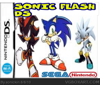
Why would they make a flash game for the DS
Further more Siver doesn't match the style of the other characters.
Nintendo shouldn't be a dev logo
Theres no background
The Wifi Logo shouldnt be there
the logo sucks
And theres no ESRB logo
#1, It's much better than a lot of peoples' firsts, but it's far from perfect. I'll make a list for you:
- Silver's art style is different.
- Sega and Nintendo logos are stretched.
- Wifi logo doesn't go there look at officials to figure it out.
- Logo is kind of bland.
- Renders are stretched.
- No ESRB.
#3 & #4
Constructive criticism is the rule
I told him whats wrong with it, if you guys want to keep making me out as a bad guy fine, but I'm fulfilling my obligations to the site. Get over it.
#7, just shut up.
You pointed out the errors rudely:
"BAD, really BAD" "The logo sucks"
Plus, you're an idiot. Nintendo is a dev logo. Look on any DS box and that's where the nintendo logo goes.
#8, Well I'm not going to tell him its good if the box is bad.
And yes nintendo is a dev logo...
On the back.
Not on the front with SEGA.
Now if you don't mind, I'd prefer if you get off your high-horse sir.
#9, you are the biggest idiot on the site. Nintendo is a dev logo. Look at the front of any DS box, if you aren't blind, you'll see that there is a nintendo logo in the bottom right-hand corner. I hope that wasn't too complex for you to understand.
This is supposed to be an area where we should give constructive critics to the author's box, and not argue with someone that doesn't know how to treat people kindly. (P.S.: #2 You should work on you're boxes before talking shi*.)
#1 Before uploading you're box, make shure you follow the Beginners Guide link . And also there's a section of Tips in the forum that will help you improve you're box.
#15, Tsk Tsk, just because I have better things to do than work on boxart doesn't mean I don't know crap from good.
Also last time I checked, this argument was about THIS box, not mine. I don't HAVE to treat people nicely, I just have to give them constructive criticism. If some people want to retaliate thats their choice, but I'm not the one who's wrong here.
Oh and #13, also note how thats a DIFFERENT dev logo.
Yeah thats what a thought.
Are you actually friggin saying it's wrong because it's white and not red? Please, Drakxxx, I beg of you to ban this ignorant, stupid troll who can't even make a good box, let alone crtique one correctly.
Oh you poor, poor man.
I'm not the one who started this argument, now am I?
You were the one who decided to come in here and tell me to "shut up."
If anything, that makes YOU a troll.
And once again, this topic is about this box, not mine. So if you don't mind, I would advise you to stop raging and get back on topic.
#22, Oh tsk tsk, now what if my feelings were sincerely hurt by that comment? You should really learn to control your temper outbursts. They'll really get you into trouble someday.
#24, If you're ignoring me, then why do you keep replying to me posts? If you were truly ignoring me, then you would have no need to reply, now would you?
Dude, seriously, both of you shut your mouth. Neither of you are doing anything but being whiny and figting over the color and placement of a dev logo. Honestly.
I'm not a huge fan...but it's still better than my first. HEY!!! What if you update it!!! It my look a whole lot different. I'm just gonna list the parts that need to be fixed
1.Shadow is way to stretched
2.Get rid of the Nintendo logo
3.Make the title a bit smaller
4.Find an animated pic of Silver
5.Put a background
6. The SEGA logo is to stretched
I hope you can fix these things. Can't wait to see version 2.
 Sonic Flash DS Box Cover Comments
My first art. Not the best but please rate. 2nd game will be made...
[ Reply ]
Bad.
REALY BAD.
Why would they make a flash game for the DS
Further more Siver doesn't match the style of the other characters.
Nintendo shouldn't be a dev logo
Theres no background
The Wifi Logo shouldnt be there
the logo sucks
And theres no ESRB logo
[ Reply ]
#2, shut up.
#1, It's much better than a lot of peoples' firsts, but it's far from perfect. I'll make a list for you:
- Silver's art style is different.
- Sega and Nintendo logos are stretched.
- Wifi logo doesn't go there look at officials to figure it out.
- Logo is kind of bland.
- Renders are stretched.
- No ESRB.
Looking forward to your work.
[ Reply ]
#2 doing that will only get you banned.
#3 exactly what I was going to say!
I see great potential in you@ fav
Edited at 1 decade ago
[ Reply ]
#3 & #4
Constructive criticism is the rule
I told him whats wrong with it, if you guys want to keep making me out as a bad guy fine, but I'm fulfilling my obligations to the site. Get over it.
[ Reply ]
#5, No, you just told him what was wrong very rudely and told him his work sucked.
[ Reply ]
#6, Because I say bad at the beggining of my post doesn't mean the entire post is suddenly rude.
And I lol'd because every single one of your points are the same as mine.
[ Reply ]
#7, just shut up.
You pointed out the errors rudely:
"BAD, really BAD" "The logo sucks"
Plus, you're an idiot. Nintendo is a dev logo. Look on any DS box and that's where the nintendo logo goes.
[ Reply ]
#8, Well I'm not going to tell him its good if the box is bad.
And yes nintendo is a dev logo...
On the back.
Not on the front with SEGA.
Now if you don't mind, I'd prefer if you get off your high-horse sir.
[ Reply ]
#9, you are the biggest idiot on the site. Nintendo is a dev logo. Look at the front of any DS box, if you aren't blind, you'll see that there is a nintendo logo in the bottom right-hand corner. I hope that wasn't too complex for you to understand.
[ Reply ]
As much as I agree with you GameNinja, I must point out you are wrong about the dev logo.
link: Proof
[ Reply ]
EDIT: That link didn't work:
try this one link
[ Reply ]
#12, yeah, but like 90% have the LOGO!
link
link
link
#9 YES, IT'S NOT ON ALL BUT THE GUY CAN FRIGGIN PUT ONE ON HIS BOX AND NOT BE WRONG YOU IDIOT!
[ Reply ]
Haha noob fight.
[ Reply ]
This is supposed to be an area where we should give constructive critics to the author's box, and not argue with someone that doesn't know how to treat people kindly. (P.S.: #2 You should work on you're boxes before talking shi*.)
#1 Before uploading you're box, make shure you follow the Beginners Guide link . And also there's a section of Tips in the forum that will help you improve you're box.
[ Reply ]
#15, Tsk Tsk, just because I have better things to do than work on boxart doesn't mean I don't know crap from good.
Also last time I checked, this argument was about THIS box, not mine. I don't HAVE to treat people nicely, I just have to give them constructive criticism. If some people want to retaliate thats their choice, but I'm not the one who's wrong here.
Oh and #13, also note how thats a DIFFERENT dev logo.
Yeah thats what a thought.
Edited at 1 decade ago
[ Reply ]
#16, What the hell are you talking about? It's the same effing logo!
Edited at 1 decade ago
[ Reply ]
#17, No, no its not.
[ Reply ]
EDIT: Sorry, computer lagged, double posted
Edited at 1 decade ago
[ Reply ]
Are you actually friggin saying it's wrong because it's white and not red? Please, Drakxxx, I beg of you to ban this ignorant, stupid troll who can't even make a good box, let alone crtique one correctly.
[ Reply ]
Oh you poor, poor man.
I'm not the one who started this argument, now am I?
You were the one who decided to come in here and tell me to "shut up."
If anything, that makes YOU a troll.
And once again, this topic is about this box, not mine. So if you don't mind, I would advise you to stop raging and get back on topic.
[ Reply ]
#21, I feel bad for your sorry ass. Why don't you go get a life?
Edited at 1 decade ago
[ Reply ]
#22, Oh tsk tsk, now what if my feelings were sincerely hurt by that comment? You should really learn to control your temper outbursts. They'll really get you into trouble someday.
[ Reply ]
#23, you are passive-aggresive, ignorant, flat-out stupid, rude, inconsiderate, lifeless, crappy-boxartist, troll.
And I am ignoring you.
[ Reply ]
#24, If you're ignoring me, then why do you keep replying to me posts? If you were truly ignoring me, then you would have no need to reply, now would you?
[ Reply ]
Dude, seriously, both of you shut your mouth. Neither of you are doing anything but being whiny and figting over the color and placement of a dev logo. Honestly.
[ Reply ]
God shut up. You keep bumping this atrocity. You should both be banned.
[ Reply ]
I'm not a huge fan...but it's still better than my first. HEY!!! What if you update it!!! It my look a whole lot different. I'm just gonna list the parts that need to be fixed
1.Shadow is way to stretched
2.Get rid of the Nintendo logo
3.Make the title a bit smaller
4.Find an animated pic of Silver
5.Put a background
6. The SEGA logo is to stretched
I hope you can fix these things. Can't wait to see version 2.
[ Reply ]
By the way Vaderkid123, this is NOT a flash game. It is pure DS.
[ Reply ]
back coming soon. DON'T FIGHT ABOUT IT. I KNOW IT WILL BE CRAP SO DON'T FIGHT.
[ Reply ]
#11, No, Gameninja's right, however most of the time it says "Licensed By" above it.
As for the box, everyone else said it. However, this isn't bad for a first.
[ Reply ]
not bad 4 a 1st try i still didnt make 1 but good job
[ Reply ]
#31, Why in gods name would you bump this box back up to the front page. Do that with good boxes, not shitty ones.
[ Reply ]