Template (All three parts) - Rayblade
Logo - Stevencho :)
Renders - are either from the forms and bings
border - Me :)
Nintendo and ESRB logo - bing
WI-FI logo - bing
Screenshots - Gamefaqs
I think since i started over it turned out alot better
favs and comments are welcome, and so is constructive critisim!
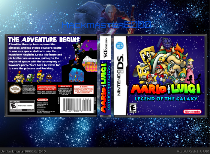
It's good. But Babyluigi is backwards (and therefore his L is). I also think there is too much text on the back and the tagline is really unnatractive, try to make a better one, something with colour. Also, The random black on the side of the back looks just plain weird, and the shape of the screenshots don't look right either. Thats pretty much all you need to fix. I do like the idea for the front positioning though :)
EDIT: Take the mario & Luigi silhouettes off the logo, it doesnt look right with them there.
Not bad. But pretty empty on the front and for the back you should add some features of whats in the game. Cause making the plot so big isnt going to help get rid of the empty space but just make it look ugly.
 Mario & Luigi : Legend of the Galaxy Box Cover Comments
Template (All three parts) - Rayblade
Logo - Stevencho :)
Renders - are either from the forms and bings
border - Me :)
Nintendo and ESRB logo - bing
WI-FI logo - bing
Screenshots - Gamefaqs
I think since i started over it turned out alot better
favs and comments are welcome, and so is constructive critisim!
Edited at 1 decade ago
[ Reply ]
It's good. But Babyluigi is backwards (and therefore his L is). I also think there is too much text on the back and the tagline is really unnatractive, try to make a better one, something with colour. Also, The random black on the side of the back looks just plain weird, and the shape of the screenshots don't look right either. Thats pretty much all you need to fix. I do like the idea for the front positioning though :)
EDIT: Take the mario & Luigi silhouettes off the logo, it doesnt look right with them there.
Oh, and stevencho is my logo-enemy lol.
Edited at 1 decade ago
[ Reply ]
I think the silhouettes look marvelous. Leave them.
[ Reply ]
I'm sorry #2 but i'm not changing the logo but thanks for the other advice too.
[ Reply ]
I like it!
[ Reply ]
Other than the backwards "L" on Baby Luigi's hat, this boxart is very well done. :)
[ Reply ]
#5 thanks for the fav
#2 and #6 the backwards L on baby luigi was some thing I tried to edit but it didn't turn out right so, I left it alone.
Edited at 1 decade ago
[ Reply ]
Nice, and better than I could do! link Please go here to see my superstar saga box in the video i couldnt upload it...
Edited at 1 decade ago
[ Reply ]
Not bad. But pretty empty on the front and for the back you should add some features of whats in the game. Cause making the plot so big isnt going to help get rid of the empty space but just make it look ugly.
[ Reply ]
#8 left a message on your box page
#9 Yeah I'll probably update tomorrow.Glad you took a look at it though :)
Edited at 1 decade ago
[ Reply ]
Your best so far
[ Reply ]
#5, #6, and #11 thanks
Edited at 1 decade ago
[ Reply ]
I like it, cool.
[ Reply ]
#13 thanks for the fav
[ Reply ]
Bump!
[ Reply ]
I like the back a lot more than the front. The front seems a little boring but I'll fav because I really like the back :)
[ Reply ]
The sponge characters seem out of place on the front
[ Reply ]
love the front. hate the the back
[ Reply ]