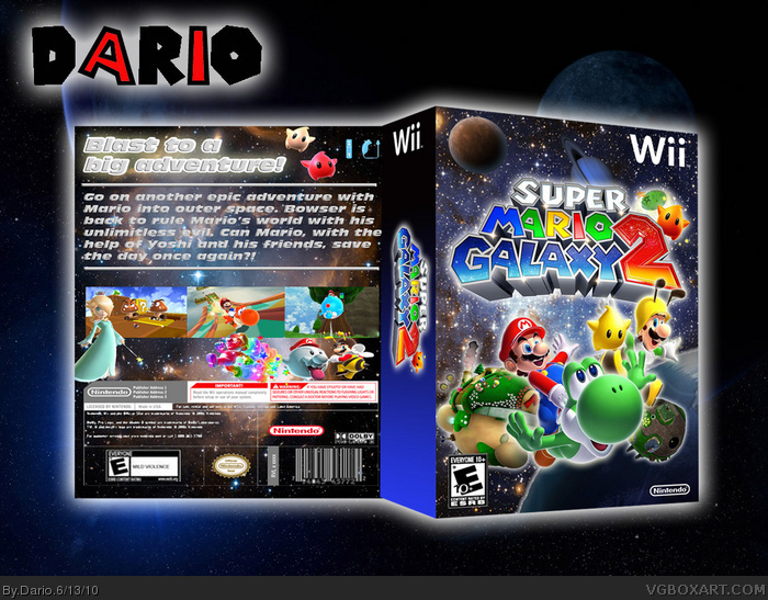
The back font doesn't fit... and you're missing a screenshot border. The front is good, but not great, it seems so random. You can improve alot on this. :)
I'll fav since this is pretty good
all you need is a screenshot border and try to fix the renders on the back of the box they seem kinda squished. Nice Job!
#6, Although he is normally unfair and harsh, this time he has a point. I think he should have explained WHY it was a trainwreck though.
Firstly, I don't like any of the box.
Here are the things you can do to improve:
-Use a normal wii template.
Anyone that uses these templates except Jevangod seems a bit desperate, almost unfair. Use a custom temp, sure, but not ones like these, this is Jevan's style, let him have that.
-The box is generic.
It seems like "Just another galaxy box". These galaxy boxes are starting to have the reputation of a pokemon box - a simple thing that everyone is doing. In this case it is that same render on a starry background with some planets. That is why Yoshistar's box was so successful - it was unique, different. You should work on your originality for this box.
-The front looks messy.
The placing of the planets, luigi and the colourful background really clash. It just looks way too busy and random, and it just looks weird. Try a different background, one less busy, and rearrange your renders.
-Putting a glow on every render does not equal looking good.
On the front everything has a glow which just puts off the balance even more and it doesn't look right.
-The text on the back.
The text is way too big and you should not put effects like that on back synopsis texts.
-The screenshots need fixing.
The screens at the moment look messy. This is because they are all clumped together, without borders, and not in the centre of the box. (further over to the right)
-Don't squash renders.
The renders on the back, especially the lumas, Rosalina and the 3 Marios are all squashed vertically. It looks bad. Not only wierd, but BAD.
-The legal info is also squashed.
Same thing as above, the legal info is squashed vertically, and it looks wrong.
-The controllers are choppy.
In the top right hand corner of the back, the controller options are very choppy, and badly rendered.
-The entire box is LQ in full view.
In full view, the box is blurry and choppy. Never increase the siz of images, decrease the size of the box so that the images will fit.
-Contrasting image styles
The planets on the front are very contrasting - you have photos of real planets, sketch/drawings of real planets and Mario Galaxy planets. It doesn't look right. The same as the background, it is a real life image with animated characters on it.
I am not being harsh, so please don't take it that way. This is criticism.
#6, Grand's right.
Calling this beautiful, when it looks like 100 others boxes on this site, and is extremely messy. (Pretty much everything what tmrd said)
I know everyone has a different taste, but some of the members on this site seriously needs to stop being that easily impressed.
The huge spines are so pointless. I understand wanting to do a box with this type of temp, and even I like this temp style since it looks sharp and clean and it's easy to make it yourself to fit your custom dimensions. I don't, however, agree that jevan should be the only one to use this style but I think if you're going to do it, you better do it right. So to that effect, I'd rather say that jevan is one of the only people who can do this right, along with a few others, which I suppose some would say does make it his. This one is wrong though. Like #10 said the huge spine is old and quite frankly, it looks like crap on everyone's boxes, including the few jevan made like this. However, jevan quickly downsized the spine and now nearly perfected this temp. The problem is you'd almost never find a game with a spine like that in a store unless that's the box the special edition game is coming in, otherwise the spine is never that big in comparison to the rest of the box. I'll also be the first to admit that on my last box I tried this style and completely screwed up the spine, making it way bigger than necessary. As for the rest of the box, at first I was like, "Wow, this is a great front but the back needs work". Then I looked at it in full view and realized that although this is an alright box it is generic and does need a lot of work. As someone above said, in full view it looks choppy and blurry which is a huge turn off. The back also needs serious layout and typographic work.
And I'm not trying to step on anyone's feet, especially jevan's because I really do think he's a very talented box artist but I thought I should throw that out there.
 Super Mario Galaxy 2 Box Cover Comments
No explanation, just another Super Mario Galaxy 2 box.
But it is my first 3D box well at least the front.
Enjoy!
[ Reply ]
All you need is a screenshot border.
*Tears up* This is...beautiful...
[ Reply ]
The back font doesn't fit... and you're missing a screenshot border. The front is good, but not great, it seems so random. You can improve alot on this. :)
[ Reply ]
#2, You are far too easily impressed, kid. That back is a trainwreck.
[ Reply ]
I'll fav since this is pretty good
all you need is a screenshot border and try to fix the renders on the back of the box they seem kinda squished. Nice Job!
[ Reply ]
#4, no, Grand, you just think everyone's work except your own is awful. I'm really getting sick of you.
[ Reply ]
#6, Although he is normally unfair and harsh, this time he has a point. I think he should have explained WHY it was a trainwreck though.
Firstly, I don't like any of the box.
Here are the things you can do to improve:
-Use a normal wii template.
Anyone that uses these templates except Jevangod seems a bit desperate, almost unfair. Use a custom temp, sure, but not ones like these, this is Jevan's style, let him have that.
-The box is generic.
It seems like "Just another galaxy box". These galaxy boxes are starting to have the reputation of a pokemon box - a simple thing that everyone is doing. In this case it is that same render on a starry background with some planets. That is why Yoshistar's box was so successful - it was unique, different. You should work on your originality for this box.
-The front looks messy.
The placing of the planets, luigi and the colourful background really clash. It just looks way too busy and random, and it just looks weird. Try a different background, one less busy, and rearrange your renders.
-Putting a glow on every render does not equal looking good.
On the front everything has a glow which just puts off the balance even more and it doesn't look right.
-The text on the back.
The text is way too big and you should not put effects like that on back synopsis texts.
-The screenshots need fixing.
The screens at the moment look messy. This is because they are all clumped together, without borders, and not in the centre of the box. (further over to the right)
-Don't squash renders.
The renders on the back, especially the lumas, Rosalina and the 3 Marios are all squashed vertically. It looks bad. Not only wierd, but BAD.
-The legal info is also squashed.
Same thing as above, the legal info is squashed vertically, and it looks wrong.
-The controllers are choppy.
In the top right hand corner of the back, the controller options are very choppy, and badly rendered.
-The entire box is LQ in full view.
In full view, the box is blurry and choppy. Never increase the siz of images, decrease the size of the box so that the images will fit.
-Contrasting image styles
The planets on the front are very contrasting - you have photos of real planets, sketch/drawings of real planets and Mario Galaxy planets. It doesn't look right. The same as the background, it is a real life image with animated characters on it.
I am not being harsh, so please don't take it that way. This is criticism.
[ Reply ]
#6, Grand's right.
Calling this beautiful, when it looks like 100 others boxes on this site, and is extremely messy. (Pretty much everything what tmrd said)
I know everyone has a different taste, but some of the members on this site seriously needs to stop being that easily impressed.
[ Reply ]
#7, #8, yeah, I looked a little closer and everything you said is true. This has lost a lot of its beautiful-ness.
[ Reply ]
You should have listened to Pan's critique, the huge spine's are getting old.
[ Reply ]
The huge spines are so pointless. I understand wanting to do a box with this type of temp, and even I like this temp style since it looks sharp and clean and it's easy to make it yourself to fit your custom dimensions. I don't, however, agree that jevan should be the only one to use this style but I think if you're going to do it, you better do it right. So to that effect, I'd rather say that jevan is one of the only people who can do this right, along with a few others, which I suppose some would say does make it his. This one is wrong though. Like #10 said the huge spine is old and quite frankly, it looks like crap on everyone's boxes, including the few jevan made like this. However, jevan quickly downsized the spine and now nearly perfected this temp. The problem is you'd almost never find a game with a spine like that in a store unless that's the box the special edition game is coming in, otherwise the spine is never that big in comparison to the rest of the box. I'll also be the first to admit that on my last box I tried this style and completely screwed up the spine, making it way bigger than necessary. As for the rest of the box, at first I was like, "Wow, this is a great front but the back needs work". Then I looked at it in full view and realized that although this is an alright box it is generic and does need a lot of work. As someone above said, in full view it looks choppy and blurry which is a huge turn off. The back also needs serious layout and typographic work.
And I'm not trying to step on anyone's feet, especially jevan's because I really do think he's a very talented box artist but I thought I should throw that out there.
[ Reply ]