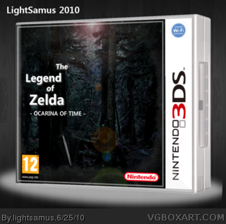
Probably the most abstract creations I've created, I wanted a sort of dark feel to Ocarina of Time. Admittedly, there isn't THAT much Ocarina of Time in the box (full-screen and you'll see what is), but I like it anyway.
Credit to Ninty and Silent Oblivion for resources.
 The Legend of Zelda: Ocarina of Time Box Cover Comments
Probably the most abstract creations I've created, I wanted a sort of dark feel to Ocarina of Time. Admittedly, there isn't THAT much Ocarina of Time in the box (full-screen and you'll see what is), but I like it anyway.
Credit to Ninty and Silent Oblivion for resources.
[ Reply ]
Font for the logo is interesting s really bringing this concept down. Other than that, I kinda like this.
[ Reply ]
It would look better if there was a master sword.
[ Reply ]
#3, There IS a Master Sword...
[ Reply ]
Not too Crazy about the Logo, and it is kind of plain.
[ Reply ]