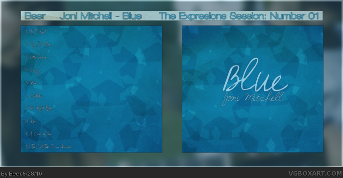
This is a great example of working with a color and literally making it the design. It also is a good job and letting the color talk about things with it's simplicity.
The font choices are a next match as well man. Great job, and thanks for submitting to the first session!
Edit: I'm quite found of Joni Mitchell
Edit 2: The actual tag is session01 if you could change it, that would be great.
I am a minimalism fan. To me however, since this is blue, I was interested in seeing a few more shades and tones. For example, some of the "flakes" could be ice blue, and really pop off the box.
I'm a minimalism fan as well. The front is ace. However, the back text is very hard to read--maybe you should remove the stroke? Also, it might look better if the BGs for the front and the back aren't the same. Otherwise, nice job!
I think you chose an excellent font for this. It matches your design really well. I like how the subtle grudge effect you chose plays off of the clean and crisp snow-flakey design of the shapes.
I like the simplicity of it, but I don't like what you've done with the text. It's so small, and difficult to read. Were it me, I would have done a drop shadow, probably a very dark blue, and I would have bolded the text, so that it stands out a bit more, since it's such a thin font choice as it is.
I also agree with qwerty about the back's background. Even if it was mirrored horizontally, it would be better.
I'm not really seeing a whole lot of effort put in here. The background you have going isn't anything that is popping out at me either (It is the main focus after all). It looks like a cover to somebody's own music they made at home. I would also redo the listing on the back.
I've never listened to this musician btw just so you understand where I am coming from.
It's a nice design,and I like the concept alot.
However, I feel as if you didn't incorporate enough elements to make the simplistic approach work.
When you center a design around a colour, it is very vital to keep it interesting.
Things to improve on in my opinion are:
-Typography [ I feel a little let down,because of the odd use of fonts. Also, the songlist looks a bit small.]
-Textures. The papery/grainy texture doesn't really cut it for me. It kind of destroys the simplistic approach.
-Contrast. Try making some of the lighter parts actually lighter, and the darkes ones darker.[increase the contast].
 Blue - Joni Mitchell Cover Comments
Viewing in full is absolutely vital.
[ Reply ]
I like the shapes and color tone. The font looks great, I just wish there was a little more on the back.
[ Reply ]
This is a great example of working with a color and literally making it the design. It also is a good job and letting the color talk about things with it's simplicity.
The font choices are a next match as well man. Great job, and thanks for submitting to the first session!
Edit: I'm quite found of Joni Mitchell
Edit 2: The actual tag is session01 if you could change it, that would be great.
[ Reply ]
Thanks to Drakxxx and Spiderpig24. Drakxxx, I'm sorry, could you tell me how to edit tags?
[ Reply ]
No problem man. :)
Scroll down to the bottom, past the comments for the box and you'll see "Owner Tools". The first field is to update the tag.
[ Reply ]
I am a minimalism fan. To me however, since this is blue, I was interested in seeing a few more shades and tones. For example, some of the "flakes" could be ice blue, and really pop off the box.
Oh and, you spelt expressions wrong :P
Edited at 1 decade ago
[ Reply ]
I'm a minimalism fan as well. The front is ace. However, the back text is very hard to read--maybe you should remove the stroke? Also, it might look better if the BGs for the front and the back aren't the same. Otherwise, nice job!
[ Reply ]
I think you chose an excellent font for this. It matches your design really well. I like how the subtle grudge effect you chose plays off of the clean and crisp snow-flakey design of the shapes.
[ Reply ]
qwerty, you didn't view in full did you? The text on the back is certainly readable in full view. Thanks for the comments to both though.
[ Reply ]
Yeah, I viewed in full. However, if this was a real CD case, I wouldn't be able to "view in full", yaknow?
[ Reply ]
I like the simplicity of it, but I don't like what you've done with the text. It's so small, and difficult to read. Were it me, I would have done a drop shadow, probably a very dark blue, and I would have bolded the text, so that it stands out a bit more, since it's such a thin font choice as it is.
I also agree with qwerty about the back's background. Even if it was mirrored horizontally, it would be better.
Edited at 1 decade ago
[ Reply ]
I'm not really seeing a whole lot of effort put in here. The background you have going isn't anything that is popping out at me either (It is the main focus after all). It looks like a cover to somebody's own music they made at home. I would also redo the listing on the back.
I've never listened to this musician btw just so you understand where I am coming from.
[ Reply ]
Thanks. Gonna see what I can do and the possibly post up a version 2.
[ Reply ]
It's a nice design,and I like the concept alot.
However, I feel as if you didn't incorporate enough elements to make the simplistic approach work.
When you center a design around a colour, it is very vital to keep it interesting.
Things to improve on in my opinion are:
-Typography [ I feel a little let down,because of the odd use of fonts. Also, the songlist looks a bit small.]
-Textures. The papery/grainy texture doesn't really cut it for me. It kind of destroys the simplistic approach.
-Contrast. Try making some of the lighter parts actually lighter, and the darkes ones darker.[increase the contast].
Good luck!
[ Reply ]