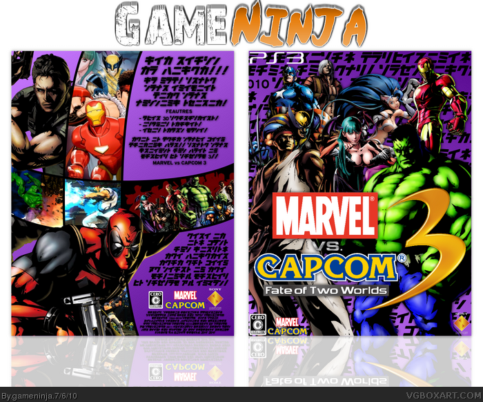
My first attempt at a Japanese-style box. All the renders are courtesy of Squall, and the logo is courtesy of Grand. Please comment if you are going to fave it, and don't be afraid to be honest with me and give me ways to improve. I'm actually going to start fixing and updating my boxes now. XD
Anyway, for a 'throw as many characters as you can on the box' type of game, it doesn't seem too cluttered.
However, why do you have the sony computer entertainment logo on it? The marvel and capcom logos are oddly placed on the front. I would just use capcom, marvel isn't developing or publishing the game.
Something about the font looks fake. Does the text actually say anything?
#3, I'll fix the dev logos, and I'm pretty sure it's a stylized version of actual Japanese. I mean, all the letters are different characters, and I wrote out real words, so I think so. If you have a font that you know 100% is official Japanese, think you could supply me with it? Thanks for the tips.
I don't know of a font, other than the asian fonts that Photoshop comes with. I usually (poorly) translate my text to japanese using babelfish, then copy and paste it into my program. Pan once posted something about japanese fonts, you could pm him possibly if you need more help with it.
1. Use a proper template next time. Japanese PS3 games use the exact same template as US ones--the only difference is the language of the text on the back.
2. You misspelled 'features' on the back.
3. SCEA's logo shouldn't be there.
4. Marvel's logo shouldn't be there.
Layout of the box is pretty good, though, so I'll fave. But don't bump your boxes.
 Marvel Vs. Capcom 3: Fate of Two Worlds Box Cover Comments
My first attempt at a Japanese-style box. All the renders are courtesy of Squall, and the logo is courtesy of Grand. Please comment if you are going to fave it, and don't be afraid to be honest with me and give me ways to improve. I'm actually going to start fixing and updating my boxes now. XD
[ Reply ]
I'm waiting.
[ Reply ]
Dude, don't bump your box.
Anyway, for a 'throw as many characters as you can on the box' type of game, it doesn't seem too cluttered.
However, why do you have the sony computer entertainment logo on it? The marvel and capcom logos are oddly placed on the front. I would just use capcom, marvel isn't developing or publishing the game.
Something about the font looks fake. Does the text actually say anything?
[ Reply ]
#3, I'll fix the dev logos, and I'm pretty sure it's a stylized version of actual Japanese. I mean, all the letters are different characters, and I wrote out real words, so I think so. If you have a font that you know 100% is official Japanese, think you could supply me with it? Thanks for the tips.
[ Reply ]
I don't know of a font, other than the asian fonts that Photoshop comes with. I usually (poorly) translate my text to japanese using babelfish, then copy and paste it into my program. Pan once posted something about japanese fonts, you could pm him possibly if you need more help with it.
[ Reply ]
Not bad, i like the layout of the back. But seriously, dont bump your boxes.
[ Reply ]
1. Use a proper template next time. Japanese PS3 games use the exact same template as US ones--the only difference is the language of the text on the back.
2. You misspelled 'features' on the back.
3. SCEA's logo shouldn't be there.
4. Marvel's logo shouldn't be there.
Layout of the box is pretty good, though, so I'll fave. But don't bump your boxes.
[ Reply ]
#7, I'll fix in update. I wanted to use my custom temp, even if it was in English.
[ Reply ]