#2, check the printable version, you shouldn't have a problem there. I didn't stretch the wallpaper (don't panic, I edited it), so if it still looks stretched I dunno what to tell ya.
#3, Well I was kinda going for the essence collection feel buuut...
1) I didn't feel like it; I wantd something custom.
2) Essence is dead.
3) People usually freak out if my essence boxes don't show the essence in their opinion.
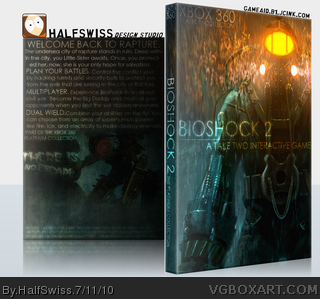
This box could look real nice with some more work and greater detail.
Front is great, the only suggestion would be to make text "A Take Two Interactive Game" smaller.
Back on the other hand needs some more work. I like the continuing color scheme but there's just too much text. Text could also use a better typography. Simply increasing size of some words isn't enough.
I think you had a great idea but it lacks in execution.
 Bioshock 2 Box Cover Comments
A little something to tie me over while I work on my custom South Park project, but I actually really liked the outcome.
PLEASE view in full and the printable.
[ Reply ]
Looks really good. Maybe it's just the way the box is presented, but the big daddy on the front looks somehow stretched o.O
[ Reply ]
I dont think it looks streched, im a great fan of the front. I dont like the back though; just text without screenshot. 7.5/10
[ Reply ]
#3 Like I said, it might just be the way it is presented. I have to say that I really dig the simplistic style of the back!
[ Reply ]
I LOVE it ^_^
[ Reply ]
#2, check the printable version, you shouldn't have a problem there. I didn't stretch the wallpaper (don't panic, I edited it), so if it still looks stretched I dunno what to tell ya.
#3, Well I was kinda going for the essence collection feel buuut...
1) I didn't feel like it; I wantd something custom.
2) Essence is dead.
3) People usually freak out if my essence boxes don't show the essence in their opinion.
[ Reply ]
#6, no problem, its still a really nice box^^
[ Reply ]
I like it. And about the stretching, that would be Imandix doing that.
[ Reply ]
#8, yeah I figured. So if anyone thinks the box looks a bit stretched, just check out the printable for maximum quality.
[ Reply ]
#6 Ok, it was Imandix's fault . Never worked with Imandix, wasn't aware of this.
It doesn't look stretched on the printable.
[ Reply ]
The rain makes it seem stretched apparently. Otherwise good. It's really a "replacement" cover since it doesn't provide logos and other ratings.
The back description is pure WALL OF TEXT. D': I feel intimidated somehow by the look of it.
[ Reply ]
#11, *sigh* If you think it's stretched, view the printable.
[ Reply ]
This box could look real nice with some more work and greater detail.
Front is great, the only suggestion would be to make text "A Take Two Interactive Game" smaller.
Back on the other hand needs some more work. I like the continuing color scheme but there's just too much text. Text could also use a better typography. Simply increasing size of some words isn't enough.
I think you had a great idea but it lacks in execution.
[ Reply ]
#13, thanks for the critique. :)
[ Reply ]
Your recent best.
[ Reply ]
I like it, it looks really cool even though the back looks a bit odd without screen shots but it still has an attractive feeling to it. 8.5/10
+fav
[ Reply ]
#15, thanks, that means a lot from you.
[ Reply ]