The box is killed by the use of renders from AC1, just like your HALO box. The front looks nice, but it makes no sense. The use of screenshots on the back is a little bit boring with the render placed in the middle. Oh, and i dont like your text, it is hard to read and placed in the edge.
Other than their costumes, their faces are identical, if I remember. They're supposed to look like Desmond.
The renders are are slightly out of context, however. Why would Altair be on this box?
#1, "The use of screenshots on the back is a little bit boring with the render placed in the middle."
Honestly, are you just making up things to bitch about? How is placing a render in the middle of the screenshots "Boring"?!
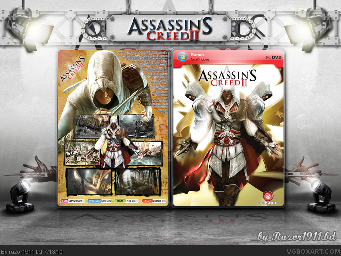
 Assassin's Creed II Box Cover Comments
The box is killed by the use of renders from AC1, just like your HALO box. The front looks nice, but it makes no sense. The use of screenshots on the back is a little bit boring with the render placed in the middle. Oh, and i dont like your text, it is hard to read and placed in the edge.
[ Reply ]
There is absolutely no difference in appearnce between Altair and Ezio, so I can't understand why you think that images from AC1 ruin it.
Great bloody work here, mate, I love it.
[ Reply ]
Great box, all you need to do is fix the text at the back and it is fine work.
[ Reply ]
#2, dude, take that back and play the game.
[ Reply ]
#2, Lol. Have you played the games?
[ Reply ]
Other than their costumes, their faces are identical, if I remember. They're supposed to look like Desmond.
The renders are are slightly out of context, however. Why would Altair be on this box?
Edited at 1 decade ago
[ Reply ]
I don't see a difference at all. Sorry.
[ Reply ]
#7, seriously!
link
[ Reply ]
Oh.
[ Reply ]
Thanks "gameninja" & "SilverKing2"
Edited at 1 decade ago
[ Reply ]
#1, "The use of screenshots on the back is a little bit boring with the render placed in the middle."
Honestly, are you just making up things to bitch about? How is placing a render in the middle of the screenshots "Boring"?!
[ Reply ]