[ Box updated on August 2nd, 2010 ] [ original ]
 The Legend of Zelda: Ocarina of Time Box Cover Comments
Comment on Lestat_the_vampire's The Legend of Zelda: Ocarina of Time Box Art / Cover.

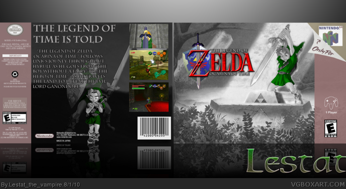
Consider this my submission for the Expression Sessions 05. I spent about 5-6 days with this project, picking away at the design, reworking it, etc. I redid the logo, as I prefer the sword going down. Also, I know the art on the front doesn't match up, game to game, but I feel the forest is symbolic of the beginning of Link's journey, and how when he pulls the Master Sword is the halfway point, I thought, why not combine the two. Where he begins as the booy without a fairy, and where he becomes the Hero of Time.
Edited at 1 decade ago
[ Reply ]
I like it, especially the pose on the front. The use of green is nice too, and makes Link and the screenshots really stand out. The only thing I don't really like is the image quality of the back, it's really blurry compared to the front.
[ Reply ]
Very nice idea. The green tunic is synonymous with Zelda, and I like how you play it up as the focal point. :)
[ Reply ]
I would like to thank everyone who has faved the box, especially Drakxxx, someone I never expected to fave one of my boxes. I also want to thank everyone who helped out in my WiP thread.
#2, I am planning on either remaking the back template, or finding one of higher resolution, which ever comes first.
[ Reply ]
I don't like how the tagline is the same font and colour as the one used on the description, not too mention adult Link's face is covered completely. The text is way too large. There is more than enough room for you too move the Links next to the screenshots, and maybe add bullet points or something over by the left. Overall you did a really nice job, but the back could use a little work.
Edited at 1 decade ago
[ Reply ]
I'm very split. I truly love when boxes are simple and to the point. I love the lack of color and desaturation of this box, but it feels like there's just something missing. It seems like it could just use a little extra "oomph!" to knock it out of the park, but regardless, it's a great idea, but the execution is just missing a tiny thing. Still really like it though!
[ Reply ]
This is very nice, colors and blending are well done.
[ Reply ]
It's really nice, looks beautiful. The back is very low-res, and brings down the box. +Fav
[ Reply ]
Looks great! I love the colors.
[ Reply ]