Niice! The back seems empty to me though. The front, Love it!
[P.S., my computer had to be formatted not too long ago and I have looked everywhere for that plastic. Can you PM it to me? Thanks.]
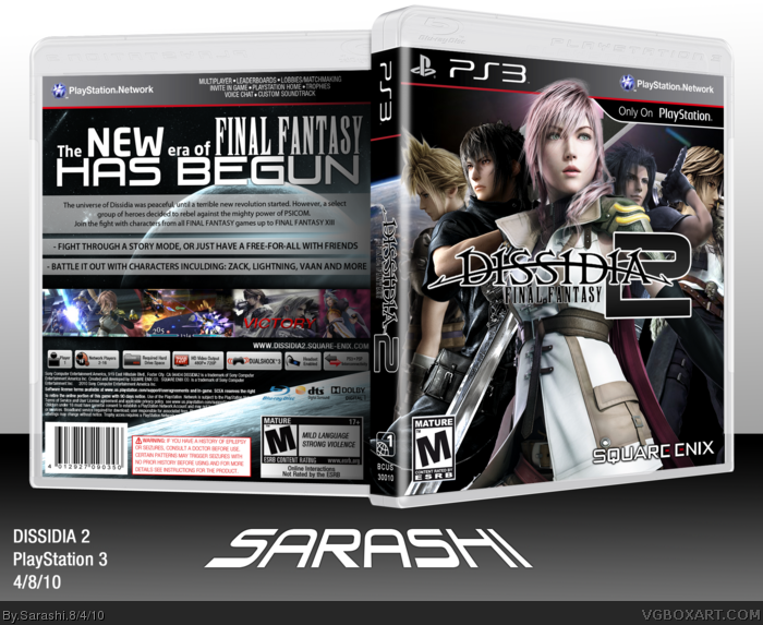
Hmmm, I am not a big fan of the front. Squall's pose looks weird and Zack's contrast is different from the others. Cloud and Lightening are well blended but Noctis (if that's his name, the FFXIII versus guy) and Zack are not really blended well, their hair looks choppy a bit. I love the back though, specially the planet behind the screenshots and the fonts you used, very creative arrangement of all elements. I loved the idea as well. :)
#3, Admittedly the only Noctis image I found was 500x600 pixels, which was blown up to about a thousand-by-onethousandtwohundred. (I know it's not displaying correctly with a random space)
I can fix the contrast on Zack, but nothing I can do with Squall, as it's the only CG Pose of him apart from the elusive side image which isn't found anywhere.
EDIT: After a gruelling 5 minutes, i've managed to hack-and-slash A Squall hybrid render with Cloud and his side pose with front pose.
 Dissidia 2: FINAL FANTASY Box Cover Comments
CREDITS:
SS: Template
Sens: Plastic
sd1833: Help and pointing out errors.
[ Reply ]
Niice! The back seems empty to me though. The front, Love it!
[P.S., my computer had to be formatted not too long ago and I have looked everywhere for that plastic. Can you PM it to me? Thanks.]
Edited at 1 decade ago
[ Reply ]
Hmmm, I am not a big fan of the front. Squall's pose looks weird and Zack's contrast is different from the others. Cloud and Lightening are well blended but Noctis (if that's his name, the FFXIII versus guy) and Zack are not really blended well, their hair looks choppy a bit. I love the back though, specially the planet behind the screenshots and the fonts you used, very creative arrangement of all elements. I loved the idea as well. :)
[ Reply ]
#3, Admittedly the only Noctis image I found was 500x600 pixels, which was blown up to about a thousand-by-onethousandtwohundred. (I know it's not displaying correctly with a random space)
I can fix the contrast on Zack, but nothing I can do with Squall, as it's the only CG Pose of him apart from the elusive side image which isn't found anywhere.
EDIT: After a gruelling 5 minutes, i've managed to hack-and-slash A Squall hybrid render with Cloud and his side pose with front pose.
Edited at 1 decade ago
[ Reply ]
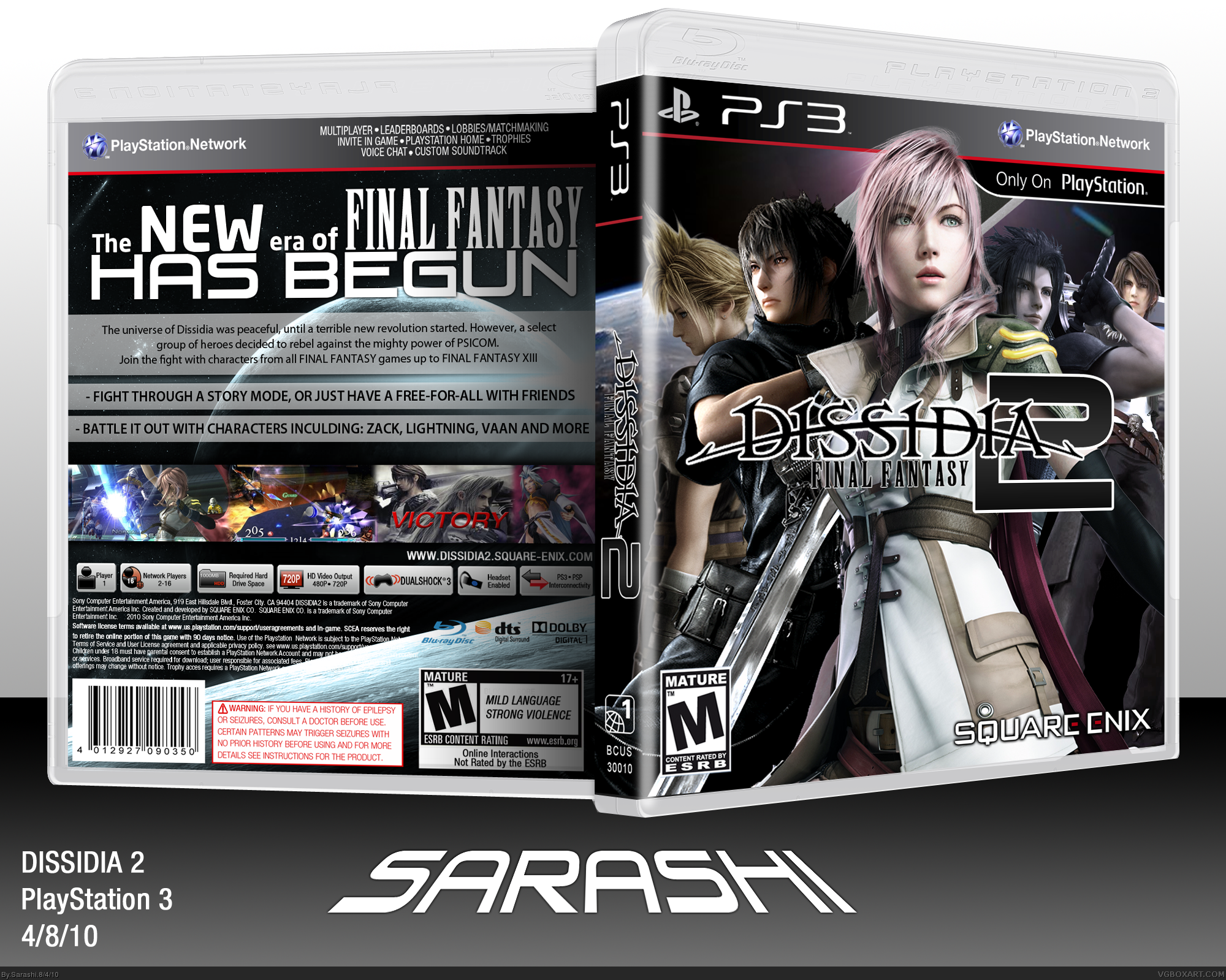
That's much much better and into my faved box collection this box goes. Lovely!
[ Reply ]
Fuck yes.
:)
[ Reply ]
Nice, glad to see you fixed the lighting as well as Cloud's hair. I like the simplistic back too.
[ Reply ]
Lightning going over the template on the front wouldn't happen. Box is awesome though.
[ Reply ]
Very eye catching!+fav!
[ Reply ]
All your covers are betutiful.
[ Reply ]