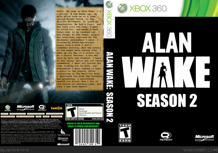
My very first published box! Please tell me what you think, and please, no rude comments, because, once again, this is my first box, and it may not look like it, but it took a lot of time. Any constructive criticism will be accepted, and I will continue to improve the box! Credit goes to Remedy for the screenshots, and Microsoft for the Xbox 360 banner.
Thanks for the comment! I'm still wondering which font you're talking about when you mention it. But other than that, thanks, i'll see what i can do about the back.
 Alan Wake: Season 2 Box Cover Comments
My very first published box! Please tell me what you think, and please, no rude comments, because, once again, this is my first box, and it may not look like it, but it took a lot of time. Any constructive criticism will be accepted, and I will continue to improve the box! Credit goes to Remedy for the screenshots, and Microsoft for the Xbox 360 banner.
[ Reply ]
-:Very bland and I still don't like the use of font. The back render looks alone and out of place.
+:Nothing is blurry and everything is in the right place. (Age and Dev logos)
[ Reply ]
Thanks for the comment! I'm still wondering which font you're talking about when you mention it. But other than that, thanks, i'll see what i can do about the back.
[ Reply ]
Updated!
[ Reply ]