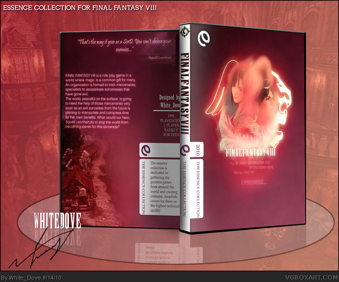
WAY too much blur on the front. I love the color scheme and layout, though the front image could be larger if possible.
But yeah, if you can, tone down the amount of blur on the front image (I'm just talking about Squall and Rinoa, the outlines behind them are fine).
#6, The blur on the front was kind of intended, because both squall and rinoa are inside a rose petal (one of those that flew around at the ending) but maybe I'll fix that at some point, I'm too lazy to do that though. :p
It's okay that it's blurred, but I personally think it's too heavy of a blur. But I know what you mean, I usually can't be bothered to fix something on a box after I call it done.
Way too much blur on the front, boring and generic fonts that come default on any computer. Also too pink. Not exactly a color I'd associate with FFVIII.
 Final Fantasy VIII Box Cover Comments
This is my box for the summer competition, the theme was simplicity. Hope you enjoy this.
Template by me, if it's good I might post it in the resource section after few minor corrections.
Comments & favs are welcome. :)
[ Reply ]
This is lovely, except I'm not feeling the white template.
[ Reply ]
#2, I agree, but I didn't know what other color to go for that won't make the box have a dark look. :/
[ Reply ]
So awesome, the only thing I don't like is the white spine.
[ Reply ]
Woooooow.
[ Reply ]
WAY too much blur on the front. I love the color scheme and layout, though the front image could be larger if possible.
But yeah, if you can, tone down the amount of blur on the front image (I'm just talking about Squall and Rinoa, the outlines behind them are fine).
[ Reply ]
#6, The blur on the front was kind of intended, because both squall and rinoa are inside a rose petal (one of those that flew around at the ending) but maybe I'll fix that at some point, I'm too lazy to do that though. :p
Thanks guys for the favs and comments.
[ Reply ]
It's okay that it's blurred, but I personally think it's too heavy of a blur. But I know what you mean, I usually can't be bothered to fix something on a box after I call it done.
[ Reply ]
Way too much blur on the front, boring and generic fonts that come default on any computer. Also too pink. Not exactly a color I'd associate with FFVIII.
Edited at 1 decade ago
[ Reply ]
#8, I'll try to edit it, just for you. :D
#9, so there's basically nothing good with this box, eh? Shame!
Btw, I try to portrait feelings into the boxes, this one was suppose to show the feeling of blissfulness. :)
Edited at 1 decade ago
[ Reply ]
Magical!
[ Reply ]
Nice effects =O
[ Reply ]
Awesome and no printable :(
[ Reply ]
Es perfecta pero como podria descargarla la quiero
[ Reply ]