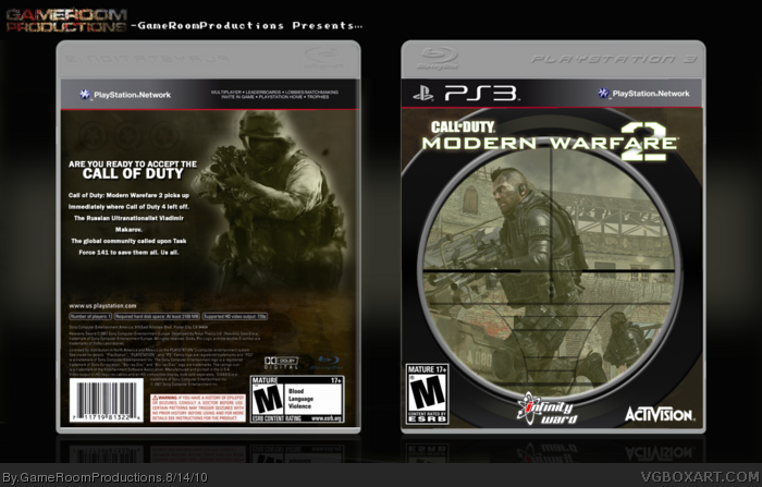
Here's my box for the Summer Comp. I thought it'd be an interesting idea using the scope view for the front. Anyways, enjoy and good luck other competitors!
#2, Well, it is not simple as in silhouettes and that kind of stuff, but it is a fairly simple cover. The front is just a scope and an image and the back is a render and words. This may not be the same kind of simple as the other boxes for the Summer Comp., but this box is simple compared to others.
I like the concept of the scop on the front and I think it looks great. I feel like the back could use a bit more like screenshots etc becuase it feels slightly empty.
 Call Of Duty: Modern Warfare 2 Box Cover Comments
Here's my box for the Summer Comp. I thought it'd be an interesting idea using the scope view for the front. Anyways, enjoy and good luck other competitors!
Credits:
Template- jevangod
Logo- Scorpian Soldier
Activision Logo- Cerium
Infinity Ward Logo- tat76
[ Reply ]
I honestly don't see anything simplistic/minimalistic about this at all...
[ Reply ]
#2, Well, it is not simple as in silhouettes and that kind of stuff, but it is a fairly simple cover. The front is just a scope and an image and the back is a render and words. This may not be the same kind of simple as the other boxes for the Summer Comp., but this box is simple compared to others.
[ Reply ]
Please Try changing the template, then I and many others will fav.
[ Reply ]
#4, What is wrong with the template though?
[ Reply ]
I like the concept of the scop on the front and I think it looks great. I feel like the back could use a bit more like screenshots etc becuase it feels slightly empty.
[ Reply ]