Credit to:
IGN for the Duck Hunt Dog
Google for many of the images
Special thanks to Gamer Gizmo and White Dove for giving many suggestions in the forums when this box art was just a wii template and a dog.
#3, This isn't my first, it's my second. my first was terrible. And thanks a LOT! I really wanted someone to call my box good. Every coment on my first box was saying that the box wasnt good
If you want some advice, my boxes weren't good at first either. If you look at my first few boxes and then look at my boxes now, you'll see a huge change. You'll improve as time goes on :) just keep it up!
fav, cause I know I can't do any better :) good job though. Try adding a different font and/ or customized logo for the "Duck Hunt Wii" letters, also focus more on the box then having all of that random blue negative space around it
 Duck Hunt Wii Box Cover Comments
Credit to:
IGN for the Duck Hunt Dog
Google for many of the images
Special thanks to Gamer Gizmo and White Dove for giving many suggestions in the forums when this box art was just a wii template and a dog.
Edited at 1 decade ago
[ Reply ]
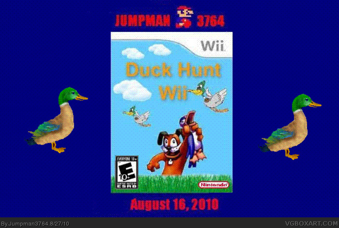
And yes I know, the quality isn't the greatest. I might update it in the future, give it a back and better quality
Edited at 1 decade ago
[ Reply ]
Not bad for a first
[ Reply ]
#3, This isn't my first, it's my second. my first was terrible. And thanks a LOT! I really wanted someone to call my box good. Every coment on my first box was saying that the box wasnt good
[ Reply ]
If you want some advice, my boxes weren't good at first either. If you look at my first few boxes and then look at my boxes now, you'll see a huge change. You'll improve as time goes on :) just keep it up!
[ Reply ]
#5, Thanks!
[ Reply ]
yay, nice box man.
[ Reply ]
Looks so cool! Good job there. :)
[ Reply ]
#7 & #8
Thanks a whole lot! :) Im proud of it! You don't know how much I'm thanking you right now! :):):):):):):) THANKS!
Edited at 1 decade ago
[ Reply ]
maybe i should of rated it e10+... who thinks i should update it and rate it e10+?
[ Reply ]
i just updated it and for some reason it got really blury. so now im going to update back to the version 1 box. hopefully the bluryness will go away.
[ Reply ]
#11, darnit it's saying its to skinny to upload :( i highly recomend looking at version 1.
Edited at 1 decade ago
[ Reply ]
It's not bad or awful or even fine. It's pretty good.
Edited at 1 decade ago
[ Reply ]
#11, #12 Please don't bump your box. Edit your comments
[ Reply ]
#14, Oh the irony...
[ Reply ]
#15 I don't bump my boxes
[ Reply ]
#13, thanks! :)
[ Reply ]
Thanks TheBestBoxEver! You gave me my first fav! Thank you! I'm overjoyed :)
[ Reply ]
The only part I like is the dog holding the duck.
[ Reply ]
#21, So your saying it's not very good?
[ Reply ]
fav, cause I know I can't do any better :) good job though. Try adding a different font and/ or customized logo for the "Duck Hunt Wii" letters, also focus more on the box then having all of that random blue negative space around it
[ Reply ]
Edited at 1 decade ago
[ Reply ]