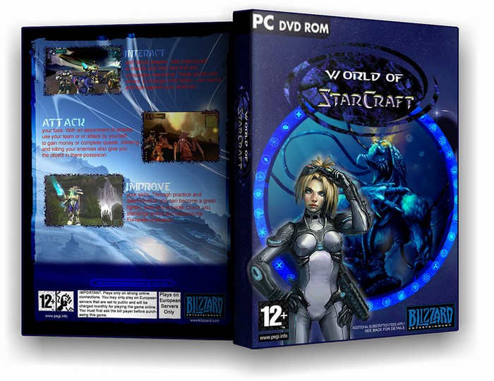
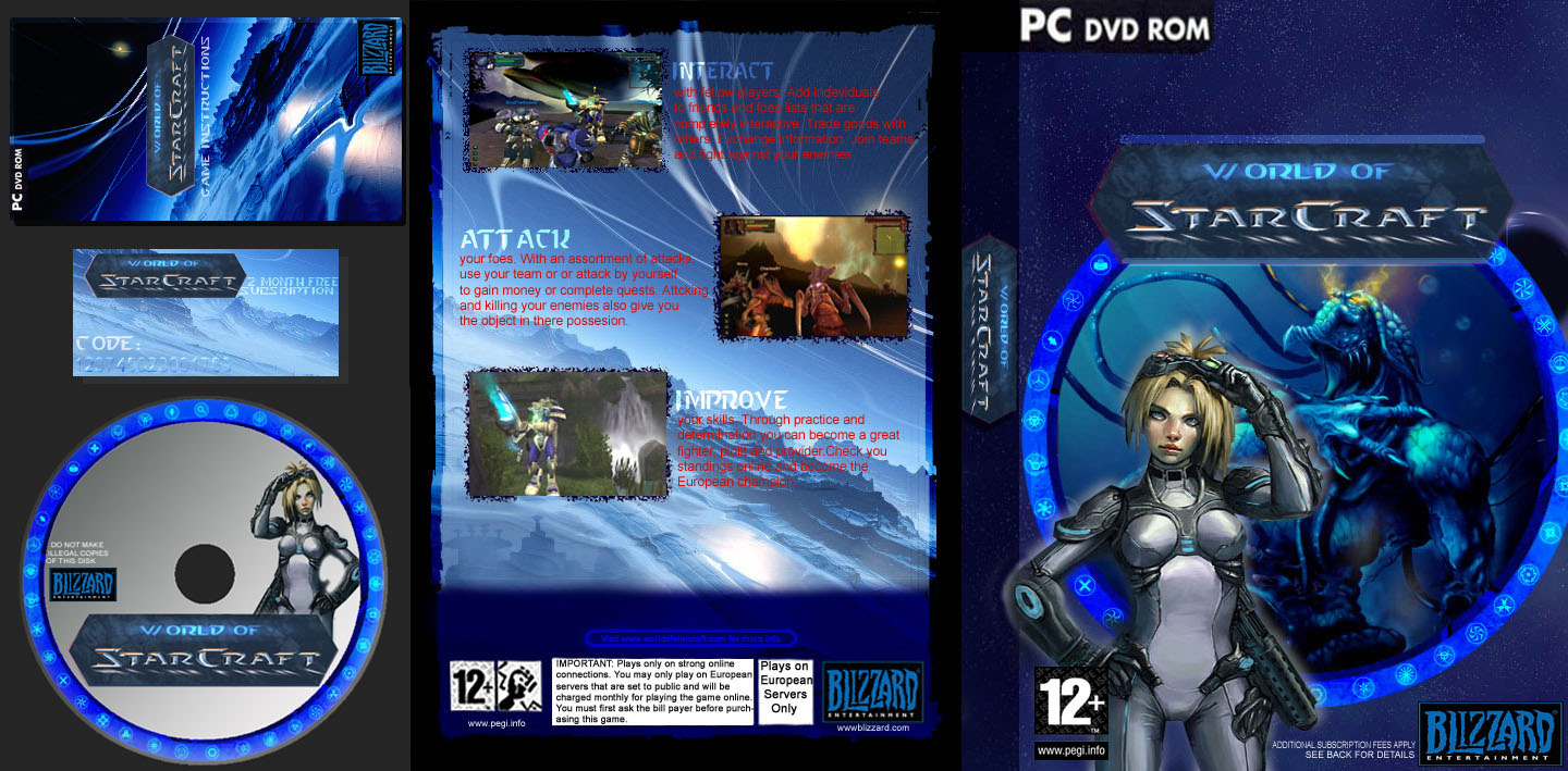
i like it all besides the logo, i think it would be a bit bigger and i like the way you have used the world of warcraft box as a template. but try and work a little on the logo.
its really good lodo...but i think you should fix two things
1. world of starcraft should all be one font...even if its not the official font, then the title flows better
2. the circle thingy around the title i think should be the same as the circle around the picture with that monster thingy in it
other than that, its pretty good 4/5
Only playable in Europe servers?! O Lodovicok, you wound me.
If there is one thing that bugs me about this box, it's the text and the title. The title doesn't really blend with the Starcraft logo a whole lot and the red text on the back seems... well... iffy to me. Box is really blue. Like... really blue. Might want to get another color in there, like white or something.
Otherwise, great box. The rings and symbols were a good addition and I see you could a couple of pictures from that Gamespot April Fools' Day prank. I remember that prank from that crazy Gamespot. Oh... good times. :3
 World of StarCraft Box Cover Comments
this took me 2 days, so i really hope you like it. comments would be appreciated!
[ Reply ]
I got imandex to work :D
[ Reply ]
i like it all besides the logo, i think it would be a bit bigger and i like the way you have used the world of warcraft box as a template. but try and work a little on the logo.
[ Reply ]
#3, thanks hk i'll see what i can do
[ Reply ]
oh yeh where di you get that ring shape from ??
[ Reply ]
#5, i made it
[ Reply ]
bigger logo
[ Reply ]
#5, here ar the symbols i used, if it helps
link
[ Reply ]
new logo
[ Reply ]
Nice job lodvicok . I think this is you'r best you made so far.
4.5/5
[ Reply ]
#10, thanks :D
[ Reply ]
its really good lodo...but i think you should fix two things
1. world of starcraft should all be one font...even if its not the official font, then the title flows better
2. the circle thingy around the title i think should be the same as the circle around the picture with that monster thingy in it
other than that, its pretty good 4/5
[ Reply ]
This is deffinitly worth a 5/5. No doubt. i just wish i new what this game was about :(
PS. congrats on getting imandex to work.
[ Reply ]
The text on the back is hard to read,you should make it a diffrent colour like light green.
Very goog box 4/5.
[ Reply ]
Only playable in Europe servers?! O Lodovicok, you wound me.
If there is one thing that bugs me about this box, it's the text and the title. The title doesn't really blend with the Starcraft logo a whole lot and the red text on the back seems... well... iffy to me. Box is really blue. Like... really blue. Might want to get another color in there, like white or something.
Otherwise, great box. The rings and symbols were a good addition and I see you could a couple of pictures from that Gamespot April Fools' Day prank. I remember that prank from that crazy Gamespot. Oh... good times. :3
[ Reply ]
Just looking back at amazing box arts. 10/10! :) ;) :D
[ Reply ]