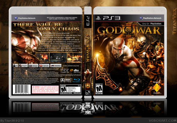
Nothing noticeably wrong with it, a nicely made, "safe" box. The front looks cool with Kratos looking more pissed off than usual, but I have a feeling all those enemies on the right make it a little cluttered.
#5, I thought Kratos looked rather peaceful. Other than that I agree, there's a bit much going on on the cover. The logo is kind of blending in with the [ogre?].
Not too shabby. I'd ditch the lens flare on the blades, though. Also you have godofwar.com crammed in on the back there. Use a smaller size, or a different font if you have to.
The letters on the spine seem to be spaced out quite a bit, obviously intended to take up more vertical space, but to me it just looks kinda odd.
I find the logo placement a bit strange on the front. Seems very close to the top, and it is too similar in color tone to the rest of the front, so it doesn't really stand out.
And the body copy on the back just needs some major work. You have a few run-on sentences and such. I'm probably the only one that cares about that stuff, though so no worries.
Thank you everyone for your comments. I really enjoy reading them, both positive and negative.
As for eat_nade, I will comment on yours in particular, trying to address every issue.
1. Lens flare was something I originally didn't have on the blades, but these exact ones were on an official piece of art from godofwar.com, and I decided to include it, since without it, the left side seemed a little bit empty.
2. Godofwar.com was something I added right away at the start of the box, and quite frankly, forgot about it. Now that you mention it, it is quite big, and I think I might have even stretched it. If I get around to it, I will try to fix that.
3. Someone in the WiP thread mentioned that it looked empty. So I spaced out the letters and then added Kratos at the bottom. It didn't occur to me that with Kratos, the letters could be normally sized. I will revert it to the original and see if I like it.
4. The logo was something I contemplated with. With it at the bottom, I felt like it covered up too much of the right, and it blended in a lot worse. At the top, I found it stuck out better than anywhere else on the box. I had the gradient map actually over the logo for a while, so it looked even more like the rest of the box, but in the end, I decided against it, and kept it the original color. Maybe I could add the slightest of drop shadows to make it stick out, but I shall see.
5. I don't know exactly what the "body copy" is, but I assume it is the description of the game? I reread it, and I saw no run-ons whatsoever. Some commas look like periods, if that is what you mean, and it may appear to be a run-on, but in full-view, it is very distinguishable.
Overall, thank you for everyones comments. I like to read them all and take all critiques and praise into consideration.
 God of War III Box Cover Comments
Credit to Scorpion Soldier for the template and everyone in the WiP thread.
[ Reply ]
wow, there is one word to say about this box. Epic, love the back and the spine is awesome, FAV
[ Reply ]
Wow!!!My personal favourite from you.
Front and spine are HoF design man.
[ Reply ]
Nice art on the front and back! I love this no complaints thus far!
[ Reply ]
Nothing noticeably wrong with it, a nicely made, "safe" box. The front looks cool with Kratos looking more pissed off than usual, but I have a feeling all those enemies on the right make it a little cluttered.
[ Reply ]
#5, I thought Kratos looked rather peaceful. Other than that I agree, there's a bit much going on on the cover. The logo is kind of blending in with the [ogre?].
[ Reply ]
#6, the cyclops you mean
[ Reply ]
OH. MY. GOD. YES. THIS.
[ Reply ]
Not too shabby. I'd ditch the lens flare on the blades, though. Also you have godofwar.com crammed in on the back there. Use a smaller size, or a different font if you have to.
The letters on the spine seem to be spaced out quite a bit, obviously intended to take up more vertical space, but to me it just looks kinda odd.
I find the logo placement a bit strange on the front. Seems very close to the top, and it is too similar in color tone to the rest of the front, so it doesn't really stand out.
And the body copy on the back just needs some major work. You have a few run-on sentences and such. I'm probably the only one that cares about that stuff, though so no worries.
[ Reply ]
damn titan GJ! i love this so much. it looks so official! this deserves HOF
[ Reply ]
Thank you everyone for your comments. I really enjoy reading them, both positive and negative.
As for eat_nade, I will comment on yours in particular, trying to address every issue.
1. Lens flare was something I originally didn't have on the blades, but these exact ones were on an official piece of art from godofwar.com, and I decided to include it, since without it, the left side seemed a little bit empty.
2. Godofwar.com was something I added right away at the start of the box, and quite frankly, forgot about it. Now that you mention it, it is quite big, and I think I might have even stretched it. If I get around to it, I will try to fix that.
3. Someone in the WiP thread mentioned that it looked empty. So I spaced out the letters and then added Kratos at the bottom. It didn't occur to me that with Kratos, the letters could be normally sized. I will revert it to the original and see if I like it.
4. The logo was something I contemplated with. With it at the bottom, I felt like it covered up too much of the right, and it blended in a lot worse. At the top, I found it stuck out better than anywhere else on the box. I had the gradient map actually over the logo for a while, so it looked even more like the rest of the box, but in the end, I decided against it, and kept it the original color. Maybe I could add the slightest of drop shadows to make it stick out, but I shall see.
5. I don't know exactly what the "body copy" is, but I assume it is the description of the game? I reread it, and I saw no run-ons whatsoever. Some commas look like periods, if that is what you mean, and it may appear to be a run-on, but in full-view, it is very distinguishable.
Overall, thank you for everyones comments. I like to read them all and take all critiques and praise into consideration.
[ Reply ]
Quite nice I must admit, the "god of war 3" logo at the bottom is a buzzkill, i would remove it.
I like they layout and effort that has went into this.
+fav
[ Reply ]
I like putting the logos at the bottom like that. Thanks for you kind words though anyway!
[ Reply ]