Hi!
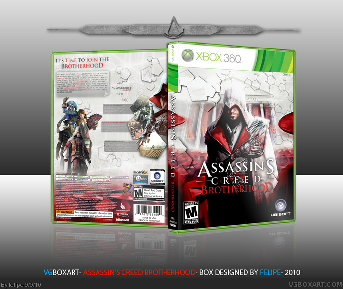
So, here is my newest box, Assassin's Creed Brotherhood, was very cool make this one and I think it's my best box by far,I took aproximately 1 week to finish it.
Thanks to all persons who helped me on my WIP thread.
I hope you like it!
It looks way too much like MARKER's for me to think of it as someone's other than his. The back is way too empty and looks incomplete. It's well put together overall, but like I said, it's not original in the least.
Front looks very good, I like red/white combinations and you pulled it off nicely, no complaints. I can't say the same about the back though.
It's been said before and now it's my turn: it's too empty. I was expecting more from early on in the WIP thread, I didn't see the finished version otherwise I would have let my suggestion in there...
Everything seems way too small, especially Ezio, the screenshots, and the near unreadable text next to them. The hexagons were cool at first, and put to good use on the front, but on the back it seems like you just threw them everyone because you didn't know what else to do. Simply put, it's just filler, and it doesn't look good.
To put it shortly, the front looks great, but the back is very lacking and looks unfinished.
For the description boxes you could have used a black color on the text to make it more legible, right now, I wouldn't be able to read that text unless I saw the printable. Then of course it's very empty.
A way to fill emptiness is not to add more things, but to make certain objects larger. The characters on the back could have been made larger, or the text and screenshots in general could have been blown up a bit.
It's a solid work but the concept seems off to me.
The front is beautiful, but there is work to be done on the back. I don't like how there are those squares behind the text, it throws of the whole feel imo.
Other than that this is damn beautiful.
As few others said the back is lacking of something.I would prefer the text to be on horizontal edge to edge shapes and the necessary to that change render arrangement.
 Assassin's Creed: Brotherhood Box Cover Comments
Hi!
So, here is my newest box, Assassin's Creed Brotherhood, was very cool make this one and I think it's my best box by far,I took aproximately 1 week to finish it.
Thanks to all persons who helped me on my WIP thread.
I hope you like it!
[ Reply ]
It's great....
.....but I personally prefer your Conviction one. ;)
[ Reply ]
Stunning.
[ Reply ]
Thanks dude!
[ Reply ]
#2,3 thanks!
[ Reply ]
i like the front but the back needs something more idk what but something nice work
[ Reply ]
Its great, but yea the back is still pretty empty :/ Not as good as your Conviction box, but still great (:
[ Reply ]
thanks guys!
[ Reply ]
Make the text boxes bigger. It would alleviate empty space, and would actually make them readable.
[ Reply ]
The back seems pretty empty...
[ Reply ]
The back looks empty and not spicy enough (I don't like the way the white overlaps the red things), but the front looks awesome.
[ Reply ]
thanks guys, update coming soon!
[ Reply ]
Looks a lot like MARKER's.
[ Reply ]
It looks way too much like MARKER's for me to think of it as someone's other than his. The back is way too empty and looks incomplete. It's well put together overall, but like I said, it's not original in the least.
[ Reply ]
Ok guys, thanks by the critique!
[ Reply ]
It's about time you uploaded this :)
Great job man!
[ Reply ]
Amazingly amazing, you always make great boxes. I would say it's in the top 3 for your best boxes.
[ Reply ]
Front looks very good, I like red/white combinations and you pulled it off nicely, no complaints. I can't say the same about the back though.
It's been said before and now it's my turn: it's too empty. I was expecting more from early on in the WIP thread, I didn't see the finished version otherwise I would have let my suggestion in there...
Everything seems way too small, especially Ezio, the screenshots, and the near unreadable text next to them. The hexagons were cool at first, and put to good use on the front, but on the back it seems like you just threw them everyone because you didn't know what else to do. Simply put, it's just filler, and it doesn't look good.
To put it shortly, the front looks great, but the back is very lacking and looks unfinished.
[ Reply ]
#18, I meant "pentagons" not "hexagons".
[ Reply ]
The back is very empty.
For the description boxes you could have used a black color on the text to make it more legible, right now, I wouldn't be able to read that text unless I saw the printable. Then of course it's very empty.
A way to fill emptiness is not to add more things, but to make certain objects larger. The characters on the back could have been made larger, or the text and screenshots in general could have been blown up a bit.
It's a solid work but the concept seems off to me.
[ Reply ]
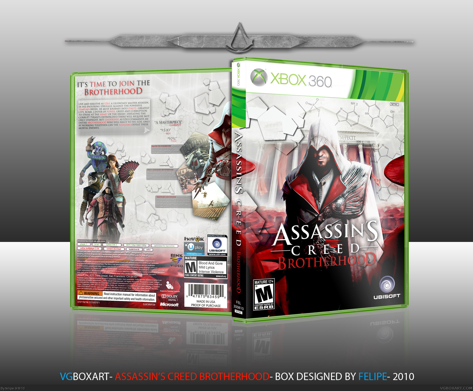
Ok guys I'll re-do the back with less pentagons and increase the characters size, it'll look so much better, thanks by the suggestions guys!
[ Reply ]
Updated, some objects are larger now, it looks much better, printable will be add!
[ Reply ]
Yeah, much much better than before
[ Reply ]
Soon to be Hall of Fame!!!
[ Reply ]
thanks guys!
[ Reply ]
I love you felipe, but I'm afraid I'm going to have an affair with this boxart.
It's beautiful.
Fav!!
[ Reply ]
I can definitely see a good difference, nice update.
[ Reply ]
Looks much better, nice job!
[ Reply ]
Thanks guys!
[ Reply ]
love it! nice work!
[ Reply ]
thanks!
[ Reply ]
The front is beautiful, but there is work to be done on the back. I don't like how there are those squares behind the text, it throws of the whole feel imo.
Other than that this is damn beautiful.
[ Reply ]
As few others said the back is lacking of something.I would prefer the text to be on horizontal edge to edge shapes and the necessary to that change render arrangement.
[ Reply ]
I still think that the sub-description text should be red, then black, I still can't read it very well. To me the idea looks half-way executed.
[ Reply ]
Thanks by the critique guys I'll update it some time.
[ Reply ]
Love the back layout, and the DNA cell effect you put on the design. very cool stuff :)
[ Reply ]
Thanks Draxxx!
[ Reply ]
AMAZING!
[ Reply ]
thanks!
[ Reply ]
I like the composition of the front, but the back looks too sparse.
[ Reply ]
Beatiful, it all comes together well. Only criticism is that the features sections need to be bigger.
[ Reply ]
Awesome man!
I like the back more than the front. It's just awesome.
[ Reply ]
thanks guys, in a near future I will design new backs for some of my boxes...
[ Reply ]
Loving the color scheme and new take on those polygon things that everyone whines about!
[ Reply ]
thanks!
[ Reply ]
Very very nice, I love the back a lot. Faved.
[ Reply ]
Congrats on the Hall!
[ Reply ]
Thanks guys!
[ Reply ]
Congrats :D
[ Reply ]
Congratulations on the well-deserved HOF.
[ Reply ]
thanks!
[ Reply ]
Congrats! It deserved it!
[ Reply ]
Thanks you!
[ Reply ]
WoW!I made a assassins creed box art and I thought mine was good. Yours is better man!:)
[ Reply ]
Hehe, my fav is the 50 fav of this box.
Wanted to give a fav to this a long time ago. Then got lazy. :(
Well here it is, great work mait!
[ Reply ]
thanks!
[ Reply ]