Hello Latest! so i wanted to do redo my really hideous first attempt now i have. I would love to give credit to all those who helped me in the WIP forum. I hope its enjoyable
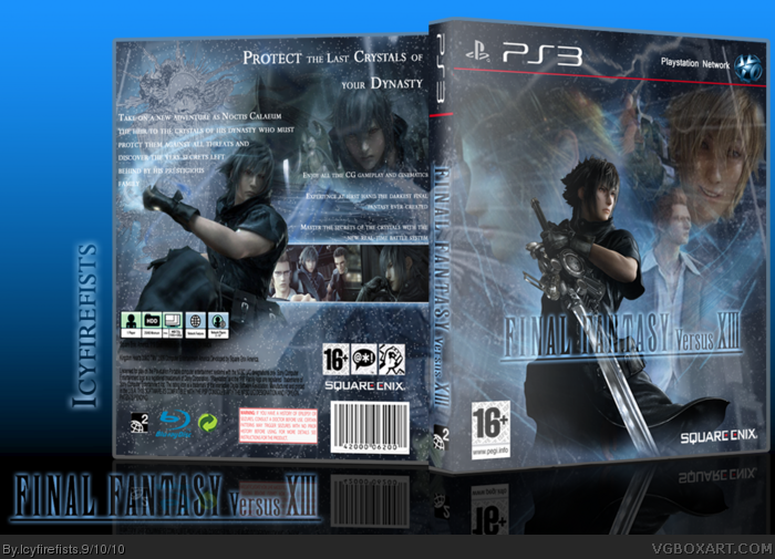
It's a somewhat refreshing take on Versus, so many of the cases look the same. There's work that needs to be done for this box to look it's best though...
- The whole case looks... foggy. The way everything's faded, de-saturated, and blurry makes the whole thing look odd. The contrasts should be raised.
- While using different material is good, the characters on the front (other than Noctis) are all blurry and just kind of randomly placed. Mainly glasses dude and the blonde guy.
- The logo should be solid, it doesn't look good faded and parts are difficult to see.
- Even if you left all the other things faded, I still highly recommend you return the template back to it's original state. I rarely like it when people edit the template, this isn't one of those times.
- The back really isn't too bad, the layout is good although I'm not too sure about having a second Noctis (outside of screenshots).
- The main problem is again the "fogginess", the contrasts just seems way too low.
Thanks guys! #3 thank you very much for the advice. Ill certainly put all that into action with other boxes.
I would like to leave the fading because it leaves a feel of a mysterious final fantasy which has no information about it. and i just think it fits. but maybe i'll edit the contrasts
Not a fan of the front but love the back, it looks so different from other Vesus boxes. I agree though with #3 about the contrast and the fading. I really like it though, it tastes different.
 Final Fantasy Versus XIII Box Cover Comments
Hello Latest! so i wanted to do redo my really hideous first attempt now i have. I would love to give credit to all those who helped me in the WIP forum. I hope its enjoyable
[ Reply ]
that is really cool. I like the mystifying and magical feel to it, and the back is AWESOME, good job.
[ Reply ]
It's a somewhat refreshing take on Versus, so many of the cases look the same. There's work that needs to be done for this box to look it's best though...
- The whole case looks... foggy. The way everything's faded, de-saturated, and blurry makes the whole thing look odd. The contrasts should be raised.
- While using different material is good, the characters on the front (other than Noctis) are all blurry and just kind of randomly placed. Mainly glasses dude and the blonde guy.
- The logo should be solid, it doesn't look good faded and parts are difficult to see.
- Even if you left all the other things faded, I still highly recommend you return the template back to it's original state. I rarely like it when people edit the template, this isn't one of those times.
- The back really isn't too bad, the layout is good although I'm not too sure about having a second Noctis (outside of screenshots).
- The main problem is again the "fogginess", the contrasts just seems way too low.
-
[ Reply ]
Thanks guys! #3 thank you very much for the advice. Ill certainly put all that into action with other boxes.
I would like to leave the fading because it leaves a feel of a mysterious final fantasy which has no information about it. and i just think it fits. but maybe i'll edit the contrasts
[ Reply ]
Not a fan of the front but love the back, it looks so different from other Vesus boxes. I agree though with #3 about the contrast and the fading. I really like it though, it tastes different.
[ Reply ]