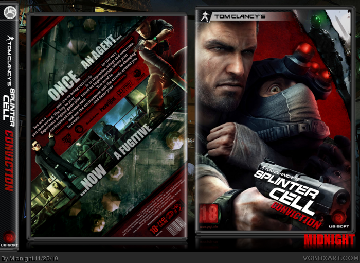
[ Box updated on November 25th, 2010 ] [ original ]
 Tom Clancy's Splinter Cell: Conviction Box Cover Comments
Comment on Midnight's Tom Clancy's Splinter Cell: Conviction Box Art / Cover.
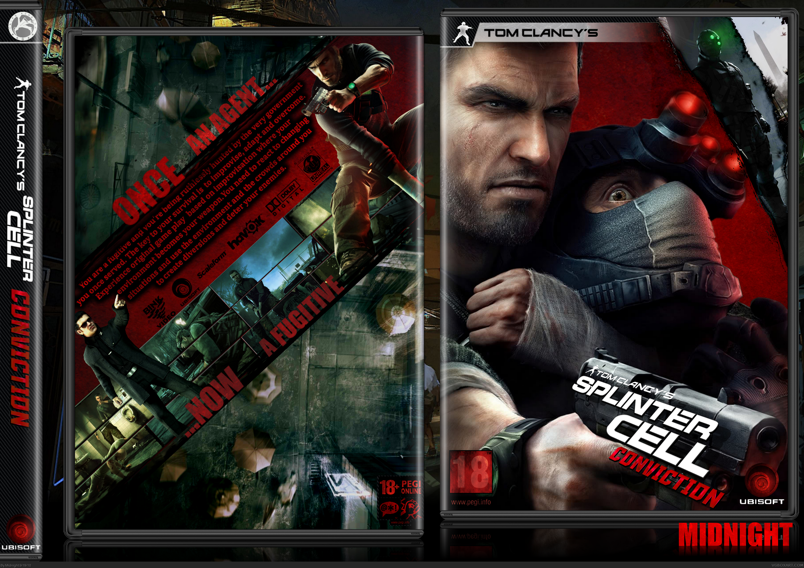
[ Box updated on November 25th, 2010 ] [ original ]
Comment on Midnight's Tom Clancy's Splinter Cell: Conviction Box Art / Cover.
I live it
Nice and simplistic
[ Reply ]
Awesome.
[ Reply ]
I made this one only to see my improvement since I tried this game before.You can see my old one here link advertising it,obviously).
A thank to all people in Wip.
Indexenos for the plastic.
Enjoy and critique and comments are highly appreciated!
P.S A Sorry to Del337er and Spiderpig24 who had already commented.While I was uploading it I noticed some minor flaws.So I
had to delete it and up the new one.
[ Reply ]
Haha now ill have to refav :P But i still think you should change the tagline text to white, the back needs some white to go along with the logo, theres way to much red.
[ Reply ]
Ahhh
EDIT:It was supposed to say (Not Adverting it,obviously).Didn't leave a space between the link.
[ Reply ]
Change the text on the back to white to make it more visible. I dont know why people think that the text needs to be the same color as the background.
[ Reply ]
Yea change the text like jevan said, maybe you could make a few key words red though, just not the same red as the background. Also try making the taglines a bit brighter. Looking great dude!
[ Reply ]
Thanx for comments and favs guys.I'll look into that text thing tomorrow as it's easily fixable and I really have to sleep now.
[ Reply ]
OMG. Best Splinter Cell cover ever made :) Everything looks just perfect. Be so kind add printable version of this cover - i woul love to print it right now and use with my box of this game.
+ fav 10/10 :)
[ Reply ]
Very slick
[ Reply ]
Updated the cover with Jevan's and Del's suggestions.And IMO it does look better.
#9 I knew you would ask one.
Thanks for comments,suggestions and favs guys.
[ Reply ]
Looks loads better, great job!
[ Reply ]
#12 Yeah thank you both.
[ Reply ]
Good, it's a creative and innovate design, but I don't like the dark red grungy feel, and the white text on the back seems very low in quality and doesn't look too good.
I think no matter what the design, the dev logos and ratings should be left alone.
[ Reply ]
My opinion is that the dev logos etc should be incorporated in the design.I know you're not a fan and that you wanna keep yours as official as possible. :)
[ Reply ]
Thanx for printable Midnight :)
[ Reply ]
Really cool i love the picture on the front. I'm not a big fan of the diagonal descrition, but thats just me
[ Reply ]
#15, You know more about me than myself friend.
[ Reply ]
Creative, which is good. I do think however that the tagline should be white so it stands out a bit more (a more interesting font would be a plus as well).
[ Reply ]
Nice, I like the slanted design here. Typography is cool, as is the logo against the gun. I've never been much for template logos being edited unless it's implemented into the design in a nice way. Unfortunately the red grunge effect seems way too strong.
[ Reply ]
#19 I don't see how the font choice is wrong and the tagline is already white.
#20 The red texture is part of the design and IMO it fits quite nicely.
#14,20 I don't do official looking covers so the implemented/modified dev etc. logos is a part of my box-making style and I don't consider it a flaw when it flows with the general design.
Except for the changes that Jevan and del337er pointed out in my eyes this one looks great and it just couldn't turn out better.
Thanks to all for comments and favs.
[ Reply ]
This is freaking awesome man!!!
[ Reply ]
LOOKS AWESOME!!!
But...since there's nothing on the box that makes it a kind of official (except for pegi) i'd like it better as a sleeve... but that's just a matter of taste xD
[ Reply ]
I was about to print it today and thought to update the back to make it look less empty and I think it looks somehow better now.
[ Reply ]
Better than the official.
[ Reply ]
Very impressive!
[ Reply ]
Excellent!
[ Reply ]