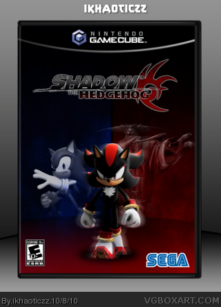
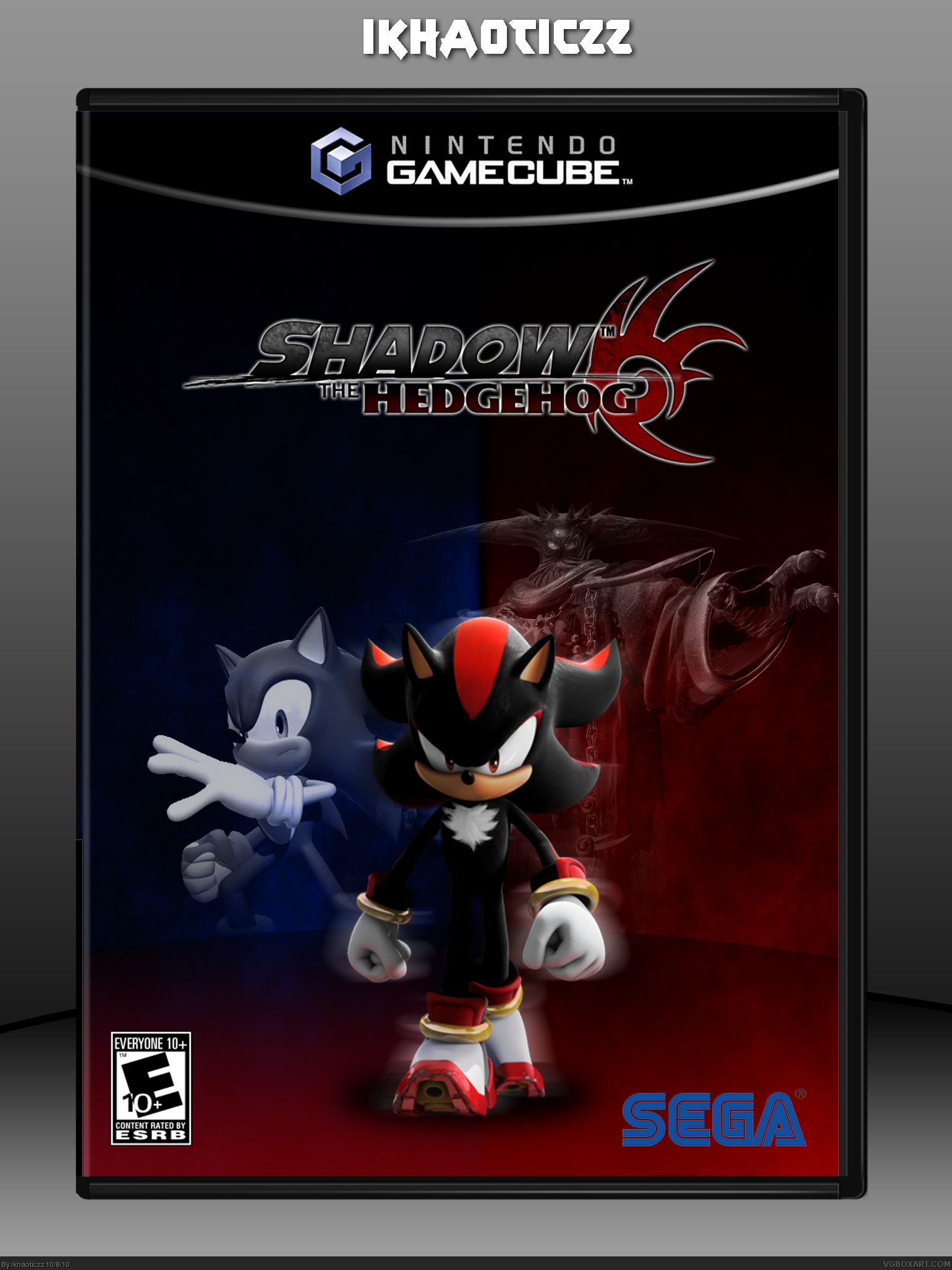
shadow_sonic [ Buy Shadow the H... at Amazon ] By ikhaoticzz 4 on October 8th, 2010 No Printable Available [ Box updated on October 9th, 2010 ] [ original ] Shadow the Hedgehog Box Cover Comments Comment on ikhaoticzz's Shadow the Hedgehog Box Art / Cover. Cancel Reply ikhaoticzz 4 [ 1 decade ago ] This been in the forums for some time now :P took me about 8 days (because of school) so tell me what you think. [ Reply ] Unknown Flames 33 [ 1 decade ago ] Wow I really like this! [ Reply ] FMD 7 [ 1 decade ago ] I saw this in the forums! lol Anyway, I really like how it looks. The blur on Shadow makes it look epic! [ Reply ] XIII-DARKNESS 1 [ 1 decade ago ] Better than all mines, you did good [ Reply ] ikhaoticzz 4 [ 1 decade ago ] #2, and #3, thanks :D been working hard on this...hopefully i get rank 2 :D [ Reply ] rpgfreak 14 [ 1 decade ago ] Not bad. I can tell you used the sega font for the logo at the bottom right corner. Try using the official sega logo with the white link [ Reply ] ikhaoticzz 4 [ 1 decade ago ] #6, thanks ill update tomorrow [ Reply ] Sonic the Hedgehog 39 [ 1 decade ago ] It's quite good, but the logo could stand to be a bit bigger, and Sonic could be moved up a bit, so he's level with Black Doom. [ Reply ] ikhaoticzz 4 [ 1 decade ago ] #6, Updated #8, when I aligned Sonic with Black Doom it didnt look so good, so i tried the best i could to fix it. [ Reply ] darth_mallen 7 [ 1 decade ago ] i think shadow needs to be a little bigger but other than that, fav! [ Reply ] ikhaoticzz 4 [ 1 decade ago ] #10, ok ill do an update later [ Reply ] Vaderkid123 20 [ 1 decade ago ] Looks like someone got a bit of influence form my box. Nice job anyway, the transition between colors is subtle but nicely done. [ Reply ] Sonic the Hedgehog 39 [ 1 decade ago ] #12, Actually the design is common for Shadow the Hedgehog boxes. [ Reply ] Vaderkid123 20 [ 1 decade ago ] #13, Not really Or at least the ones I've seen anyway. [ Reply ] uther 3 [ 1 decade ago ] i like it shadow is awesome. [ Reply ] ikhaoticzz 4 [ 1 decade ago ] #15, yes indeed, but i like Knuckles more [ Reply ] ikhaoticzz 4 [ 1 decade ago ] HOLY this box resembles mine link wtf [ Reply ] MattStar 49 [ 1 decade ago ] #17, Your's is better. [ Reply ] ikhaoticzz 4 [ 1 decade ago ] #18, thanks [ Reply ]
 Shadow the Hedgehog Box Cover Comments
This been in the forums for some time now :P took me about 8 days (because of school) so tell me what you think.
[ Reply ]
Wow I really like this!
[ Reply ]
I saw this in the forums! lol Anyway, I really like how it looks. The blur on Shadow makes it look epic!
[ Reply ]
Better than all mines, you did good
[ Reply ]
#2, and #3, thanks :D been working hard on this...hopefully i get rank 2 :D
[ Reply ]
Not bad. I can tell you used the sega font for the logo at the bottom right corner. Try using the official sega logo with the white link
[ Reply ]
#6, thanks ill update tomorrow
[ Reply ]
It's quite good, but the logo could stand to be a bit bigger, and Sonic could be moved up a bit, so he's level with Black Doom.
[ Reply ]
#6, Updated
#8, when I aligned Sonic with Black Doom it didnt look so good, so i tried the best i could to fix it.
[ Reply ]
i think shadow needs to be a little bigger but other than that, fav!
[ Reply ]
#10, ok ill do an update later
[ Reply ]
Looks like someone got a bit of influence form my box.
Nice job anyway, the transition between colors is subtle but nicely done.
[ Reply ]
#12, Actually the design is common for Shadow the Hedgehog boxes.
[ Reply ]
#13, Not really
Or at least the ones I've seen anyway.
[ Reply ]
i like it shadow is awesome.
[ Reply ]
#15, yes indeed, but i like Knuckles more
[ Reply ]
HOLY this box resembles mine
link wtf
[ Reply ]
#17, Your's is better.
[ Reply ]
#18, thanks
[ Reply ]