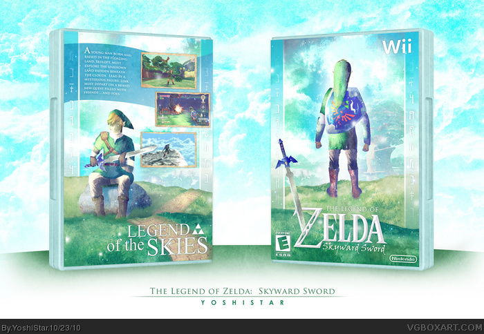
- Started 09-05. Completed 10-23 More than a month to finally complete.
- WIP thread was 10 pages lol. I think that's enough to tell you guys how much work went into this.
- All of this is custom artwork. I didn't get it from anywhere.
- At first, I was going for the official artstyle, but I kinda just turned it into my own, which I think matches the game in an artistic way.
- Link's eyes / face on the back took FOREVER!!! Check the WIP thread out and see all the revisions (including cyborg eyes, sunglasses, and eyeless versions).
- I wanted everything to look bright, magical, and epic. IMO I captured it good. Not to brag lol
- THANKS TO EVERYBODY IN THE CRITIQUES THREAD! SO SO SO MUCH. THIS WOULD SUCK IF IT WASN'T FOR YOU GUYS.
- YOU GUYS BETTER LIKE IT OR IM KILLING MYSELF. Okay, bye =]
Sorry for the double post but... You need to contact Nintendo about having this made into a special slip cover for the game. I'm not trying to be extra flattery, I'm dead fucking serious. Send this to Nintendo's office with no explanation, and see what they say..
You know, for me Yoshistar's amazing boxes are like herpes. You can try to get rid of them but they just keep coming. Yoshi has hourly flair ups of burning itchy highly contagious talent. :D
One of the best boxes I've seen in a long time YS. Everything about this turned out incredible, the textures, colors, layout, everything. I was beginning to think you would never get this done, haha. I like the tag too ;)
Front is pretty much flawless, you combined your own signature style with that of Skyward Sword perfectly. The front as a whole has a very calm look to it, I love the bright, shining colors.
The back layout is somewhat uninspired, but the effort is definitely there (hell, that WIP thread is the proof). In the end I think you did a good job with the custom Link image, although the Skyward Sword version has a bit more of a tan. :P
Nice job Yoshi, not my favorite from you but still an excellent addition to the site.
I absolutely love the overall design, I can't find any significant problem with it at all. However I don't really see where it relates to the chosen name for the game, "Skyward Sword".
It's adventurous, colorful and very blue themed, which I suppose relates very well to sky. But, the majority of the imagery seems grounded in a sense. Don't get me wrong here, it's amazing, but I think if the perspective were slightly tilted upward, especially on the front, where Link is looking outward, in order to focus on the sky, it would connect with the Skyward Sword statement.
Personally I think this design would work dreams for the Ocarina Of Time title for the 3DS. It's just so Adventure-esque, and I think that's just so reminiscent of OoT.
Something does look a little off with Link's face on the back, but I think it's because I was expecting to see something like the official instead of what you did. That, and the facial features seem a tad small.
But this is so beautiful, you did an excellent job with textures and nice bright colors.
I'm so happy that you finally finished this. The front is absolutely incredible and although the back is pretty basic in terms of layout, it all flows so beautifully and is so artfully done that I can overlook that. I think maybe the background behind the description could have been a little lighter and the eyes on the Link on back still look more worried than determined. Overall though, this is gorgeous. Beautiful colors, beautiful artwork that really does mimic the style show in the concept art. I agree with #5, send this to Nintendo.
I'm now planning to re-do a lot of the back, to make the layout a lot better, because honestly, I'm not too fond of it either. Sd hit the nail on the head when he said it was uninspired. It really was, so I'll try to fix that problem whenever I get the time and give an update.
Oh, and Eggboy. Thanks a lot, but Nintendo has a policy of not accepting anything that a fan creates. I've tried it before on something else, and they said they are forbidden to use ideas from fans and stuff :P
#17, Ray Blaade. Thanks for your opinion. I suppose you're right. That perspective could have really made this more suiting to the game. But I think the focus on the Master Sword kind of makes up for that. As you can see, the Master Sword on the front is clearly visible and in the foreground. On the back, Link is like curiously looking at the Master Sword, and sooo yeaah. But yeah, I do agree ... I just don't think I can change it now ...
#27, Haha doubt it would work out. I really doubt they'd want something with such a different art style and unprofessional lol. I trust their artists to do waay better
#24, yes this os true. I too have proposed ideas to Nintendo, only to get them shot down by their policies.
#25, Yes, you're absolutely right, the Master Sword aspect does somewhat make up for the "lack" of sky-ness. And you know, it's really all about an artist's perspective. I mean, were I to do a box for Skyward Sword, I probably wouldn't have taken this approach. But you did, and that's what makes it your original design. Which is something I can't help but respect and admire. Again, in spite of my criticism, this is a fabulous design. Well done. :)
Never was a big fan of Zelda at all, but it looks good. I figured my comment really wouldn't add anything originally, but since you give me your attention, I give you mine.
#28, I lol'd... pretty goddamn hard. How do you think their designers get into that position? Yeah, I have not idea, but I'll be damned if that industry doesn't need the kind of creative aspect you could bring to they're table.
You need to get this shit sent somwhere. Now.
I think this is really good, and I'm totally impressed that it was made from scratch, but I have a few critiques.
The style itself is really good, and matches the official style of the game almost perfectly (Though it's a little too sharp and grainy, not "splotchy" enough). The background and textures look astounding. Just a beautiful environment. The composition is really lacking, though. I feel like people are responding to this so well because of the effects used to immitate the style, not because of genuine quality. It's overall a pretty boring, uninspired, box. I like the back a lot, but in combination with the front it just doesn't present anything special.
The anatomy and proportions for the drawings are pretty lacking, I wish you'd have used some anatomical references for Link's poses and facial features. Link's missing his feet (I know they're supposed to be behind the hill in the foreground, but that proportionately doesn't make sense.) and the brick road doesn't present depth very well. The bricks seem to actually get bigger as they stretch into the background, and because it's so thin, it actually makes Link look like he's a giant.
It's also worth pointing out that the only time thin, sharp, blades of grass appear are around the rock and Link's feet. They should at least appear on the edge of the hill alongside Link to maintain consistency. The thick, stylized blades of grass on the right side of the road don't mesh with the thin, realistic ones at Link's feet.
I hope you're not displeased with my complaints. I picked it apart because I like it and want you to know its potential.
Like I mentioned earlier, it was originally going to match the official work until I took a different direction with it, to make it less vibrant, but still colorful in an airy and more serious way. An original art style, rather than their one. I understand everyone has a different opinion and that you think the front is boring and uninspired, but I just can't see that lol. If by boring you mean plain, I agree. I didn't want it to look exciting or for it to stick out. I think of it as more of a nicely done painting of boring scenery (which still makes for a good painting). And what is boring scenery to someone may be beautiful scenery to someone else. Haha, I honestly love the front in the simple way it is, so I'm not gonna change it. Not saying you're bad to think differently or anything. =]
I actually did use a lot of references for Link's proportion. Yeaah, I agree with the facial features. I may change that with the next update! =] I'll work on the road and all too, haha.
No prob. Actually, thanks a lot. I'll be sure to take all that into consideration when I kinda revamp the back.
kudos on the work you made~~ but I'm missing some stuff to make it look official.
- add the white "corners" on the back and front (the one where the "wii" is supposed to be)
- change the rating back to its official look
- add the icons for the control-schemes on the back
- add the copy-text on the back
And please no argument about "it would ruin my box", because that's the real work behind making a box - to work with that!!!
You say that's the real work behind making a box, well as you can see, this is a completely different medium of boxarting than you're reffereing to. It's the artist's choice if he or she wishes to oberve the same rules that most do.
#39, Thanks wasa-bi! Haha, I'm not for making things look official. I have some official looking things, but that's just because I liked how they looked like that. It's not like they're Nintendo's actually gonna use this or something. Just for fun, and .. as Eggboy and you said, it would ruin my box, imo. Haha, thanks though
#40 - #42, ruin? no, if you know how to work with it. yes, THIS design would not work 100% with the official stuff, but it sure is the real work to get the same feeling of (for example) this box with the "limitations" of the official stuff, aka template and logo.
And it is not the designers choice - after all a lot of people start drama and flame a lot if you don't make the official stuff and a designer cannot choose IRL to change that too.
I hate not being able to edit comment's because everything is "too big", even a single number is too big >__<. Oh well, now that I have to make a whole new comment I can write a big one anyways :P
It's good, but more art than being a real boxart to me - donÄt get that wrong, it's a **** load of work and you get a lot of kudos for that ' because that's what I am missing on the page. "Hut ab", like I'd say.
Just add at least the copy-stuff somewhere on the back, maybe somewhere on the grassy area on the bottom to get a more "boy-ish" feeling.
IMO you could remove the "Legend of the Skies" on the back for this and add it on top, because it seems somewhat unrelated to anything in the bottom anyways and more like you put it there because it looked good or because you did not know how to fill the space...?
There are two possible purposes for boxes. The first is commercial. A cover and back designed in order to primarily sell the product, and secondarily to inform the customer about the product.
The second purpose is aesthetics. Someone who is a fan of a game doesn't need to know the ESRB rating. They don't care to read a bad summary on the back, nor do they want to see loads of legal text. Even a template isn't important. They just want a beautiful case to keep their game in for their personal collection.
I understand that you want to imitate the commercial designs, Wasa-bi, and design a box as if it's going to be sold in stores, but you can't say that those traits are in any way essential for creating a box, or that they're even important. Sure, working around and with them IS an exercise in design, and to be able to consistently make boxes with that handicap shows resourcefulness, but to some people the aesthetics of the final product is more important than being able to say "I designed a decent looking box even though there's a lot of shit I don't want on it."
Oh please... Like you cannot create something aesthetic with the logos and official templates, etc. That's exactly the problem of people not knowing what a designers work is... They think you can make whatever you want and so on. Anyways, we had this topic in the forums already and I don't wanna start this again.
As I said it is looking good and I appreciate the work put into this, because a lot of people use the same stuff over and over again rather than trying to create something on their own, but for me there's stuff missing to make this a real box. And even if I turn off the designers point of view you should at least put the copyrights on it. Call it a spleen, but even if the box is just for private fun you should mention the copyrights, since the charakters are not yours, etc. That shows some kind of respect to the original owner IMO.
BTW: A lot of people complain if such stuff is missing, so why starting another "drama" when I do mention such missing stuff? I don't want any drama, I just post my thoughts O__o
I don't think you're trying to start drama, Wasa-bi. It's pretty clear to me that you're just voicing your opinion. I agree with you that a big part of designing a commercial product is working around commercial restraints and requirements, like legal information, logos, etc. However, with hobby projects, there's no necessity for such things, and while an official looking box can still be aesthetic, it can often be MORE aesthetically pleasing without them. To a lot of people all that official information look like blemishes on what might otherwise be a beautiful face.
#49, Maybe it's about time for some rules about real critism? Sure, it's "just a hobby thing", but the page is calld VGBOXART, so it's about boxarts, right? This work may be good, but to me it's just art - no BOXart. Why? Because that text-stuff is kinda essential on boxarts. Besides: If the text-stuff is causing a lot of drama on other packages, why not bringing it up on this one? Because it is a Zelda-box? Because it's from YoshiStar?
Just for the record: I am not making drama here. I sure do understand your point and why people don't add the text, but why do people cause drama about such missing stuff just on some works is way beyond me. That's why I try to make my critiques kinda consistent , bu rating it as real boxart - you could call it necessary evil, even if it would look better without it. On the other hand: You could try to make it look as good with the text-stuff too... (sorry for late reply)
Whoa, thanks for MasterWorks guys, but I dunno if this deserves it. I was gonna edit it and change up the proportions and all that stuff that was wrong, but got too lazy and never really did it .. I was hoping that if it got MasterWorks, it would be after I edited it .. but thanks anyway!
 The Legend of Zelda: Skyward Sword Box Cover Comments
Things to note:
- Started 09-05. Completed 10-23 More than a month to finally complete.
- WIP thread was 10 pages lol. I think that's enough to tell you guys how much work went into this.
- All of this is custom artwork. I didn't get it from anywhere.
- At first, I was going for the official artstyle, but I kinda just turned it into my own, which I think matches the game in an artistic way.
- Link's eyes / face on the back took FOREVER!!! Check the WIP thread out and see all the revisions (including cyborg eyes, sunglasses, and eyeless versions).
- I wanted everything to look bright, magical, and epic. IMO I captured it good. Not to brag lol
- THANKS TO EVERYBODY IN THE CRITIQUES THREAD! SO SO SO MUCH. THIS WOULD SUCK IF IT WASN'T FOR YOU GUYS.
- YOU GUYS BETTER LIKE IT OR IM KILLING MYSELF. Okay, bye =]
[ Reply ]
1st fav on a mw!
[ Reply ]
Absolutely Stunning, you've really outdone yourself!
Cheers.
[ Reply ]
Soo sexy (: but whats up with his eyes? :/ ...haha jk they look great (:
[ Reply ]
Sorry for the double post but... You need to contact Nintendo about having this made into a special slip cover for the game. I'm not trying to be extra flattery, I'm dead fucking serious. Send this to Nintendo's office with no explanation, and see what they say..
[ Reply ]
#5 Completely agreed
[ Reply ]
Absolutely amazing!
[ Reply ]
Link looks wierd on the backside.
[ Reply ]
#8, Shut up.
[ Reply ]
Sorry I don't like the eyes.
[ Reply ]
You know, for me Yoshistar's amazing boxes are like herpes. You can try to get rid of them but they just keep coming. Yoshi has hourly flair ups of burning itchy highly contagious talent. :D
[ Reply ]
One of the best boxes I've seen in a long time YS. Everything about this turned out incredible, the textures, colors, layout, everything. I was beginning to think you would never get this done, haha. I like the tag too ;)
[ Reply ]
#10, Noooooooooooooooooooooo. Oh well, lol. Not gonna change em.
Thanks people :)
[ Reply ]
You are the biggest effing freak I've ever seen ever.
EVERDY DEVERDY.
[ Reply ]
Front is pretty much flawless, you combined your own signature style with that of Skyward Sword perfectly. The front as a whole has a very calm look to it, I love the bright, shining colors.
The back layout is somewhat uninspired, but the effort is definitely there (hell, that WIP thread is the proof). In the end I think you did a good job with the custom Link image, although the Skyward Sword version has a bit more of a tan. :P
Nice job Yoshi, not my favorite from you but still an excellent addition to the site.
[ Reply ]
#13, I'm dead serious about my 2nd post. You have to do it. NOW.
[ Reply ]
I absolutely love the overall design, I can't find any significant problem with it at all. However I don't really see where it relates to the chosen name for the game, "Skyward Sword".
It's adventurous, colorful and very blue themed, which I suppose relates very well to sky. But, the majority of the imagery seems grounded in a sense. Don't get me wrong here, it's amazing, but I think if the perspective were slightly tilted upward, especially on the front, where Link is looking outward, in order to focus on the sky, it would connect with the Skyward Sword statement.
Personally I think this design would work dreams for the Ocarina Of Time title for the 3DS. It's just so Adventure-esque, and I think that's just so reminiscent of OoT.
[ Reply ]
#13, I was kidding :P, there absolutely amazing, as with everything in this box. I agree with Eggboy, you should really send this in.
[ Reply ]
Ill bet anyone 5 bucks this will be MW.
[ Reply ]
Only thing I don't like is that the eyes are too close to each other. Makes him look kinda dumb.
[ Reply ]
Something does look a little off with Link's face on the back, but I think it's because I was expecting to see something like the official instead of what you did. That, and the facial features seem a tad small.
But this is so beautiful, you did an excellent job with textures and nice bright colors.
[ Reply ]
I'm so happy that you finally finished this. The front is absolutely incredible and although the back is pretty basic in terms of layout, it all flows so beautifully and is so artfully done that I can overlook that. I think maybe the background behind the description could have been a little lighter and the eyes on the Link on back still look more worried than determined. Overall though, this is gorgeous. Beautiful colors, beautiful artwork that really does mimic the style show in the concept art. I agree with #5, send this to Nintendo.
[ Reply ]
Thanks for all the comments guys! :)
I'm now planning to re-do a lot of the back, to make the layout a lot better, because honestly, I'm not too fond of it either. Sd hit the nail on the head when he said it was uninspired. It really was, so I'll try to fix that problem whenever I get the time and give an update.
[ Reply ]
Oh, and Eggboy. Thanks a lot, but Nintendo has a policy of not accepting anything that a fan creates. I've tried it before on something else, and they said they are forbidden to use ideas from fans and stuff :P
[ Reply ]
#17, Ray Blaade. Thanks for your opinion. I suppose you're right. That perspective could have really made this more suiting to the game. But I think the focus on the Master Sword kind of makes up for that. As you can see, the Master Sword on the front is clearly visible and in the foreground. On the back, Link is like curiously looking at the Master Sword, and sooo yeaah. But yeah, I do agree ... I just don't think I can change it now ...
[ Reply ]
#24, that makes sense. They probably don't want to have to deal with all of the legal crap that would go along with using fan art.
[ Reply ]
#24, Maybe you could try to play it off like some frelance bullshit.
[ Reply ]
#27, Haha doubt it would work out. I really doubt they'd want something with such a different art style and unprofessional lol. I trust their artists to do waay better
[ Reply ]
#24, yes this os true. I too have proposed ideas to Nintendo, only to get them shot down by their policies.
#25, Yes, you're absolutely right, the Master Sword aspect does somewhat make up for the "lack" of sky-ness. And you know, it's really all about an artist's perspective. I mean, were I to do a box for Skyward Sword, I probably wouldn't have taken this approach. But you did, and that's what makes it your original design. Which is something I can't help but respect and admire. Again, in spite of my criticism, this is a fabulous design. Well done. :)
[ Reply ]
Never was a big fan of Zelda at all, but it looks good. I figured my comment really wouldn't add anything originally, but since you give me your attention, I give you mine.
[ Reply ]
Very nicely presented. The clean, airy colours are all really well composed. Great work.
[ Reply ]
#28, I lol'd... pretty goddamn hard. How do you think their designers get into that position? Yeah, I have not idea, but I'll be damned if that industry doesn't need the kind of creative aspect you could bring to they're table.
You need to get this shit sent somwhere. Now.
[ Reply ]
#28 Hahaha :') that made me lol
[ Reply ]
I think this is really good, and I'm totally impressed that it was made from scratch, but I have a few critiques.
The style itself is really good, and matches the official style of the game almost perfectly (Though it's a little too sharp and grainy, not "splotchy" enough). The background and textures look astounding. Just a beautiful environment. The composition is really lacking, though. I feel like people are responding to this so well because of the effects used to immitate the style, not because of genuine quality. It's overall a pretty boring, uninspired, box. I like the back a lot, but in combination with the front it just doesn't present anything special.
The anatomy and proportions for the drawings are pretty lacking, I wish you'd have used some anatomical references for Link's poses and facial features. Link's missing his feet (I know they're supposed to be behind the hill in the foreground, but that proportionately doesn't make sense.) and the brick road doesn't present depth very well. The bricks seem to actually get bigger as they stretch into the background, and because it's so thin, it actually makes Link look like he's a giant.
It's also worth pointing out that the only time thin, sharp, blades of grass appear are around the rock and Link's feet. They should at least appear on the edge of the hill alongside Link to maintain consistency. The thick, stylized blades of grass on the right side of the road don't mesh with the thin, realistic ones at Link's feet.
I hope you're not displeased with my complaints. I picked it apart because I like it and want you to know its potential.
[ Reply ]
I like the front!
[ Reply ]
#34, Thanks for your critique!
Like I mentioned earlier, it was originally going to match the official work until I took a different direction with it, to make it less vibrant, but still colorful in an airy and more serious way. An original art style, rather than their one. I understand everyone has a different opinion and that you think the front is boring and uninspired, but I just can't see that lol. If by boring you mean plain, I agree. I didn't want it to look exciting or for it to stick out. I think of it as more of a nicely done painting of boring scenery (which still makes for a good painting). And what is boring scenery to someone may be beautiful scenery to someone else. Haha, I honestly love the front in the simple way it is, so I'm not gonna change it. Not saying you're bad to think differently or anything. =]
I actually did use a lot of references for Link's proportion. Yeaah, I agree with the facial features. I may change that with the next update! =] I'll work on the road and all too, haha.
No prob. Actually, thanks a lot. I'll be sure to take all that into consideration when I kinda revamp the back.
[ Reply ]
#36, E-mail this to somone or I'll club a baby seal.
[ Reply ]
#37, Do that NOW! or 2 baby seals will die!
dude this better make Master works, its Amazing!
[ Reply ]
kudos on the work you made~~ but I'm missing some stuff to make it look official.
- add the white "corners" on the back and front (the one where the "wii" is supposed to be)
- change the rating back to its official look
- add the icons for the control-schemes on the back
- add the copy-text on the back
And please no argument about "it would ruin my box", because that's the real work behind making a box - to work with that!!!
[ Reply ]
#39, That would ruin the box. Plain and simple.
[ Reply ]
Sorry for the double post..
You say that's the real work behind making a box, well as you can see, this is a completely different medium of boxarting than you're reffereing to. It's the artist's choice if he or she wishes to oberve the same rules that most do.
[ Reply ]
#39, Thanks wasa-bi! Haha, I'm not for making things look official. I have some official looking things, but that's just because I liked how they looked like that. It's not like they're Nintendo's actually gonna use this or something. Just for fun, and .. as Eggboy and you said, it would ruin my box, imo. Haha, thanks though
[ Reply ]
People didn't like the WIP in the forum but now look! It's a featured box now! Great job.
[ Reply ]
#9 I'm not saying it's bad. Jesus Christ I'm just saying he does.
[ Reply ]
#40 - #42, ruin? no, if you know how to work with it. yes, THIS design would not work 100% with the official stuff, but it sure is the real work to get the same feeling of (for example) this box with the "limitations" of the official stuff, aka template and logo.
And it is not the designers choice - after all a lot of people start drama and flame a lot if you don't make the official stuff and a designer cannot choose IRL to change that too.
Just saying.
[ Reply ]
I hate not being able to edit comment's because everything is "too big", even a single number is too big >__<. Oh well, now that I have to make a whole new comment I can write a big one anyways :P
It's good, but more art than being a real boxart to me - donÄt get that wrong, it's a **** load of work and you get a lot of kudos for that ' because that's what I am missing on the page. "Hut ab", like I'd say.
Just add at least the copy-stuff somewhere on the back, maybe somewhere on the grassy area on the bottom to get a more "boy-ish" feeling.
IMO you could remove the "Legend of the Skies" on the back for this and add it on top, because it seems somewhat unrelated to anything in the bottom anyways and more like you put it there because it looked good or because you did not know how to fill the space...?
[ Reply ]
There are two possible purposes for boxes. The first is commercial. A cover and back designed in order to primarily sell the product, and secondarily to inform the customer about the product.
The second purpose is aesthetics. Someone who is a fan of a game doesn't need to know the ESRB rating. They don't care to read a bad summary on the back, nor do they want to see loads of legal text. Even a template isn't important. They just want a beautiful case to keep their game in for their personal collection.
I understand that you want to imitate the commercial designs, Wasa-bi, and design a box as if it's going to be sold in stores, but you can't say that those traits are in any way essential for creating a box, or that they're even important. Sure, working around and with them IS an exercise in design, and to be able to consistently make boxes with that handicap shows resourcefulness, but to some people the aesthetics of the final product is more important than being able to say "I designed a decent looking box even though there's a lot of shit I don't want on it."
[ Reply ]
Oh please... Like you cannot create something aesthetic with the logos and official templates, etc. That's exactly the problem of people not knowing what a designers work is... They think you can make whatever you want and so on. Anyways, we had this topic in the forums already and I don't wanna start this again.
As I said it is looking good and I appreciate the work put into this, because a lot of people use the same stuff over and over again rather than trying to create something on their own, but for me there's stuff missing to make this a real box. And even if I turn off the designers point of view you should at least put the copyrights on it. Call it a spleen, but even if the box is just for private fun you should mention the copyrights, since the charakters are not yours, etc. That shows some kind of respect to the original owner IMO.
BTW: A lot of people complain if such stuff is missing, so why starting another "drama" when I do mention such missing stuff? I don't want any drama, I just post my thoughts O__o
[ Reply ]
I don't think you're trying to start drama, Wasa-bi. It's pretty clear to me that you're just voicing your opinion. I agree with you that a big part of designing a commercial product is working around commercial restraints and requirements, like legal information, logos, etc. However, with hobby projects, there's no necessity for such things, and while an official looking box can still be aesthetic, it can often be MORE aesthetically pleasing without them. To a lot of people all that official information look like blemishes on what might otherwise be a beautiful face.
[ Reply ]
#49, That is an interesting way of looking at it.
I would certainly do a lot more boxes if I didn't have to get all the commercial restraints to look right.
[ Reply ]
#49, Maybe it's about time for some rules about real critism? Sure, it's "just a hobby thing", but the page is calld VGBOXART, so it's about boxarts, right? This work may be good, but to me it's just art - no BOXart. Why? Because that text-stuff is kinda essential on boxarts. Besides: If the text-stuff is causing a lot of drama on other packages, why not bringing it up on this one? Because it is a Zelda-box? Because it's from YoshiStar?
Just for the record: I am not making drama here. I sure do understand your point and why people don't add the text, but why do people cause drama about such missing stuff just on some works is way beyond me. That's why I try to make my critiques kinda consistent , bu rating it as real boxart - you could call it necessary evil, even if it would look better without it. On the other hand: You could try to make it look as good with the text-stuff too... (sorry for late reply)
[ Reply ]
Whoa, thanks for MasterWorks guys, but I dunno if this deserves it. I was gonna edit it and change up the proportions and all that stuff that was wrong, but got too lazy and never really did it .. I was hoping that if it got MasterWorks, it would be after I edited it .. but thanks anyway!
[ Reply ]
Maybe I'll edit it some other day!
[ Reply ]
#53, Today.
[ Reply ]
#54, xD that sounded like a command SC!
And Congrats on the MW Yoshi! I think it deserved it on terms of pure innovation...
[ Reply ]
Wow Best Best Best Cover
[ Reply ]