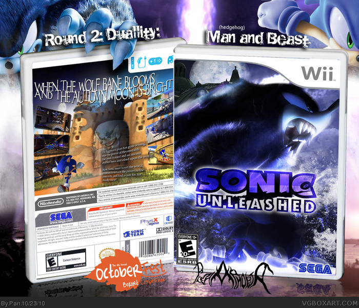
Here is my entry for round 2, I chose Man and Beast instead of the obvious Day and Night choice. The front image I composed as a transition scene from regular Sonic to werehog, and the back is supposed to be Sonic running away from his inner self.
This styles on the front and back don't really match. The front is blurry and dark and aggressive and the back is really light and clean and doesn't really make an impression in my opinion. Well put together no doubt, but doesn't make an impression. Good luck anyway.
I was expecting some generic light/day design for this game, but this is pleasantly surprising. Nice job going for something different with the duality theme, it turned out really great.
#7, The theme was Duality... the fact that he was able to include both a Night/Day (Night on the front, day on the back) AND a Man/Beast (Sonic/Werehog on both sides) Duality in the same box, and make it look great says a lot.
#10, Last time I made a design for this game everyone complained that I "only focused on the dark side" of the game, so I made an attempt to pay attention to both sides.
If you look at the back, I did attempt to blend the day and night together a bit, I've never actually played the game, but I've heard the Wii version focuses much more on the werehog and very little on Sonic, so I personally think the flow works.
 Sonic Unleashed Box Cover Comments
Here is my entry for round 2, I chose Man and Beast instead of the obvious Day and Night choice. The front image I composed as a transition scene from regular Sonic to werehog, and the back is supposed to be Sonic running away from his inner self.
Anyway, hope everyone enjoys it.
[ Reply ]
awesome. 5/5
[ Reply ]
This is fantastic man, such an incredible design. The editing on the front is very well done, and the layout of the back is really nice too.
[ Reply ]
I actually really like this.
Props for being an awesomely original Unleashed design.
[ Reply ]
I wet myself...
[ Reply ]
Definitely my personal favorite box of the competition so far. Amazing job.
[ Reply ]
This styles on the front and back don't really match. The front is blurry and dark and aggressive and the back is really light and clean and doesn't really make an impression in my opinion. Well put together no doubt, but doesn't make an impression. Good luck anyway.
[ Reply ]
I was expecting some generic light/day design for this game, but this is pleasantly surprising. Nice job going for something different with the duality theme, it turned out really great.
[ Reply ]
#7, The theme was Duality... the fact that he was able to include both a Night/Day (Night on the front, day on the back) AND a Man/Beast (Sonic/Werehog on both sides) Duality in the same box, and make it look great says a lot.
[ Reply ]
I know what the theme was, but it doesn't flow well. I see the man/beast thing going on, but I don't feel like night/day was needed as a result.
[ Reply ]
#10, Last time I made a design for this game everyone complained that I "only focused on the dark side" of the game, so I made an attempt to pay attention to both sides.
If you look at the back, I did attempt to blend the day and night together a bit, I've never actually played the game, but I've heard the Wii version focuses much more on the werehog and very little on Sonic, so I personally think the flow works.
Your criticism is appriciated though.
[ Reply ]
nice work my friend *bro fist*
[ Reply ]
Pan you fucking rule the roost with this box, don't ever forget that :)
[ Reply ]
May I ask what font did you use for the description text?
[ Reply ]
#11, to each his/her own. I respect what everyone else thinks.
[ Reply ]
One of the best boxes I've seen in a long time.
[ Reply ]
#16 agreed
[ Reply ]
I love everything about the back but the front seems like it have too much effects for me. Still, this is great job.
[ Reply ]
The back synopsis says Robotnik's plan went wrong, yet awakening Dark Gaia was exactly what he was trying to accomplish.
[ Reply ]