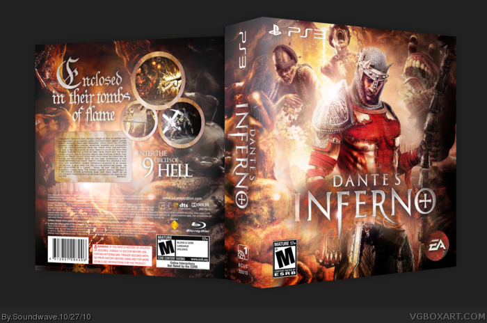
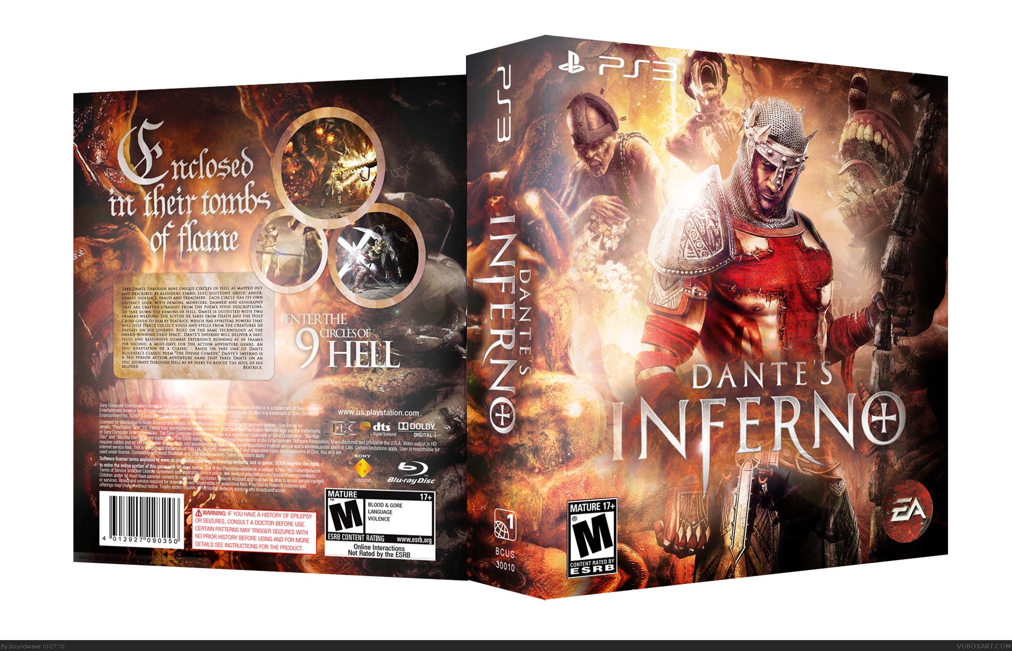
Ok, im finally done with this. Its been a while and decided to take my time on a box for the first time. After spending ages getting all the colors and lighting right i think it turned out pretty well. :D Probably not the best game but the art is badass. Anyway here it is.
Scorpion soldier for back info.
Full view please.
*sorry about the last comment dont know why that happened.
I think the presentation is lacking slightly but that's not really much of a concern - really nice flow and colours you've got going there. Great work.
 Dante's Inferno Box Cover Comments
Edited at 1 decade ago
[ Reply ]
Ok, im finally done with this. Its been a while and decided to take my time on a box for the first time. After spending ages getting all the colors and lighting right i think it turned out pretty well. :D Probably not the best game but the art is badass. Anyway here it is.
Scorpion soldier for back info.
Full view please.
*sorry about the last comment dont know why that happened.
[ Reply ]
Looks great man.I especially like the back's composition.
[ Reply ]
I think the presentation is lacking slightly but that's not really much of a concern - really nice flow and colours you've got going there. Great work.
[ Reply ]
I think it looks great. Fav.
[ Reply ]
The box is awesome, I really like it.
[ Reply ]
Hello, Who are you? I see you have produced a sick box. Icyfirefists, Nice to meet you(doesnt shake hand, gives a fave instead.)
[ Reply ]
#3, #5, #6, #7, Thanks.
#4, You mean the outside of the box? I tried to make it simple so the attention goes towards the box. And thanks.
[ Reply ]
It's a brilliant box, man, only issue I have is that the spine is a little on the large side. But that's not a huge problem.
What's the font called that you used for the tagline?
[ Reply ]
Perfection. The lighting effects are phenomenal.
[ Reply ]
#8, yeah I do, and fair enough. Just little touches like a reflection help to improve the overall image and makes it look more professional.
[ Reply ]
#9, Thanks. I was trying to make it like a boxset. I got the tagline text from a wallpaper so sorry I don't know.
#11, Alright, thanks for the feedback , will do next time
[ Reply ]
Not to double comment, but as said before this is a pretty good box. though presentation is only problem. BTW what is the font u used
?
[ Reply ]