I somewhat made an obligation not to post anymore but I really like this cover. I think what you have here is very solid.
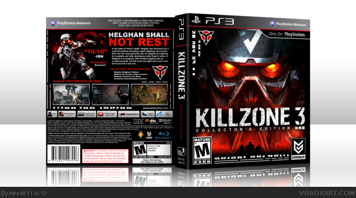
The official orange Killzone 3 logo itself has an odd color choice, good to see a consistent color theme going on here. The front looks top-notch, the MATURE ESRB logo looks a bit over-sized however. The spine works in this case, instead of having the word "Killzone" on top of Collector's Edition, you spaced it out so the spine wouldn't look empty, I tend to this most of the time.
The back has a basic grid to it, I was suggest instead of using dashes, use bullets, I personally use bullets but either works.
I see that instead of keeping the God of War III text, you just cut it off and left the Sony Computer Entertainment legal info there, it works. When regarding Killzone 3, I would have added a Motion compatible bar at the top, and a SCEA logo right by the Guerrilla logo.
Centering the specifications for the back ESRB ratings looks better in my opinion, rather than edging it to the top left of the box. You don't need to change anything for me, but good overall.
Yeah, Sentro basically said anything I would have pointed out.
Although I must say that I love the colour scheme, I could have ended up looking very monochromatic but you have managed to pull it off really well.
Sentro made this point as well, but I like that you spread the logo out over the spine of the box, its something that I always do when needed and Im a sucker for the fine details like that. It just makes it look at lot cleaner and draws the eyes in, as apposed to have the whole logo squashed in the middle.
The one thing that I noticed which is would change is the line 'Over 20 ten star reviews'. I don't think it works too well, its usually 5 stars or 10/10. Ten stars just doesn't sound right to me. Maybe change it to something like 'Over 20 perfect reviews!'.
Overall this is really fantastic box, very clean, very crips and fantastic quality. I especially like the text you have used (The text that looks Korean or Chinese)
that's very cool. thanks! I'm gonna download this, but I'm wondering how the inside of the original collector's edition looks like. Do you guys know what paper should I use for the print? I know it's a thick paper, but I'm not sure about its type.
 Killzone 3 Box Cover Comments
I think I really outdid myself with this one. Easily my best.
Cred. to Scorpion Soldier for temp. AND go check out that dude's boxes!
Enjoy!
[ Reply ]
Very nice, i love the front. The back is awesome aswell!
+Fav
[ Reply ]
I somewhat made an obligation not to post anymore but I really like this cover. I think what you have here is very solid.
The official orange Killzone 3 logo itself has an odd color choice, good to see a consistent color theme going on here. The front looks top-notch, the MATURE ESRB logo looks a bit over-sized however. The spine works in this case, instead of having the word "Killzone" on top of Collector's Edition, you spaced it out so the spine wouldn't look empty, I tend to this most of the time.
The back has a basic grid to it, I was suggest instead of using dashes, use bullets, I personally use bullets but either works.
I see that instead of keeping the God of War III text, you just cut it off and left the Sony Computer Entertainment legal info there, it works. When regarding Killzone 3, I would have added a Motion compatible bar at the top, and a SCEA logo right by the Guerrilla logo.
Centering the specifications for the back ESRB ratings looks better in my opinion, rather than edging it to the top left of the box. You don't need to change anything for me, but good overall.
[ Reply ]
#3, that was some very thorough criticism, and I thank you for it.
[ Reply ]
the front is epic good work buddy :) we should see this kind of box not a shity box... anyway just keep up...
[ Reply ]
Clean. Crisp. Awesome.
+FAV +Author Fav
[ Reply ]
Wow, very clean and smooth, the front is amazing. Great job!
[ Reply ]
LIKE
[ Reply ]
Great work!
[ Reply ]
Incredible
[ Reply ]
Oh god... it looks so good. I really do like this. The whole arrangement and colour composure is amazing. Great job.
[ Reply ]
Sentro pointed out everything that needed to be. A really great design, and I love the blank/white/red color scheme.
[ Reply ]
Yeah, Sentro basically said anything I would have pointed out.
Although I must say that I love the colour scheme, I could have ended up looking very monochromatic but you have managed to pull it off really well.
Sentro made this point as well, but I like that you spread the logo out over the spine of the box, its something that I always do when needed and Im a sucker for the fine details like that. It just makes it look at lot cleaner and draws the eyes in, as apposed to have the whole logo squashed in the middle.
The one thing that I noticed which is would change is the line 'Over 20 ten star reviews'. I don't think it works too well, its usually 5 stars or 10/10. Ten stars just doesn't sound right to me. Maybe change it to something like 'Over 20 perfect reviews!'.
Overall this is really fantastic box, very clean, very crips and fantastic quality. I especially like the text you have used (The text that looks Korean or Chinese)
[ Reply ]
Thanks very much everyone!
[ Reply ]
This design is so perfect. The colors, quality, layout, everything is great!
[ Reply ]
#4, Hey, you deserved it.
[ Reply ]
This needs to go Hof..
[ Reply ]
I just relized what this looks like.
link
[ Reply ]
Nice!
[ Reply ]
that's very cool. thanks! I'm gonna download this, but I'm wondering how the inside of the original collector's edition looks like. Do you guys know what paper should I use for the print? I know it's a thick paper, but I'm not sure about its type.
[ Reply ]
Very nice!, could you message me what program you used? thanks
[ Reply ]
Nicely Done, much better looking than the retail white cover.
[ Reply ]