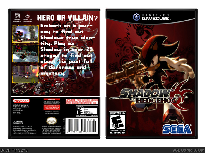
The cover is cool but, no offense, but the back ruins it. I also don't like the background used on the cover and back. It looks like you use the same image for both but flipped it on each side. I think the background pattern would better fit Dance Dance Revolution.
 Shadow the Hedgehog Box Cover Comments
The cover is cool but, no offense, but the back ruins it. I also don't like the background used on the cover and back. It looks like you use the same image for both but flipped it on each side. I think the background pattern would better fit Dance Dance Revolution.
[ Reply ]
My first box. Please comment. I took quite long doing this.
[ Reply ]
#1, Thanks
[ Reply ]
The biggest problem is the text on the back, it's way too big.But for a first, this is pretty good
[ Reply ]
i thought i saw DaArtistz23 like a similar box to yours
check his page out
[ Reply ]
#5, your'e right! link Whatever you did you didnÂ’t spend much time on this; itÂ’s nearly the same box as the one in the link.
[ Reply ]