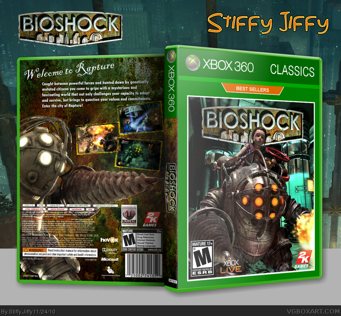
My first box art :) I chose BioShock because it's one of my favorite games. Credit goes to Leegion for the template! Comments and feedback are greatly accepted
I like it! I like background texture that you on the spine and back cover. I like how the Big Daddy is almost pointing to the right and compliments well since we read Left to Right. Cool borders for the screen shots and the off centered look is nice. My only gripe is the space underneath the company and legal info. Dolby Digital logo is all by it's lonesome self. I'd find a way to somehow reduce the negative space.
Awesome job for a first!
I like it! I like background texture that you put on the spine and back cover. I like how the Big Daddy is almost pointing to the right and compliments well since we read Left to Right. Cool borders for the screen shots and the off centered look is nice. My only gripe is the space underneath the company and legal info. Dolby Digital logo is all by it's lonesome self. I'd find a way to somehow reduce the negative space.
Awesome job for a first!
It's clear that you know your way around Photoshop, which is always great to see. I think the general idea of this could use some work, though. While it's well-done, it's not really that unique. It doesn't really have that "umph" that makes it stand out. I don't really have suggestions to improve it, just that "Big Daddy on the cover" is a bit played out, if you know what I'm saying.
The back suffers from the same issue, but over all it's clear you really know some of the ins-and-outs of what to do and what not to do. Pretty good composition, and little touches like screenshot borders were there without having to be told to consider them.
Good front, it's original, the spine must be black-colored or white with a non-logo "Bioshock", but i don't like the back that much. Also, the legal notices are too much moved up. Vote: 7/8 out of 10 ;)
 BioShock Box Cover Comments
My first box art :) I chose BioShock because it's one of my favorite games. Credit goes to Leegion for the template! Comments and feedback are greatly accepted
[ Reply ]
I like it! I like background texture that you on the spine and back cover. I like how the Big Daddy is almost pointing to the right and compliments well since we read Left to Right. Cool borders for the screen shots and the off centered look is nice. My only gripe is the space underneath the company and legal info. Dolby Digital logo is all by it's lonesome self. I'd find a way to somehow reduce the negative space.
Awesome job for a first!
[ Reply ]
I like it! I like background texture that you put on the spine and back cover. I like how the Big Daddy is almost pointing to the right and compliments well since we read Left to Right. Cool borders for the screen shots and the off centered look is nice. My only gripe is the space underneath the company and legal info. Dolby Digital logo is all by it's lonesome self. I'd find a way to somehow reduce the negative space.
Awesome job for a first!
[ Reply ]
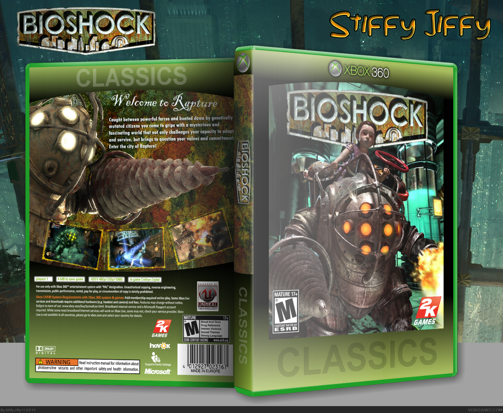
For me, the template brings the cover down.
[ Reply ]
#3 Thank you
#4 Should I change the template or leave it the way it is because I have a feeling it wouldn't look as good with a regular template
[ Reply ]
#5, I'd change it, it's one of my early designs and to be honest, it sucks. There's a more up-to-date official like temp in my resources.
As for the cover itself, it's nice.
[ Reply ]
#6 Okay I'll download your other Classics temp and change it. Thanks for the input!
[ Reply ]
Version 2 is alot better. Awesome for a first +fav.
[ Reply ]
This is awesome, i can't believe it's your first. :)
[ Reply ]
#8 Thank you!
#9 I have a lot of experience in Photoshop, I've made many things but this is my first box art :)
[ Reply ]
Edited at 1 decade ago
[ Reply ]
#11 Huh? I didn't see your comment before you edited it
[ Reply ]
It's clear that you know your way around Photoshop, which is always great to see. I think the general idea of this could use some work, though. While it's well-done, it's not really that unique. It doesn't really have that "umph" that makes it stand out. I don't really have suggestions to improve it, just that "Big Daddy on the cover" is a bit played out, if you know what I'm saying.
The back suffers from the same issue, but over all it's clear you really know some of the ins-and-outs of what to do and what not to do. Pretty good composition, and little touches like screenshot borders were there without having to be told to consider them.
Keep up the good work.
[ Reply ]
#13 Thank you and I understand what you mean by the Big Daddy concept. I appreciate the detailed comment Slyder :)
[ Reply ]
Good, but too much green going on.
[ Reply ]
#13, Congratulations, you officially give the best critiques on the site.
[ Reply ]
#15 Thats the template mostly that is giving off the green effect.
#16 I agree 100% :)
[ Reply ]
Good front, it's original, the spine must be black-colored or white with a non-logo "Bioshock", but i don't like the back that much. Also, the legal notices are too much moved up. Vote: 7/8 out of 10 ;)
[ Reply ]