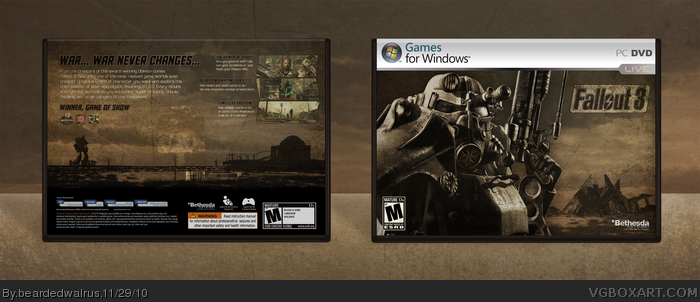
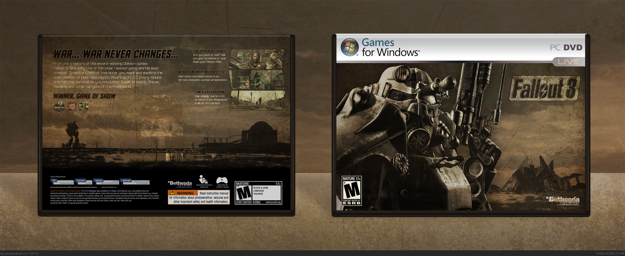
I've worked on this one quite a bit. If you look at the WIP, you can see it's come a long way. This was inspired by the grungy, desaturated, feel of Fallout 3.Not really too much to say about this other than enjoy and critique.
Big ups for adding Liberty Prime on there...fucking incredible.
Alas, the box just isn't working for me. I'm not digging the whole desaturated, monochrome style as all the things you DON'T want popping out at you (i.e. the ESRB rating, dev logos, legal info, etc.) stick out like a sore thumb.
I know it'll be hard for you to alter this (assuming you even want to,) but it's too dull for my liking.
#4, I like the desaturated, dark feeling because it's true to the vibe of the game. I went through many different ways to blend the template, and even when I thought it looked good, I got a lot of people telling me this current template looked good.
#4: Dull seems pretty fitting of the game's environment.
As in the WIP thread, I think you did a good job balancing out game case essentials (screens, synopsis) with the game's artwork. It all flows together nicely, instead of just stamped on.
I think it's really good. I'd say it matches the feel of the game (And the color of it) better than the official box.
I have to say though, the landscape boxes were kind of nice at first because they challenged the norm, but now that they're becoming more frequently used, I really don't like them. They challenge the most basic fundamental concept of box design. The spine is on the side, when you pull a box off the shelf, you shouldn't have to turn it in order to see the cover/back right-side-up.
#12, I see what you mean. However, I think that making a standard box would have made the design suffer. And that's what this is about, right? I would rather have a landscape box, and feel like I successfully created the vision that was in my head, rather than have a portrait box where I'm not happy with the overall design.
#12, Someone said that to me one time that, "When you think,think the opposite".
To me, there is no boundary in design. Also, what kindda "the most basic fundamental concept of box design"?
This makes the entire fallout series look like a bunch of generic, desaturated FPS'(Not that Fallout 3 wasn't one) and that is why I think it's a good design, but I am not faving.
#17, I really haven't played many FPS's other than Call of Duty and Medal of Honor, but I have yet to find anything generic about Fallout 3. Maybe if I had played some other games of a similar nature, such as Oblivion, I may feel different, but Fallout 3 is my favorite FPS of all time if for no other reason than that I have never played anything like it before. I actually like the desaturated feel of it, because it fits a post-apocalyptic wasteland environment. I can't imagine a world being very colorful after the events that happened in Fallout 3.
Agreed 100% about the ending though. I fucking hate how you have to buy a $20 expansion just to be able to keep playing after the ending.
 Fallout 3 Box Cover Comments
I've worked on this one quite a bit. If you look at the WIP, you can see it's come a long way. This was inspired by the grungy, desaturated, feel of Fallout 3.Not really too much to say about this other than enjoy and critique.
[ Reply ]
Ignore V1. I uploaded the wrong file.
[ Reply ]
Damn good job man!
[ Reply ]
Big ups for adding Liberty Prime on there...fucking incredible.
Alas, the box just isn't working for me. I'm not digging the whole desaturated, monochrome style as all the things you DON'T want popping out at you (i.e. the ESRB rating, dev logos, legal info, etc.) stick out like a sore thumb.
I know it'll be hard for you to alter this (assuming you even want to,) but it's too dull for my liking.
[ Reply ]
#4, I like the desaturated, dark feeling because it's true to the vibe of the game. I went through many different ways to blend the template, and even when I thought it looked good, I got a lot of people telling me this current template looked good.
[ Reply ]
amazing. id pick this over the actual box any day
[ Reply ]
I like it a lot! Great job BW :) fav+
[ Reply ]
#4: Dull seems pretty fitting of the game's environment.
As in the WIP thread, I think you did a good job balancing out game case essentials (screens, synopsis) with the game's artwork. It all flows together nicely, instead of just stamped on.
[ Reply ]
Great box.
[ Reply ]
screens, story,... in the back is a bit small to me, but I like it! Nice work! :D
[ Reply ]
Hmm... I like it but I think it would look better if the logo were lower. fav
[ Reply ]
I think it's really good. I'd say it matches the feel of the game (And the color of it) better than the official box.
I have to say though, the landscape boxes were kind of nice at first because they challenged the norm, but now that they're becoming more frequently used, I really don't like them. They challenge the most basic fundamental concept of box design. The spine is on the side, when you pull a box off the shelf, you shouldn't have to turn it in order to see the cover/back right-side-up.
[ Reply ]
#12, I see what you mean. However, I think that making a standard box would have made the design suffer. And that's what this is about, right? I would rather have a landscape box, and feel like I successfully created the vision that was in my head, rather than have a portrait box where I'm not happy with the overall design.
[ Reply ]
#12, Someone said that to me one time that, "When you think,think the opposite".
To me, there is no boundary in design. Also, what kindda "the most basic fundamental concept of box design"?
[ Reply ]
#8, I have no qualms about that. However, in the case of artwork it doesn't look too aesthetically pleasing.
[ Reply ]
This is very nice.
The whole feel of it is awesome.
[ Reply ]
This makes the entire fallout series look like a bunch of generic, desaturated FPS'(Not that Fallout 3 wasn't one) and that is why I think it's a good design, but I am not faving.
Also the ending, ugh, sucked balls.
[ Reply ]
#17, I really haven't played many FPS's other than Call of Duty and Medal of Honor, but I have yet to find anything generic about Fallout 3. Maybe if I had played some other games of a similar nature, such as Oblivion, I may feel different, but Fallout 3 is my favorite FPS of all time if for no other reason than that I have never played anything like it before. I actually like the desaturated feel of it, because it fits a post-apocalyptic wasteland environment. I can't imagine a world being very colorful after the events that happened in Fallout 3.
Agreed 100% about the ending though. I fucking hate how you have to buy a $20 expansion just to be able to keep playing after the ending.
[ Reply ]
#18, No I am talking about the whole shitty final battle, if they had a fucking robot, what the fuck is the point of deploying it so late.
[ Reply ]