My first box. This took quite long. Please give me ways to improve.
I'll do the credits tomorrow since it's late now (in Britain) and I'm feeling tired.
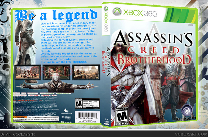
for a start i think it's pretty good although the text on the back does not suit the theme and you could've used better screenshot borders.
And why is it showing ezio's half body in the bottom?
This is actually pretty well done for a first. Good job!
One thing I find sort of distracting is the cover. The logo and background images don't mesh together very nice. And well, the logo is covering too much of the characters faces.
So, just a couple tips to consider:
Either,
1) Shrink down the logo and a bit of the background image and keep the logo over the white portion of the background at the top or,
2) Just shrink the logo and maybe have it positioned more in the center as to avoid covering the faces but not too close to the very bottom or finally,
Hope that helps, man. In the end, it's still a really good cover.
 Assassin's Creed: Brotherhood Box Cover Comments
My first box. This took quite long. Please give me ways to improve.
I'll do the credits tomorrow since it's late now (in Britain) and I'm feeling tired.
[ Reply ]
link
link
[ Reply ]
for a start i think it's pretty good although the text on the back does not suit the theme and you could've used better screenshot borders.
And why is it showing ezio's half body in the bottom?
[ Reply ]
Also i don't think that the text colour actually suits the cover
try changing it and do those improvements and i'll fave after that...
[ Reply ]
Why is your avatar Tinie Tempah???
although he is pretty good..
[ Reply ]
This is actually pretty well done for a first. Good job!
One thing I find sort of distracting is the cover. The logo and background images don't mesh together very nice. And well, the logo is covering too much of the characters faces.
So, just a couple tips to consider:
Either,
1) Shrink down the logo and a bit of the background image and keep the logo over the white portion of the background at the top or,
2) Just shrink the logo and maybe have it positioned more in the center as to avoid covering the faces but not too close to the very bottom or finally,
Hope that helps, man. In the end, it's still a really good cover.
[ Reply ]