Above is the companion box to this, created by the amazing MattStar!
Roughly two weeks ago, MattStar contacted me about a collaboration box. I was deeply honored that somebody who was so adept with creating beautiful artwork would ask a new member such as myself to collaborate with him. I quickly expressed my happiness, and he said he would contact me in a few days when he could get an idea. Not long after, he sent me a message telling of a Bioshock Infinite box with an American flag on the front. From there, we both shot back and forth many ideas and proposals.
We came to the great idea of doing two different boxes, one for each platform (PS3 and 360.) Instead of having both be the exact same, we realized a great way to give them our own unique touches was to make one for each side of the war for Columbia: The rich and powerful Saltonstall, and the Vox Populi, looking for equality and understanding on Columbia. The Saltonstall would be professional and sleek and eye-catching, while the Vox Populi would be more DIY and destroyed (symbolism of our skills, prehaps? Haha) and so we went at it!
We wanted to keep the box in the timeframe of the game, so we used the 48 star flag on the cover. Originally, the flag was going to be above clouds, with structures on top of the clouds, to symbolize the idea that Columbia wanted America to rule the skies, which is why the flag would have been so large compared to the clouds. The torn flag was to show how the war of Columbia almost mirrors the Civil-War, by how America is torn; fractured... Dirty. We should have learned by now, Columbia...
For my back, I used the phrase "We have becomes victims of the American dream." A band we used to play shows with up here were called "Victims of the American Dream" and so all the credit goes to them! Google em if you'd like, free press for em! It also helps give you an idea of how they do feel. There are 48 stars on the back as well, to show that they believe that America is a country of unity. There is one large upside down star that covers the back. I did that purposely to show that down (on land) America is a large place of togetherness... Columbia should share the same feeling.
So there it is. I had such a great time working with MattStar, and I hope that you enjoy the boxes, as we both poured so much into them and gave it our all. MattStar, I appreciate your kindness and willingness to read through PMs of me simply just spouting off why things I am currently thinking of wouldn't work. It's been a true honor!
Not bad. I like the whole collab idea you guys had to change up the backs but use the same front and spine. Honestly, I like MS's back better, but this is a decent job. My one complaint is that I feel bringing the black level up a few points will make the back perfect (don't touch the spine or front).
Weird, I tried to edit my previous comment, yet the website isn't allowing me to edit (even though it has only been about 10 minutes).
Not bad. I like the whole collab idea you guys had to change up the backs but use the same front and spine. Honestly, I like MS's back better, but this is a decent job. My one complaint is that I feel bringing the contrast up a few points (between 7 and 10) will make the back perfect (don't touch the screenshots, spine or front).
#4/5, I do prefer Matt's back to mine as well. When he sent me an early version, I could tell he had something beautiful on his hands. About 1/3 of the way through, I sent him a PM stating I felt it looked way too similar to my Valkyria Chronicles box, and was a little disappointed, but I decided to keep going with it. I have a printable that is a little too large of a file, so I'm going to play with the contrast just a small bit and try to get that up here!
Like I said on MattStar's, this is a great collab idea. One I wish more developers would implement into their designs, for multiplatform games.
Front is still flawless, and I like the newspaper feel to the back. It may seem a bit similar to your Valkyria Chronicles design, but that's not necessarily a bad thing unless you're doing it with every future case. Great job.
 BioShock Infinite Box Cover Comments
Hello again! I'm gonna jump straight into this!
link
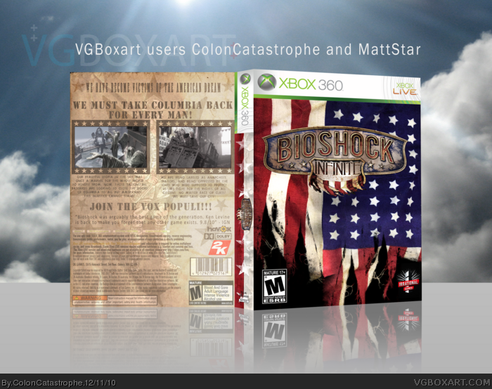
Above is the companion box to this, created by the amazing MattStar!
Roughly two weeks ago, MattStar contacted me about a collaboration box. I was deeply honored that somebody who was so adept with creating beautiful artwork would ask a new member such as myself to collaborate with him. I quickly expressed my happiness, and he said he would contact me in a few days when he could get an idea. Not long after, he sent me a message telling of a Bioshock Infinite box with an American flag on the front. From there, we both shot back and forth many ideas and proposals.
We came to the great idea of doing two different boxes, one for each platform (PS3 and 360.) Instead of having both be the exact same, we realized a great way to give them our own unique touches was to make one for each side of the war for Columbia: The rich and powerful Saltonstall, and the Vox Populi, looking for equality and understanding on Columbia. The Saltonstall would be professional and sleek and eye-catching, while the Vox Populi would be more DIY and destroyed (symbolism of our skills, prehaps? Haha) and so we went at it!
We wanted to keep the box in the timeframe of the game, so we used the 48 star flag on the cover. Originally, the flag was going to be above clouds, with structures on top of the clouds, to symbolize the idea that Columbia wanted America to rule the skies, which is why the flag would have been so large compared to the clouds. The torn flag was to show how the war of Columbia almost mirrors the Civil-War, by how America is torn; fractured... Dirty. We should have learned by now, Columbia...
For my back, I used the phrase "We have becomes victims of the American dream." A band we used to play shows with up here were called "Victims of the American Dream" and so all the credit goes to them! Google em if you'd like, free press for em! It also helps give you an idea of how they do feel. There are 48 stars on the back as well, to show that they believe that America is a country of unity. There is one large upside down star that covers the back. I did that purposely to show that down (on land) America is a large place of togetherness... Columbia should share the same feeling.
So there it is. I had such a great time working with MattStar, and I hope that you enjoy the boxes, as we both poured so much into them and gave it our all. MattStar, I appreciate your kindness and willingness to read through PMs of me simply just spouting off why things I am currently thinking of wouldn't work. It's been a true honor!
[ Reply ]
Fantastic work, both of you!
Fav+
[ Reply ]
Nice job from you too.
[ Reply ]
Not bad. I like the whole collab idea you guys had to change up the backs but use the same front and spine. Honestly, I like MS's back better, but this is a decent job. My one complaint is that I feel bringing the black level up a few points will make the back perfect (don't touch the spine or front).
[ Reply ]
Weird, I tried to edit my previous comment, yet the website isn't allowing me to edit (even though it has only been about 10 minutes).
Not bad. I like the whole collab idea you guys had to change up the backs but use the same front and spine. Honestly, I like MS's back better, but this is a decent job. My one complaint is that I feel bringing the contrast up a few points (between 7 and 10) will make the back perfect (don't touch the screenshots, spine or front).
+fav.
[ Reply ]
Thank you all for the wonderful comments!
#4/5, I do prefer Matt's back to mine as well. When he sent me an early version, I could tell he had something beautiful on his hands. About 1/3 of the way through, I sent him a PM stating I felt it looked way too similar to my Valkyria Chronicles box, and was a little disappointed, but I decided to keep going with it. I have a printable that is a little too large of a file, so I'm going to play with the contrast just a small bit and try to get that up here!
[ Reply ]
Nice job
[ Reply ]
Like I said on MattStar's, this is a great collab idea. One I wish more developers would implement into their designs, for multiplatform games.
Front is still flawless, and I like the newspaper feel to the back. It may seem a bit similar to your Valkyria Chronicles design, but that's not necessarily a bad thing unless you're doing it with every future case. Great job.
[ Reply ]