#11 No one is posting cause they don't want to, it has nothing to do with liking the box.
You have a lot of flaws here, some being these:
FRONT:
That faded render on the front is hideous, get rid of it.
That city like background for the front is stretched.
BACK:
That plain black text is boring, try to go with something else.
What I find amazing is you didn't stretch the screenshots enough, stretch them like 1 more pixel.
The first word "using" should have a capital "U".
Between the screenshots, try adding a little bit of blur.
Try just a little harder next time, you've almost got it.
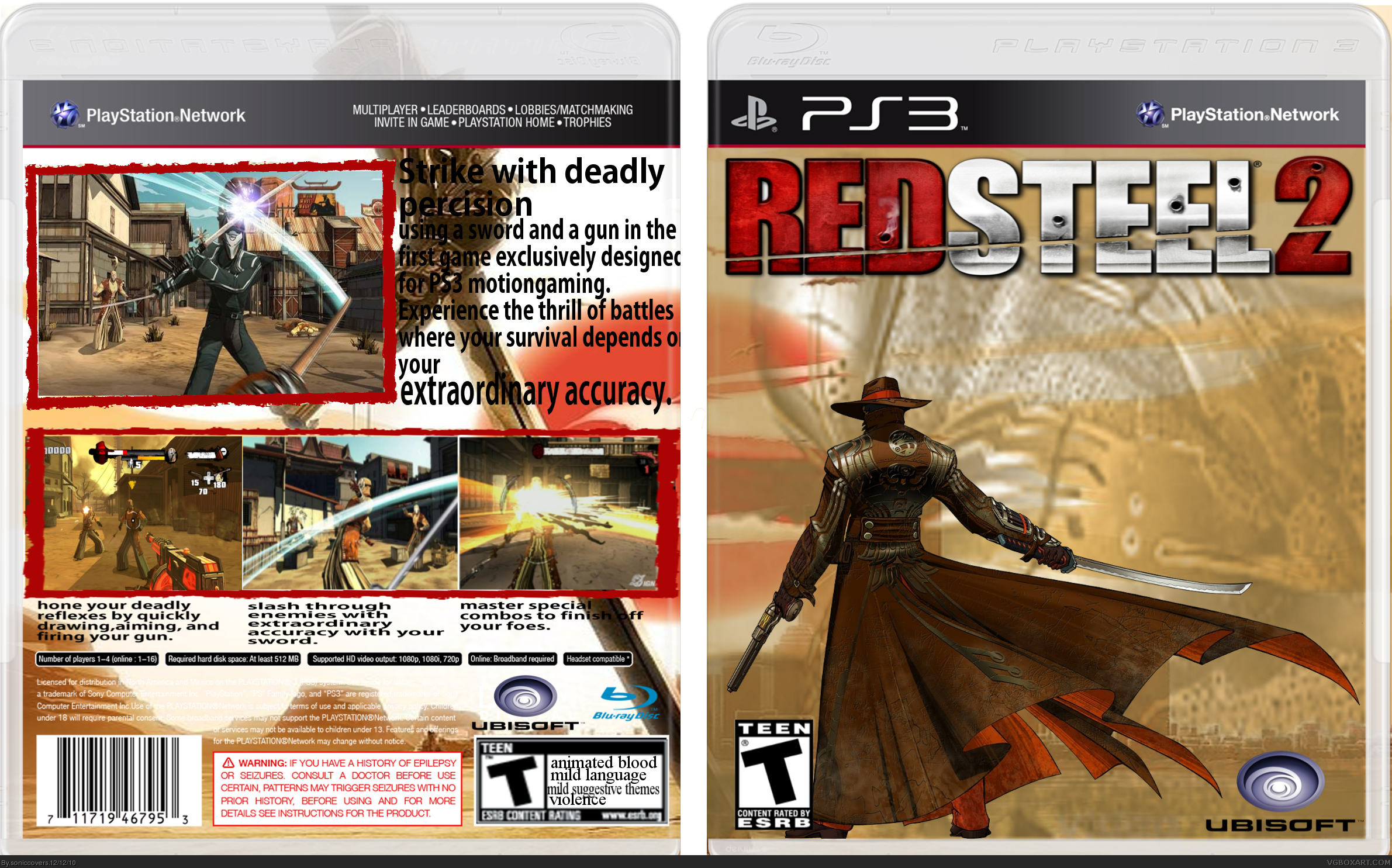
Okay, so it's a "fake boy" anyways, but... get real >__< for PS3 *doh* Anyways, if this is supposed to be a ps3 package you have to add the "move" stuff to the box. After all that's what RedSteel is about, right?
I agree with #12 on the front and I'd like to add the distance from the bottom (or the left/right) from logos should be always the same. Your ubisoft-logo however is placed unter the "bottom line" of the rating - and that looks off.
The back...? I guess you should remake it. The main problem is: The text is almost NOT visible. Black text on black background and white text on white background. C'mon, you have to see that's not good!
And what#s that text? I mean, I am not good at making a text, but RedSteel2 being the first game exclusively made for ps3 move? Again: Get real!
#12, the "strike with deadly percision" those words are in the same sentence in "using a sword and a gun and i also have the game so i read the sypnosis on the back thanks for the tips ill get to updating
- logo on the front is too close on the edges
- no logo (or title) on the spine
- you updated a PS3-package with a wii-package
- rating on the back is squeezed and not very well rendered (man, it's a rectangle!)
- text on the back is hard to read
- font on the back is HORRIBLE! it does switch randomly between majuscules and minuscules
- the interleaf is too big (space between the lines)
- icons for informations about players, control schemes, etc. are missing
- ...
 Red Steel 2 Box Cover Comments
mmmmk so i just made this one and i think its kinda good and im still figuring out how to upload stuff to the critiques forum
[ Reply ]
credit to:Eggboy'13, cerium, sd1833, LEGOslayer and silentoblivion
[ Reply ]
heres whats wrong with it
The Rating is all weird on the back,plus I can hardly read the text on the back,plus the Ubisoft logo is kinda crushed
other than that its ok
7.5/10
[ Reply ]
#3, did you look at it in full size?
[ Reply ]
#4, Yes,but it's still kind of hard to see
[ Reply ]
Edited at 1 decade ago
[ Reply ]
Edited at 1 decade ago
[ Reply ]
UPDATE! ubisoft logo no longer crushed, rated t logo on the back doesnt look weird anymore, text on the back is bigger
[ Reply ]
#8, Alright,I like it aloooot better now
[ Reply ]
if anybody is wondering why this is for ps3 its because its for ps3 motion gaming
[ Reply ]
im supposing nobody likes this box?
[ Reply ]
#11 No one is posting cause they don't want to, it has nothing to do with liking the box.
You have a lot of flaws here, some being these:
FRONT:
That faded render on the front is hideous, get rid of it.
That city like background for the front is stretched.
BACK:
That plain black text is boring, try to go with something else.
What I find amazing is you didn't stretch the screenshots enough, stretch them like 1 more pixel.
The first word "using" should have a capital "U".
Between the screenshots, try adding a little bit of blur.
Try just a little harder next time, you've almost got it.
[ Reply ]
#11, you have to give him credit, he's definitely improving much more than I ever expected.
[ Reply ]
Okay, so it's a "fake boy" anyways, but... get real >__< for PS3 *doh* Anyways, if this is supposed to be a ps3 package you have to add the "move" stuff to the box. After all that's what RedSteel is about, right?
I agree with #12 on the front and I'd like to add the distance from the bottom (or the left/right) from logos should be always the same. Your ubisoft-logo however is placed unter the "bottom line" of the rating - and that looks off.
The back...? I guess you should remake it. The main problem is: The text is almost NOT visible. Black text on black background and white text on white background. C'mon, you have to see that's not good!
And what#s that text? I mean, I am not good at making a text, but RedSteel2 being the first game exclusively made for ps3 move? Again: Get real!
[ Reply ]
#12, the "strike with deadly percision" those words are in the same sentence in "using a sword and a gun and i also have the game so i read the sypnosis on the back thanks for the tips ill get to updating
[ Reply ]
#14, well on the actual game it says "the first game exclusively designed for wii motion plus" since i was using PS3 i put that in
and red steel isnt about that and red steel and red steel 2 are completely different
[ Reply ]
RedSteel is all about motioncontrol and it is not working without it! So you should add the "PS3 Move banner"-thingie on the package link
And where did I say RS2 is the same as RS? >__<
I bet you're old enough to write a more realistic text, rather than just changing Wii into PS3 >__<
[ Reply ]
you never said the red steel and red steel 2 are the same i was just saying that so you know
[ Reply ]
you're hopeless
[ Reply ]
i figured it would atleast get 1 favorite by now not that im trying to bump this box or anything
[ Reply ]
allright i finnaly got to updating it and this took a really long time
[ Reply ]
And it didn't help the package to get better...
- logo on the front is too close on the edges
- no logo (or title) on the spine
- you updated a PS3-package with a wii-package
- rating on the back is squeezed and not very well rendered (man, it's a rectangle!)
- text on the back is hard to read
- font on the back is HORRIBLE! it does switch randomly between majuscules and minuscules
- the interleaf is too big (space between the lines)
- icons for informations about players, control schemes, etc. are missing
- ...
[ Reply ]
well i give up on this box it just takes to long
[ Reply ]
#23, perfect requirements for being a designer or doing any other kind of job
[ Reply ]
alright i was so confindent about this box im gonna give it one last try!
[ Reply ]
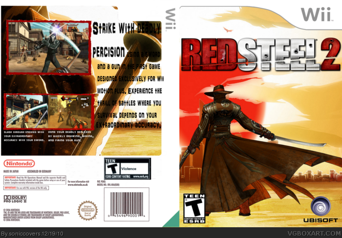
wait, why is it for Wii and it says PS3
[ Reply ]
#26, look at the first 2 versions
i updated this to wii
[ Reply ]
Credit >.<
[ Reply ]
alright, im going to update it
[ Reply ]
I MEAN IT THIS TIME
[ Reply ]