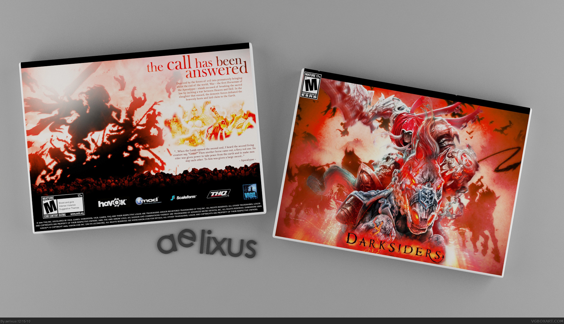
Damn near perfection. The slipcover itself is already nice enough, but the back (underneath) is gorgeous. The only things bugging me, are how close to the edges the ESRB and DarkSiders logo are. I'd try moving them in a bit.
I don't wanna say it's horrible, but somehow it feels off a bit. It seems to be without a real concept, just wallpapers put together - specially the front and the big black bar on top of it. The centered text is also a bit... errrr... "disadvantageous", because it doesn't go well with the style of your headline. Try to align the center of the centered text with the center of the headline (now that's a line XD). Right now the headlines balance is more on the left.
 DarkSiders Box Cover Comments
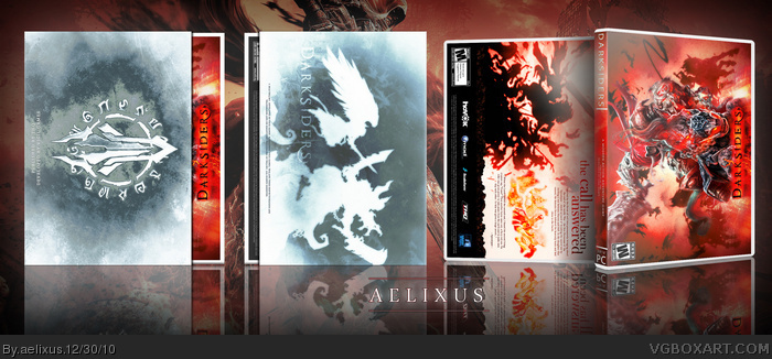
Version 1: No slipcase
Version 2: Slipcase
hey guys, I want to start something new :D, an this is it! Hope you like this ^_^
view printable plz :D
[ Reply ]
it's an okay box but i really don't get it.sorry :(
[ Reply ]
good job here mate
[ Reply ]
Damn near perfection. The slipcover itself is already nice enough, but the back (underneath) is gorgeous. The only things bugging me, are how close to the edges the ESRB and DarkSiders logo are. I'd try moving them in a bit.
Still, loving this.
[ Reply ]
#2, may be you will get it some day :)
thanks all :D
#sd, Thanks for notice me, I have updated it into a larger version too :D
[ Reply ]
I don't wanna say it's horrible, but somehow it feels off a bit. It seems to be without a real concept, just wallpapers put together - specially the front and the big black bar on top of it. The centered text is also a bit... errrr... "disadvantageous", because it doesn't go well with the style of your headline. Try to align the center of the centered text with the center of the headline (now that's a line XD). Right now the headlines balance is more on the left.
[ Reply ]
#6, thank you for the comment! I have remove the black bar and I think it is better now, tell me what you think now :D
p.s: waiting for your project M ^_^
[ Reply ]
I don't understand why the slipcase is a completely different color than the actual cover, it throws everything off.
[ Reply ]
#7, lol - yeah I noticed your fav on DA XD thx.
way better without the black bar
[ Reply ]
Fave
[ Reply ]
#8, sorry but I think the color I using is okay, it have white tone and constract with my box too. Anyway, thanks for your comment ^_^
#9,10: thank you :D
[ Reply ]