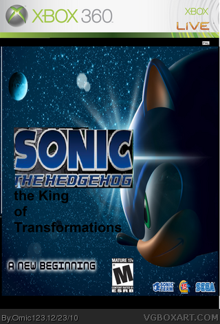
Sonic the hedgehog logo is badly cut out the king of transformations font is not a good font to use on games. the rating logo should be on the bottom left corner of the box and sega doesn't use the sonic team logo anymore. Also try to make the sega logo bigger and why are there black spaces around the picture? If you're using paint don't. Use gimp paint.net or photoshop(if you have enough money) gimp and paint.net are free.
 sonic : King of the transformations Box Cover Comments
Sonic the hedgehog logo is badly cut out the king of transformations font is not a good font to use on games. the rating logo should be on the bottom left corner of the box and sega doesn't use the sonic team logo anymore. Also try to make the sega logo bigger and why are there black spaces around the picture? If you're using paint don't. Use gimp paint.net or photoshop(if you have enough money) gimp and paint.net are free.
[ Reply ]