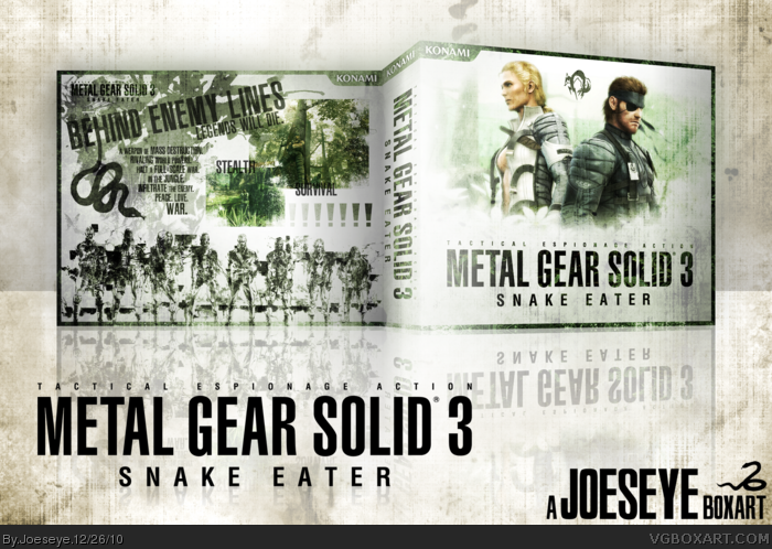
It's been four long months since I'd made a box so I thought I'd whip something up while I could. This box took around 3 - 4 hours to create. I imagine most of you have noticed the unusual template and the lack of any console/legal information, amongst other things. I did this because I felt it would detract from the style, composition and appearance I was going for. I also decided to stick to 3 main colours - green, white and black. In some cases I've found that sticking to a minimal amount of colours can ease the presentation and make a box appear more professional.
Ask me any questions if you so wish. Thanks for viewing - and check out some of my other boxes.
Really like the front. The back not so much. A bit too much going on and the typography is dark. I mean I can read it but still another color could have been a lot better instead of black.
#7, glad you like the front. What colour would you suggest for the text? I don't really want to throw in another colour randomly on the back, to be honest. I guess I could have used some sort of shadowing or glow to make the text stand out but I feel this adds to the grittiness of the box.
#8, :P I'll try but the cover was designed to fit in this template - I'm not sure it'd work. I'd probably have to put some legal in to balance it out.
I would have to agree with jevangod, aside from that it's a very good design. Me having only played in beaten MGS4 leaves me in the dark for this game.
Comeon everyone, I'm sure Joeseye is glad that you all like it... But repededly posting that is getting old. I'm sure he's getting tired of having to check his box every time you guys post that.
Oh, and bump because I think it deserves to be. :P
 Metal Gear Solid 3: Snake Eater Box Cover Comments
It's been four long months since I'd made a box so I thought I'd whip something up while I could. This box took around 3 - 4 hours to create. I imagine most of you have noticed the unusual template and the lack of any console/legal information, amongst other things. I did this because I felt it would detract from the style, composition and appearance I was going for. I also decided to stick to 3 main colours - green, white and black. In some cases I've found that sticking to a minimal amount of colours can ease the presentation and make a box appear more professional.
Ask me any questions if you so wish. Thanks for viewing - and check out some of my other boxes.
[ Reply ]
The typography on the back is awesome, and it fits the feel of MGS well. I happen to like the template too, as it adds to the style of the box.
[ Reply ]
This is terrible.
[ Reply ]
Superb work Joeseye!
[ Reply ]
cool...awesome...brilliant...great...fantastic...terrific...excellent...adorable...amazing...better than brilliant...superb...QUALITY!!!
[ Reply ]
This has got to be my favorite MGS box...
[ Reply ]
Really like the front. The back not so much. A bit too much going on and the typography is dark. I mean I can read it but still another color could have been a lot better instead of black.
[ Reply ]
Make this into a printable for PS2 NOW!
[ Reply ]
Thanks for the great feedback everyone.
#7, glad you like the front. What colour would you suggest for the text? I don't really want to throw in another colour randomly on the back, to be honest. I guess I could have used some sort of shadowing or glow to make the text stand out but I feel this adds to the grittiness of the box.
#8, :P I'll try but the cover was designed to fit in this template - I'm not sure it'd work. I'd probably have to put some legal in to balance it out.
[ Reply ]
I would have to agree with jevangod, aside from that it's a very good design. Me having only played in beaten MGS4 leaves me in the dark for this game.
[ Reply ]
Nothing to complain about.The colours,the effects,the typography and everything looks great.
[ Reply ]
#10, You should give MGS3 a try. It's in my biased opinion the best game of all time.
[ Reply ]
#9, Yeah I feel ya. Personally I try to make all my new boxes printables so I can put them into a portfolio.
[ Reply ]
Bump because I think it deserves to be.
[ Reply ]
Bump because I think it deserves to be.
[ Reply ]
Bump because I think it deserves to be.
[ Reply ]
This is my favourite of the MGS series, and this box more than does it justice. Faved.
[ Reply ]
Bump because I think it deserves to be.
[ Reply ]
I never remember triple posting here.
[ Reply ]
Bump because I think it deserves to be.
[ Reply ]
Comeon everyone, I'm sure Joeseye is glad that you all like it... But repededly posting that is getting old. I'm sure he's getting tired of having to check his box every time you guys post that.
Oh, and bump because I think it deserves to be. :P
[ Reply ]
Bump because I think it deserves to be.
[ Reply ]
Finally HOF.
[ Reply ]
Rackin em up Joeseye.
[ Reply ]
Niceeee. Totally deserving.
[ Reply ]
Another in the HoF bag. Thanks a lot everyone, 'ppreciate it.
[ Reply ]