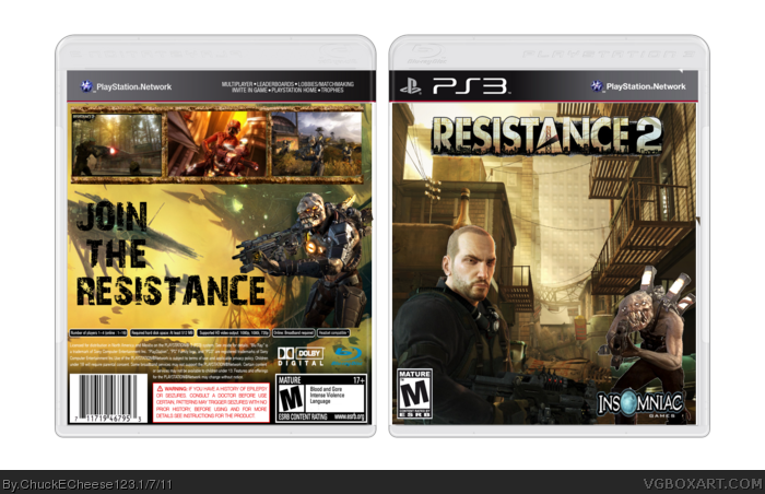
One of your best boxes, I'd dare to say. It would've been better if you added a synopsis, plus the Imnsomniac logo looks stretched. Altough, your main problem resides on the blending of the renders on the backgrounds, you may want to try some online tutorials to learn a way to it better.
P.S.: You didn't fill the template space, nor the screenshots spaces, completely; you should.
 Resistance 2 Box Cover Comments
Renders - Planet Renders
Template- deiviuxs
[ Reply ]
One of your best boxes, I'd dare to say. It would've been better if you added a synopsis, plus the Imnsomniac logo looks stretched. Altough, your main problem resides on the blending of the renders on the backgrounds, you may want to try some online tutorials to learn a way to it better.
P.S.: You didn't fill the template space, nor the screenshots spaces, completely; you should.
[ Reply ]
Pretty tight, everything fits in perfectly :D
4.5/5
[ Reply ]