That front is ripping off my Crysis 2 box: link
And that EA logo is not the proper one for Crysis 2. Check my Crysis 2 boxes for the retail logo of it.
All in all, would judge if you gave the back.
#2, rip off? you two are working with the same image - geez, this can happen if you just take a single image without editing it. calm down.
@ package: congrats on the first real boxart, even though it's not much of own effort here. A simple official artwork with the logo(s) on it... Well it does work and you don#t have to come up with A CONCEPT for a fitting title and logo, right?
The EA-Logo may be the wrong one, but it's okay. It's EA after all, right?
Anyways, It doesn't hurt to add some of your "own flavor", unless you want to make "just another one" of it. A basic design is okay, but will not get you a lot of favs, even if it is very well done (and I do think you care a lot about favs). Try a montage of some images for example.
I'd also give you the advice of keeping at least one eye on the type area. Look at the spaces around the logos and you may understand it.
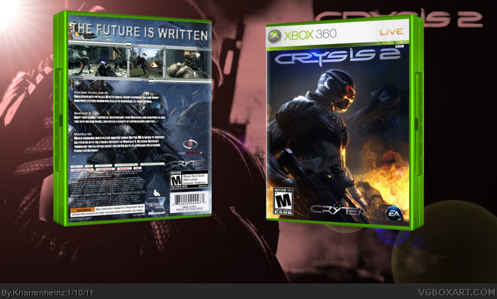
Ok, now that you have updated your box and I can see the back, I have to say the back is done finely. Though that "The Future is Written" tagline just doesn't fit. Still is placed and done properly.
Looks like you changed your front. This one is nice aswell. I can't believe I didn't get it before you! :D
nice update, but the logo on the front is too close on the top an the region icon. at least try to unify the space between the logos and the edges of the image.
 Crysis 2 Box Cover Comments
My personal Vision of a Crysis 2 Boxart for XB360!
[ Reply ]
That front is ripping off my Crysis 2 box:
link
And that EA logo is not the proper one for Crysis 2. Check my Crysis 2 boxes for the retail logo of it.
All in all, would judge if you gave the back.
[ Reply ]
#2, I have seen your box never before!
So the "ripp off" is just a coincidence!
I make a back maybe, we'll see
[ Reply ]
#2, rip off? you two are working with the same image - geez, this can happen if you just take a single image without editing it. calm down.
@ package: congrats on the first real boxart, even though it's not much of own effort here. A simple official artwork with the logo(s) on it... Well it does work and you don#t have to come up with A CONCEPT for a fitting title and logo, right?
The EA-Logo may be the wrong one, but it's okay. It's EA after all, right?
Anyways, It doesn't hurt to add some of your "own flavor", unless you want to make "just another one" of it. A basic design is okay, but will not get you a lot of favs, even if it is very well done (and I do think you care a lot about favs). Try a montage of some images for example.
I'd also give you the advice of keeping at least one eye on the type area. Look at the spaces around the logos and you may understand it.
[ Reply ]
============
FINAL UPDATE
============
[ Reply ]
Ok, now that you have updated your box and I can see the back, I have to say the back is done finely. Though that "The Future is Written" tagline just doesn't fit. Still is placed and done properly.
Looks like you changed your front. This one is nice aswell. I can't believe I didn't get it before you! :D
Nice work mait. Keep up the good work! :)
[ Reply ]
nice update, but the logo on the front is too close on the top an the region icon. at least try to unify the space between the logos and the edges of the image.
[ Reply ]