================================================
here we go againÂ…as usualÂ…another box from the hated newbie ;D
================================================
getting way better - now you just have to keep that level at your more unique stuff. as for this one: The typography could a a bit better. the title on the front could be notedly highlighted and less blending into the image, so could be the whole text on the back. The red you used it a bit too washed-out. I know you can see it on the screen, but it wouldn't work very well as REAL printable (not talking about YOU printing it on your printer @ home). The grouped style synopsis got way too much gaps.
 Dead Space 2 Box Cover Comments
================================================
here we go againÂ…as usualÂ…another box from the hated newbie ;D
================================================
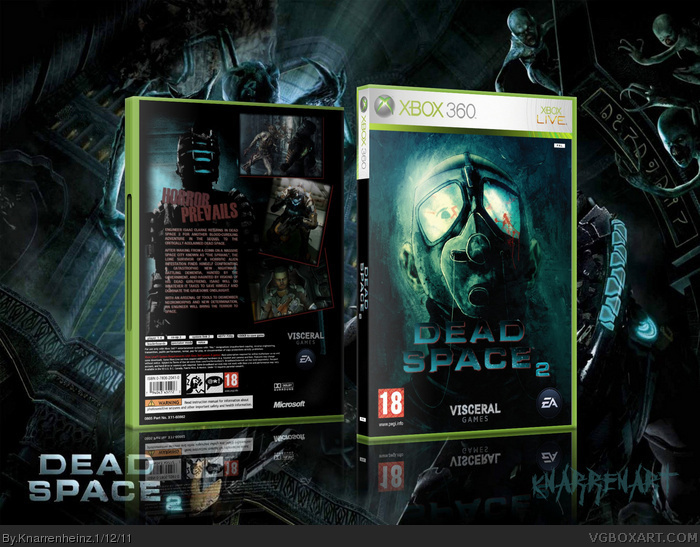
this is my box for DEAD SPACE 2! enjoy!
[ Reply ]
Not bad, what is that image on the front?
[ Reply ]
#2, it's a conceptional drawing from Dead Space Extraction...
[ Reply ]
#1, hated? no, touchy? yes!
getting way better - now you just have to keep that level at your more unique stuff. as for this one: The typography could a a bit better. the title on the front could be notedly highlighted and less blending into the image, so could be the whole text on the back. The red you used it a bit too washed-out. I know you can see it on the screen, but it wouldn't work very well as REAL printable (not talking about YOU printing it on your printer @ home). The grouped style synopsis got way too much gaps.
[ Reply ]
Hmmmmm....
[ Reply ]