The colors too dark for the sport game but I still like it! I prefer these screenshots to look like from LCD or something so that Kaka would looks like performing.
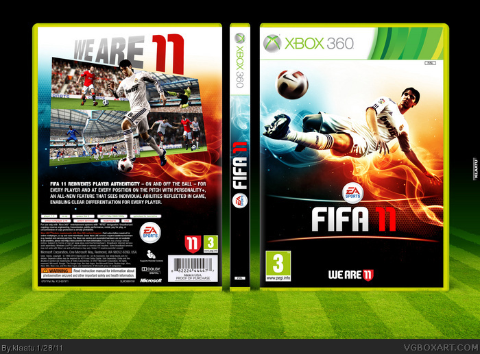
I can't believe I missed this the first time through. Fav'd It's excellent, but with one small flaw. The text on the spine is upside down. It should run from top to bottom.
To Prong about the spine ; It depends on the countries. I'm french and traditionnaly, spine of Books are in the sense. I know it's not logical with the Xbox logo of the spineÂ…But I made it like that by reflex, without asking me this questionÂ… Anyway, I suppose, both are accepted.
 Fifa 11 Box Cover Comments
That is so slick... excellent work dude.
[ Reply ]
That's clean! And awesome presentation also.
[ Reply ]
Agree.Very clean and original.
[ Reply ]
Love the colors. Great work.
[ Reply ]
nice
your definetly impressing me now...
[ Reply ]
I like this new FIFA style you went with, rather than the boring old white w/ splatters that the officials use. Very clean and sleek.
[ Reply ]
The colors too dark for the sport game but I still like it! I prefer these screenshots to look like from LCD or something so that Kaka would looks like performing.
[ Reply ]
Very nice.
[ Reply ]
thanx all
[ Reply ]
Gorgeous!
[ Reply ]
I can't believe I missed this the first time through. Fav'd It's excellent, but with one small flaw. The text on the spine is upside down. It should run from top to bottom.
[ Reply ]
To Prong about the spine ; It depends on the countries. I'm french and traditionnaly, spine of Books are in the sense. I know it's not logical with the Xbox logo of the spineÂ…But I made it like that by reflex, without asking me this questionÂ… Anyway, I suppose, both are accepted.
[ Reply ]
#12, I had no idea. I guess I've learned something new today. :)
Also, I spent so much time staring at the spine before that I didn't notice the super cool turf presentation. Very nicely done.
[ Reply ]
Great job, the colors look fantastic!
[ Reply ]