the text makeup as well as the focusing ( link ) is your biggest flaw. You tend to mix too many styles (centered, grouped, ...) together and the grouped style has a lot of gaps. You can easily avoid these.
A bit more alias woud help your smaller text too (synopsis, legal) ' cause it tends to be very choppy (like some logos) on the printable.
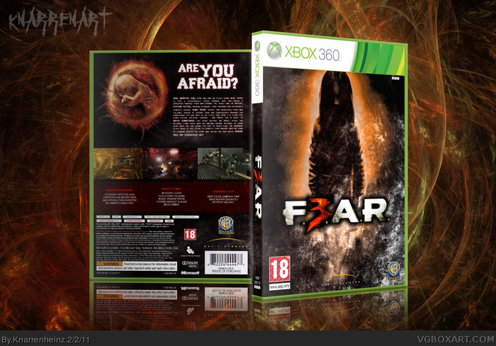
Kudos: Your printable got 300 dpi. Most people upload it with 72 dpi and that's not suitable for a a good print.
 F.3.A.R Box Cover Comments
temp ny ScorpionSoldier
[ Reply ]
Nice cover add printable :)
[ Reply ]
===============
PRINTABLE ADDED
===============
[ Reply ]
gooooooooooooood
[ Reply ]
the text makeup as well as the focusing ( link ) is your biggest flaw. You tend to mix too many styles (centered, grouped, ...) together and the grouped style has a lot of gaps. You can easily avoid these.
A bit more alias woud help your smaller text too (synopsis, legal) ' cause it tends to be very choppy (like some logos) on the printable.
Kudos: Your printable got 300 dpi. Most people upload it with 72 dpi and that's not suitable for a a good print.
[ Reply ]
I like it
[ Reply ]