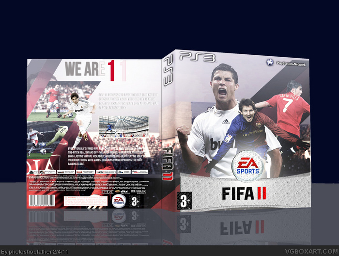
Ok guys. Firstly i want to thank the WIP forum which helped alot.
Secondly I took on board the critique about improving the image quality.
Finally credits to leegion for the template and hope you all like it =D
Shouldn't have Messi on, because he's with pes and the rating for fifa isn't mature (says so in the back). Also the template looks squashed when I look at the rating on the back.
Other than that, good box, 8/10, and try changing it.
it's not your best but just fix up those unintentional errors and then update and it should look much better
i also don't get why you chose messi as a gameplay version on the front rather then him actually
The decision to have placed messi on the composition has backfired. You could have used photographic images rather than in game renders as this gives it an awkward feeling. No game covers should have in game game graphics on the front. Also why is the fifa logo on the spine so far down? It is also vertically not straight.
The errors on the back are endless. Firstly one of the screenshots spreads onto the spine. The 'we are 11' slogan font looks dull and boring. Also the player in the white jersey seems to be flying. Could you explain what that is all about.
Overall my conclusion is that this is a prepostrous composition with mimnal input and generally uninnovative.
This solidifies my theory that you do not possess the ability to produce boxes such as the medal of honour & COD-Black ops which are of the highest calibre.Your inconsistencey shows that they are obviously stolen as this box relects your true skills.
You are the biggest phoney on VGBA and this box replicates this fact.
#11, your pathetic you know that
i think everyone has a right to give out advice
maybe you shouldn't if you say something like prepostrous
what kind of criticism is that
it sounds more like attacking the author
don't forget me dude...
yup it's much better then your version 1 and i hope that idiot maverik doesn't come back here to insult this good box and spoil the fun
Not bad. But the logo is too far down, and there was no point of taking the official PS3 bar at the top of the box, cause now you cant see the "ps3" logo. Plus putting white on white is a big no no. If anything it should be black or red font.
#27, be quiet dave
not long till you get banned again and sent to the dump you came from
ladies and gentleman...5 star generals fellow henchman dave123 has arrived
please give him a round of applause!!!
man this site is getting contaminated with alts of former crappy artists coming back...this is frustrating
can't the admins tell who these punks are
#9, are you an idiot? Boxes use in game images all the time on the front.
The main problem I have with this box is the lack of contrast. The whole thing is very sterile and the quality is really spotty. It needs to be crisper and sharper as a whole. This certainly isn't up to par with your MOH and COD boxes. Also, on the back, you put a huge image of a soccer player only to cover up most of his body and face. That's a poor design choice.
Oh yes, and about the box, I thought it was ok but I think you could have done alot better seeing as your other boxes are always blowing me away. This looks like you havnt spent much time on it but I guess it's ok. If you spent a lot of time on this then I am not impressed if you didn't then I guess it is acceptable. Fav from me.
Oh yes, and about the box, I thought it was ok but I think you could have done alot better seeing as your other boxes are always blowing me away. This looks like you havnt spent much time on it but I guess it's ok. If you spent a lot of time on this then I am not impressed if you didn't then I guess it is acceptable. Fav from me.
#32, It is better.
Just three questions to ask:
1-Why is there a texture on the logo? Not sure if thats a good thing or a bad one.
2-Why does the logo not reach one of the ends of the front cover?
3-Why does the tagline look as if it's saying 'we ar 1'? I can't see the 'e' in 'are' properly or the second '1' on '11'.
#50 Oh so you some how miraculously get a couple of faves for your box and now see fit to give out feedback since you think you are now qualified? Your box was preposterous and the fact that you got 10 faves demonstrates that this site is in decline. The incumbants on this site have lost their taste.
#51, Who is this imbecile who considers himself as a general.
More 5 star imbecile who's got only 4 senses.Oh wait that must be hearing. GET THE FUCK OFF HERE or hell will be unleashed starting with you lad.
We are the nexus
Your either with us, or your against us.
 FIFA 11 Box Cover Comments
Ok guys. Firstly i want to thank the WIP forum which helped alot.
Secondly I took on board the critique about improving the image quality.
Finally credits to leegion for the template and hope you all like it =D
[ Reply ]
the box is nice. but Messi from PES 11 on a cover of FIFA??? Nooooo!!!
[ Reply ]
Ok will update soon =)
[ Reply ]
#3, cool, then i'll fave it :D
[ Reply ]
Shouldn't have Messi on, because he's with pes and the rating for fifa isn't mature (says so in the back). Also the template looks squashed when I look at the rating on the back.
Other than that, good box, 8/10, and try changing it.
[ Reply ]
#3, Sorry, didn't see that.
[ Reply ]
it's not your best but just fix up those unintentional errors and then update and it should look much better
i also don't get why you chose messi as a gameplay version on the front rather then him actually
[ Reply ]
So what do you call this then. Shambolic thats what.
[ Reply ]
The decision to have placed messi on the composition has backfired. You could have used photographic images rather than in game renders as this gives it an awkward feeling. No game covers should have in game game graphics on the front. Also why is the fifa logo on the spine so far down? It is also vertically not straight.
The errors on the back are endless. Firstly one of the screenshots spreads onto the spine. The 'we are 11' slogan font looks dull and boring. Also the player in the white jersey seems to be flying. Could you explain what that is all about.
Overall my conclusion is that this is a prepostrous composition with mimnal input and generally uninnovative.
[ Reply ]
This solidifies my theory that you do not possess the ability to produce boxes such as the medal of honour & COD-Black ops which are of the highest calibre.Your inconsistencey shows that they are obviously stolen as this box relects your true skills.
You are the biggest phoney on VGBA and this box replicates this fact.
[ Reply ]
#7 Who on earth gave you the right to give out advice. Run along you inpotent child, go and play with your kindergarten friends.
[ Reply ]
So you remove your fave from my box just because you cannot handle a little bit of stinging criticsm?
[ Reply ]
#12, Your just trying to start a fight. I'm Just going to ignore you.
[ Reply ]
#11, your pathetic you know that
i think everyone has a right to give out advice
maybe you shouldn't if you say something like prepostrous
what kind of criticism is that
it sounds more like attacking the author
[ Reply ]
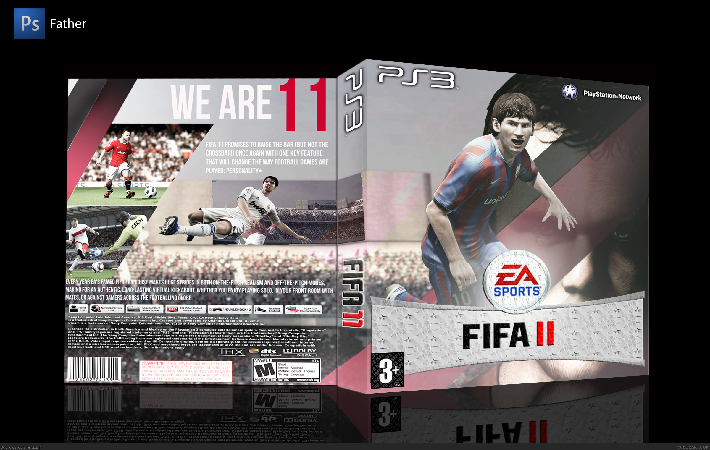
Ok guys. I've listened to what all of you have said and will soon update the box.Its going to be quite different thats all i can say now.
[ Reply ]
#15 different as in worse? You have no clear thoughts in how to improve.
[ Reply ]
Was that a fly i just heard?
[ Reply ]
Finally,I have updated it. Please tell me if i have improved.
[ Reply ]
#18, Yeah, its better, may fav. Ronaldo is choppy though and Messi's still there.
[ Reply ]
Oh, and the 'we are' on 'we are 11' is not very visible because of the white behind it. Other than that, good box.
[ Reply ]
Thanks for the favs,Mattstar and NATHAN JAIN.
[ Reply ]
#21, Thats alright.
[ Reply ]
Edited at 1 decade ago
[ Reply ]
don't forget me dude...
yup it's much better then your version 1 and i hope that idiot maverik doesn't come back here to insult this good box and spoil the fun
[ Reply ]
This is an absolute display of incompetance. It has a striking resemblence to horse manure.
[ Reply ]
Thanks for the comment maverik. I appreciate what you have said.
Is there anything else you have to say?
Oh yes thank you for the fav silent master. I REALLY appreciate it.
[ Reply ]
Hello tahmim dave is BAAAAAAACK!
[ Reply ]
#24, Kita koros
[ Reply ]
Not bad. But the logo is too far down, and there was no point of taking the official PS3 bar at the top of the box, cause now you cant see the "ps3" logo. Plus putting white on white is a big no no. If anything it should be black or red font.
[ Reply ]
#27, be quiet dave
not long till you get banned again and sent to the dump you came from
ladies and gentleman...5 star generals fellow henchman dave123 has arrived
please give him a round of applause!!!
man this site is getting contaminated with alts of former crappy artists coming back...this is frustrating
can't the admins tell who these punks are
[ Reply ]
WOooops! Left some white parts. Updating again.
[ Reply ]
#29 Updated it. is it better now?
[ Reply ]
#30,kita matos tui bangla mat or tor reh khali guil de mooo!
[ Reply ]
Desirex khene banned oi seh?
[ Reply ]
#9, are you an idiot? Boxes use in game images all the time on the front.
The main problem I have with this box is the lack of contrast. The whole thing is very sterile and the quality is really spotty. It needs to be crisper and sharper as a whole. This certainly isn't up to par with your MOH and COD boxes. Also, on the back, you put a huge image of a soccer player only to cover up most of his body and face. That's a poor design choice.
[ Reply ]
Hello everyone I am here to take over role of 5 star general.
I am his new alt.
My names blessed, but you already know that.
[ Reply ]
we got alts everywhere
ARGH!!!!!!!!!!!!
CONTAMINATION!!!
wtf is this...
[ Reply ]
#36, i don't believe you because maverik is still here and he can't sadly have two alts simultaneously at once
[ Reply ]
Kita matos tahmim. Royal rumble deks sos ne.
'My name is Alberto del rio but you already know that'
hahahaha he's the best.
[ Reply ]
sorry...
[ Reply ]
Shut up fool stop hidding your real indentity saying you have an xbox.
hshahahahahahahahahahahahahahhah!
[ Reply ]
xbox???
what are you talkin about
are you crazy fool!!!
[ Reply ]
you are like the most randomest person ever
that explains why your a kid no doubt about that
[ Reply ]
#43, ish miassab reh khoi mu tui khali chor mas
[ Reply ]
what???
[ Reply ]
Oh finally understand khoros
Just speak bangla and be proud
[ Reply ]
What are you two on about?
[ Reply ]
Oh yes, and about the box, I thought it was ok but I think you could have done alot better seeing as your other boxes are always blowing me away. This looks like you havnt spent much time on it but I guess it's ok. If you spent a lot of time on this then I am not impressed if you didn't then I guess it is acceptable. Fav from me.
[ Reply ]
#32, It is better.
Just three questions to ask:
1-Why is there a texture on the logo? Not sure if thats a good thing or a bad one.
2-Why does the logo not reach one of the ends of the front cover?
3-Why does the tagline look as if it's saying 'we ar 1'? I can't see the 'e' in 'are' properly or the second '1' on '11'.
[ Reply ]
#50 Oh so you some how miraculously get a couple of faves for your box and now see fit to give out feedback since you think you are now qualified? Your box was preposterous and the fact that you got 10 faves demonstrates that this site is in decline. The incumbants on this site have lost their taste.
[ Reply ]
#51, Who is this imbecile who considers himself as a general.
More 5 star imbecile who's got only 4 senses.Oh wait that must be hearing. GET THE FUCK OFF HERE or hell will be unleashed starting with you lad.
We are the nexus
Your either with us, or your against us.
[ Reply ]