Hi 8)
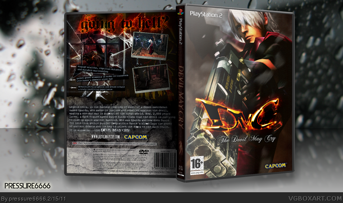
i thought i was only going to update my other dmc box, but as i was having some ideas i found myself changing the whole thing. but if its against the rules i can post this as a update to the other one, no prob. it took a week or so to complete, as i didnt work constantly on it, and i've done/redone things =p any advice to make this better is always welcome. hope you like this
I think you should chose static view to render in Imandix, it'll be better. I love the layout on the back but I'm not a fan of tagline and "the DMC" font.
#4, thanks a lot ; ) i had a lot of fun doing it, after all its my favorite game of all time. yeah maybe i should've post this on the wip forum first..i'll definitely do that next time =) thanks a lot for the advice
I like it. Especially the spine and the flame tagline. One thing that bothers me is the "THE" beneath DMC logo, I mean there's no THE in the game title is there? All in all a really nice box.
 Devil May Cry Box Cover Comments
Hi 8)
i thought i was only going to update my other dmc box, but as i was having some ideas i found myself changing the whole thing. but if its against the rules i can post this as a update to the other one, no prob. it took a week or so to complete, as i didnt work constantly on it, and i've done/redone things =p any advice to make this better is always welcome. hope you like this
[ Reply ]
I think you should chose static view to render in Imandix, it'll be better. I love the layout on the back but I'm not a fan of tagline and "the DMC" font.
[ Reply ]
Credits:
ps2 template by Leegion: link
window in the back: link
chains in the back: link
did the front logo myself using fonts from dmc2 logo and then followed a really good tutorial for flaming text 8) ..and i guess thats all for now
[ Reply ]
Wow this is very good. Say, do you hang out around the forums a lot. That might help your reputation and encourage people to see your boxes more.
[ Reply ]
#2, wish font? the "flaming" one?
yeah about the back, i had that tagline in my head the whole time =p
[ Reply ]
#4, thanks a lot ; ) i had a lot of fun doing it, after all its my favorite game of all time. yeah maybe i should've post this on the wip forum first..i'll definitely do that next time =) thanks a lot for the advice
[ Reply ]
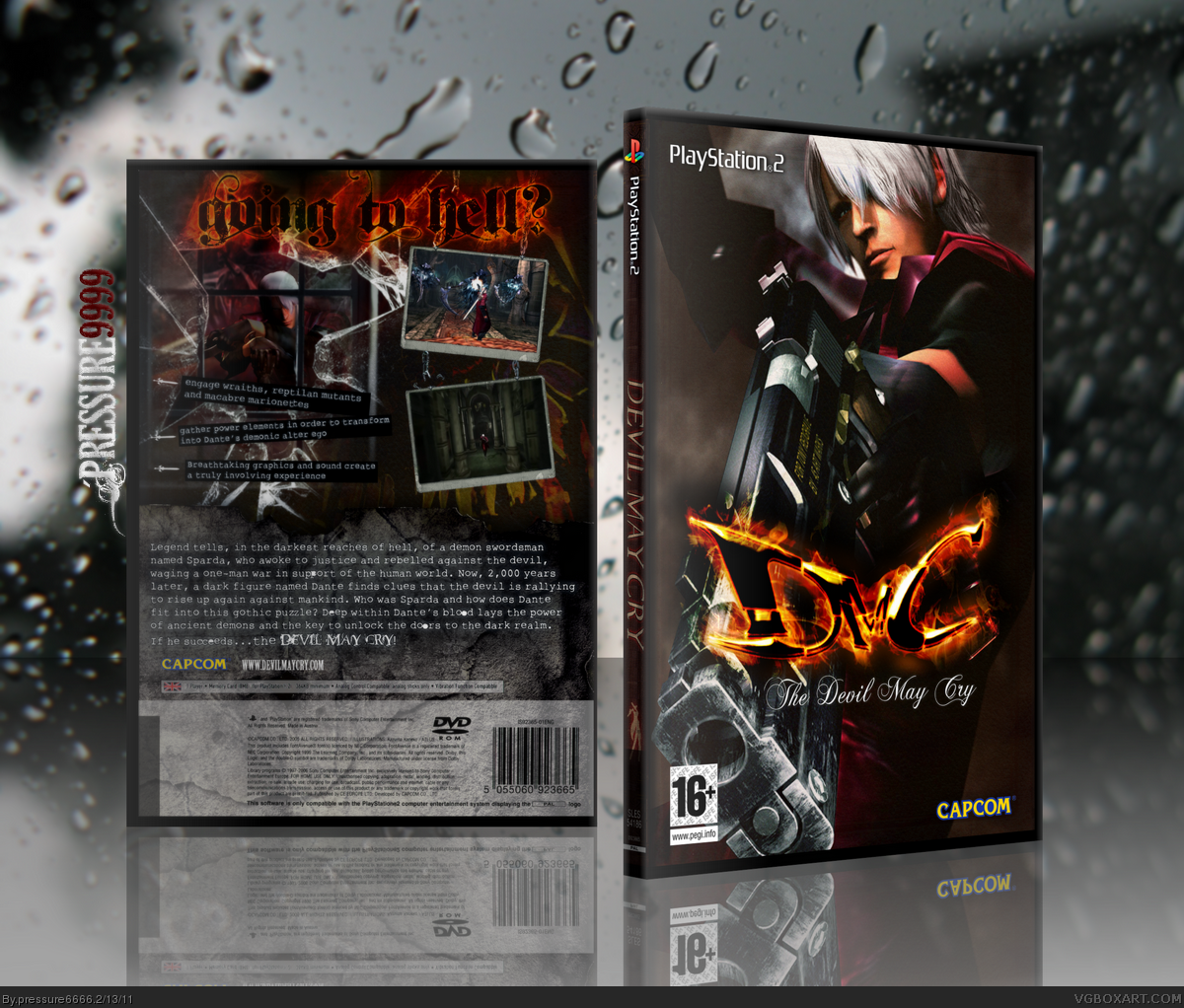
printable added, check it out for more detail =)
[ Reply ]
I like it. Especially the spine and the flame tagline. One thing that bothers me is the "THE" beneath DMC logo, I mean there's no THE in the game title is there? All in all a really nice box.
[ Reply ]
#8, i know =) there isn't. i've put it there on purpose really. kind of a personal touch.. =p thanks a lot for the comment and fave ; )
[ Reply ]
updated presentation (again!) ah, now it looks good =)
[ Reply ]
wow ANOTHER brilliant box today.
[ Reply ]
#11, thanks a lot ; )
[ Reply ]
Outstanding.
[ Reply ]
#13, wow thanks ; )
[ Reply ]
Very nice, but I think you should change the tagline. I barely see it
[ Reply ]
#15, hmm i know what you mean that flaming effect is missing some spots. thanks for the fave!
[ Reply ]
why do people post boxes like these??? it's totally unoriginal, and that style should exist in the first place.
[ Reply ]
#17, i love you too
[ Reply ]
Oh, it looks better :D
[ Reply ]
updated: just added some glass shards flying on the front and added some lightning to fit the logo better. no big deal =p
[ Reply ]
This is smashing cover.
[ Reply ]
#21, hope thats a good thing 8)
[ Reply ]
Love love love love love a thousand times love.
[ Reply ]
#23, thanks ;)
[ Reply ]
This deserves a lot more attention.
[ Reply ]
i love it very good
[ Reply ]
thanks for all the nice comments 8)
[ Reply ]
Why isn't this HOF yet? deserves that extra push, if you ask me....
[ Reply ]
Thanks! that would be great, but the good feedback is enough B-) eheh
[ Reply ]
Hope this gets HoF soon :D
[ Reply ]
Thanks! :D How does a box get HoF anyway? I can't seem to find much info about that
[ Reply ]
Awesome cover!
[ Reply ]
Nice Job Men . . . (â—Žoâ—Ž)
[ Reply ]
Thanks :3
[ Reply ]
Realy nice front...
[ Reply ]
About time. Congrats!
[ Reply ]
Thanks a lot =D
[ Reply ]