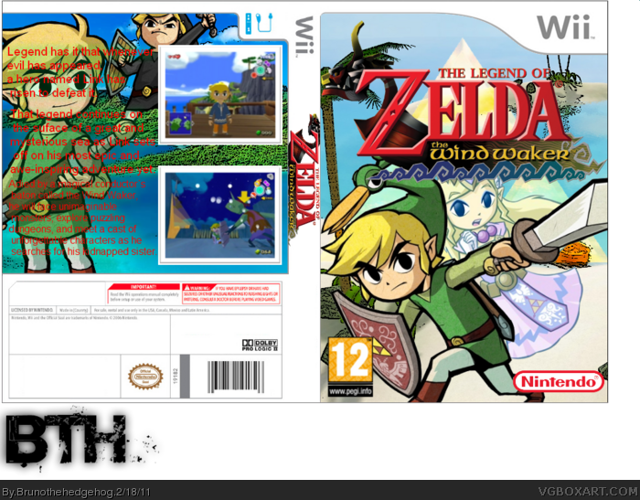
Like #2 said, Minish Cap Link shouldn't be here. I'm sure there are some good pics of WW Link somewhere. Also, what's with the black Link on the back? I think just one render is enough.
The back text is really jarring, especially since the rest of the box is quite decent. Change the font and colour (red just doesn't look right), and maybe apply drop shadow to make it stand out more.
Only other things are the missing logos on the back, and maybe you could get a better border for the screenshots.
If you can fix these, I'm sure this box will look great :)
 Legend of Zelda : The Wind Waker Box Cover Comments
I like everything except for the text on the back... same thing that happens to my boxes.
[ Reply ]
Wait, why is Link wearing the minish cap?
[ Reply ]
#2, because I didnt had better pics to put on the front XP !
[ Reply ]
Like #2 said, Minish Cap Link shouldn't be here. I'm sure there are some good pics of WW Link somewhere. Also, what's with the black Link on the back? I think just one render is enough.
The back text is really jarring, especially since the rest of the box is quite decent. Change the font and colour (red just doesn't look right), and maybe apply drop shadow to make it stand out more.
Only other things are the missing logos on the back, and maybe you could get a better border for the screenshots.
If you can fix these, I'm sure this box will look great :)
[ Reply ]
#4, thanks
[ Reply ]