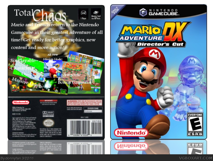
I added the thing that tells you how many players and stuff on the other side cause I couldn't fit it on the other one anyways, I made this from scratch and if you see the front, you'll see it's a lot different than the normal Sonic Adventure DX Directors Cut, but I used it as a new idea. Hope you like it!
First, I would use a more dynamic font, because the current font looks a little basic. Next, I would change the font color so it doesn't blend in too much with the background. Finally, I would change the size of the text surrounding the screenshots to make it more visible.
 Mario Adventure DX: Directors Cut Box Cover Comments
I added the thing that tells you how many players and stuff on the other side cause I couldn't fit it on the other one anyways, I made this from scratch and if you see the front, you'll see it's a lot different than the normal Sonic Adventure DX Directors Cut, but I used it as a new idea. Hope you like it!
[ Reply ]
I like the front, but the back could use some work. Also, swap the positions of the Nintendo logo and the ESRB logo.
4/5
[ Reply ]
#2 What kind of work on the back?
[ Reply ]
First, I would use a more dynamic font, because the current font looks a little basic. Next, I would change the font color so it doesn't blend in too much with the background. Finally, I would change the size of the text surrounding the screenshots to make it more visible.
[ Reply ]
#4 I know the text is hard to see, but there weren't many other options..
[ Reply ]