[ Buy Call of Duty... at Amazon ] By Throavium-Redux 40 on April 8th, 2011 Download Printable Call of Duty: Black Ops Box Cover Comments Comment on Throavium-Redux's Call of Duty: Black Ops Box Art / Cover. Cancel Reply Eggboy'13 48 [ 1 decade ago ] The lighting, the color, the layout, all SUPERB. Fav'd and Author fav'd. [ Reply ] The90sKid 38 [ 1 decade ago ] I've always loved this, glad you finally uploaded it. [ Reply ] aelixus 46 [ 1 decade ago ] I'm not sure about the front, but the back is stunning! [ Reply ] Ronthis the Werewolf 39 [ 1 decade ago ] ^^^^This [ Reply ] MattStar 49 [ 1 decade ago ] Beats the shit out of the official. [ Reply ] hesit8 46 [ 1 decade ago ] Your backs are always spot on but the front is a little weird. The two renders are competing for attention which makes it a little unsettling. [ Reply ] Throavium-Redux 40 [ 1 decade ago ] #6, Either this or get called out for copying felipe. [ Reply ] sd1833 48 [ 1 decade ago ] I have to agree the front is a confusing image. It lacks balance, and is a bit disappointing in comparison to the stellar back layout. Seriously, great job once again on your back designs. [ Reply ] Throavium-Redux 40 [ 1 decade ago ] Whatcha' gonna do when 30 people make the same cover before you? [ Reply ] CrysisNova 1 [ 1 decade ago ] title is racist [ Reply ] Throavium-Redux 40 [ 1 decade ago ] #10, Agreed [ Reply ] Ladykiller 42 [ 1 decade ago ] I'm not a fan of the front as much as the back, but as a whole it's still quite nice. [ Reply ] zorfog 1 [ 1 decade ago ] holy crap. thats a good box. [ Reply ] Throavium-Redux 40 [ 1 decade ago ] #13, Thanks. [ Reply ] MattStar 49 [ 1 decade ago ] What the fuck this needs hall. [ Reply ] Throavium-Redux 40 [ 1 decade ago ] #15, No, it doesn't. [ Reply ] MattStar 49 [ 1 decade ago ] #16, Your modest, yes it does. [ Reply ] Throavium-Redux 40 [ 1 decade ago ] Edited at 1 decade ago [ Reply ] Throavium-Redux 40 [ 1 decade ago ] Edited at 1 decade ago [ Reply ] Throavium-Redux 40 [ 1 decade ago ] #17, Don't know what happened with the posting there. I'm not being modest, I'm being realistic, and at this point, Hall of Fame is nothing more than a 16px by 16px icon. [ Reply ]
 Call of Duty: Black Ops Box Cover Comments
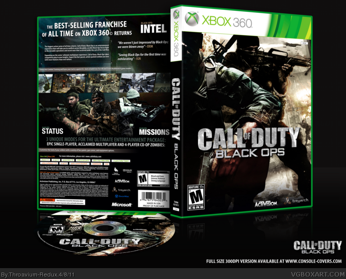
The lighting, the color, the layout, all SUPERB.
Fav'd and Author fav'd.
[ Reply ]
I've always loved this, glad you finally uploaded it.
[ Reply ]
I'm not sure about the front, but the back is stunning!
[ Reply ]
^^^^This
[ Reply ]
Beats the shit out of the official.
[ Reply ]
Your backs are always spot on but the front is a little weird. The two renders are competing for attention which makes it a little unsettling.
[ Reply ]
#6, Either this or get called out for copying felipe.
[ Reply ]
I have to agree the front is a confusing image. It lacks balance, and is a bit disappointing in comparison to the stellar back layout. Seriously, great job once again on your back designs.
[ Reply ]
Whatcha' gonna do when 30 people make the same cover before you?
[ Reply ]
title is racist
[ Reply ]
#10, Agreed
[ Reply ]
I'm not a fan of the front as much as the back, but as a whole it's still quite nice.
[ Reply ]
holy crap. thats a good box.
[ Reply ]
#13, Thanks.
[ Reply ]
What the fuck this needs hall.
[ Reply ]
#15, No, it doesn't.
[ Reply ]
#16, Your modest, yes it does.
[ Reply ]
Edited at 1 decade ago
[ Reply ]
Edited at 1 decade ago
[ Reply ]
#17, Don't know what happened with the posting there.
I'm not being modest, I'm being realistic, and at this point, Hall of Fame is nothing more than a 16px by 16px icon.
[ Reply ]